Today we’re going over the great mystery of painting with texture brushes in Adobe Photoshop. How do they work? And is there truly a difference between texture brushes and standard ones?
Standard vs. Texture: The Difference
The difference is pretty obvious. While standard brushes have that smoother quality about them, texture brushes have the grit and feel of the real world environment. In fact, digital art is often quite easy to pick out from traditional styles because of this difference.
Have you ever seen a photo that’s been “too Photoshopped”? Well, the reason we’ve all become familiar with this technique is because everything in the world has texture. So naturally when you compare the real life texture of skin to the retouched faces adorning your favorite magazine covers, your eye picks up the trick.
But don’t feel misled. My point is just that both types of brushes have their place in your digital painting arsenal. Experiment often to see which works best for different scenarios.
Will Texture Brushes Save Your Art?
So your favorite artist just posted a complete set of all the brushes they use. Now that you have them downloaded and installed, your art will magically transform into the style it was always meant to be. Right?
Trust me―I wish, otherwise I would’ve personally downloaded every brush pack ever made.
But sadly, the only things that will transform your technique are patience, time, and of course, lots of practice. I suggest you get familiar with standard round brushes as well as digital painting techniques in general before moving on to textures.
Texture Brushes: What Are They Good For?
There’s no doubt about it, the standard round brush is your one true love. You’ll need it for most details. But the great thing about texture brushes is their ability to add instant realism with the application of some grit. Check out these different ways you can utilize them for your future paintings.
Simulating Realistic Textures
As I mentioned previously, everything in the real world has texture. In fact, if you’ve ever had problems achieving realism, it’s probably because your painting looks too smooth. Remember that reference to airbrushing from before? Well, drop your normal boring brush and pick a grunge one. Make any painting come alive by applying the appropriate texture to your piece.
Painting Different Materials
The great thing about painting in Photoshop is always the convenience. If you want to paint a fuzzy sweater, pick a fuzzy brush! From skin and clothing to grunge and other natural details, utilizing these brushes is the easiest way to achieve the texture you need.
Making Digital Art Look Traditional
What if you want the look of a beautiful oil painting without all the mess? Well, experiment with different texture brushes to simulate your favorite traditional art styles, from oil to acrylic and watercolor paintings. Even create your own unique pencil sketches without wearing out a single lead tip. Search the web for brush packs and you’ll notice that many use actual paint splatters to achieve that traditional art effect.
My Favorite Types of Texture Brushes
I love these brushes. Here are some of my personal favorites and why.
Grunge Brushes
A grunge brush looks like dirt. I mean that as a compliment. These are my go-to brushes for any time I want to add realism to a piece. The potential of these brushes is truly limitless, but make sure to always adjust the Opacity accordingly for the best result.
Skin Brushes
Skin brushes are clusters of fine, grainy textures to simulate the look of pores. They instantly transform a regular portrait from digitally smooth to photo-realistic. These brushes also have the versatility of grunge brushes in that you can use them to apply grainy textures to your work.
Cloudy Brushes
There is nothing more beautiful than nature. Cloudy brushes have the ability to capture the effortless movement of hair, clouds, and other flowy details.
Adjust Texture Brushes in Two Easy Steps!
Not sure which brush to choose? When in doubt, make your own!
Step 1
Hit F5 on your keyboard to bring up the Brush panel. Making sure that your Brush Tool (B) is selected, select any brush from the panel of presets.
Step 2
Check the box next to Scatter. Adjust the Scatter to 120% for a more dispersed texture.You can play with additional features like Texture or Shape Dynamics until you’re satisfied with your new brush effect. But for this example, I’ll just stop at these simple changes.
By simply adjusting a few quick settings, you’ve just made your own custom brush!
Conclusion
The science of digital painting is understanding how to apply the tools you have to your exact painting needs. Today you’ve learned that painting with texture brushes is one great way to add realism to any piece or even to try out a new style. Do you already have a favorite? Let me know in the comments! I hope you have a lot of fun experimenting with these brushes, and wish you lots of luck!
Adobe Bridge is a really useful tool for ‘bridging’ the content of your computer’s folders between your Adobe design applications. You can use the programme to organize files, and create sophisticated libraries of images and text documents ready to use in your layout designs.
Mini Bridge creates a miniature version of Bridge within your Adobe application, allowing you to drop content into your InDesign layouts quickly and easily. In this Quick Tip we’ll take a look at how you can improve the speed and flexibility of your workflow by incorporating Mini Bridge into your InDesign Workspace, and how you can best organize your folders and their contents for maximum efficiency.
This Quick Tip applies to InDesign CC, CS6 and CS5. You can also check out how to locate images in InDesign CS5 using Mini Bridge in this quick tip tutorial from Gavin Selby.
Step 1
First up, you need to install Adobe Bridge before you can access the Mini Bridge function in InDesign. Once installed you can access Mini Bridge in both Photoshop and InDesign.
Once you have Bridge installed, you can open up InDesign and File > Open an existing document or create a new one. Here, I’ve opened a moodboard grid I created in my recent moodboard tutorial, ready for images to be placed.
Any document layout will work just fine for this tutorial—just create a new document if you haven’t got anything prepared, to practice using Mini Bridge.
Step 2
Bridge allows you to view a single folder of files at a time. So it’s a good excuse to get your folders nicely organized. Firstly, open up the full version of Adobe Bridge by clicking the Bridge icon in the Application bar in InDesign. We’ll first take a quick look at the full Bridge application before using Mini Bridge.
With Bridge opened you can navigate through your folders and move things about if you need to. To drop a file into a different folder, drag the file icon in the central Content window and drop into your chosen folder in the Folders panel (to the left side of the Bridge workspace, next to Favorites).
Try to group common elements together. If you have a group of images you want to use for a particular design project, group them in an ‘Images’ folder, and sit this folder within a project folder. Keeping your files grouped and organized will help you to get the most out of Bridge, and also help rectify situations when images are flagged up as modified or missing in InDesign—you can be optimistic that your image file is lurking somewhere in the folder you placed it in.
You can also view information about your image files using the right-hand Metadata window in Bridge, including useful things to keep in mind when designing your layouts, such as image resolution and file size; and you can also look at the camera data for the image, in a similar way as you might in Adobe Lightroom.
Click on Keywords, next to Metadata, and you can also view the keywords assigned to your image if you’ve downloaded from a stock image site.
You can also search for images by keyword using the Filter window, at the bottom left corner of the Bridge workspace.
Bridge also offers the option for creating Collections (Window > Collections Panel, then select New Collection from the bottom of the panel), which are groups of images only brought together in Bridge. This is useful if you don’t want to move files permanently to different folders on your computer.
Step 3
Once you’ve organized your files and folders, return to InDesign and to your document.
To open Mini Bridge, you can either Shift-click on the Bridge icon in the Application bar at the top left of the workspace, or go to Window > Mini Bridge from the menu bar.
When Bridge first opens, it will either open at the last-used folder, if you’ve previously used Mini Bridge, or at your root Computer folder.
Click on the small arrow next to the folder name at the top of the panel to access subfolders and navigate through your folders, or click on Computer to access a drop-down menu of your computer’s principal drives as well as Recent Files and Recent Folders. From here you can also access a previously saved Collection (see Step 2, above). Here, I created a collection in Bridge called ‘Paper’.
Step 4
Now you can start to drop images into your InDesign layouts from Mini Bridge. To view the image previews at different scale, slide the bar at the bottom right of the Mini Bridge panel along to the left (smaller scale) or right (larger scale).
It’s best if you first create a frame for your image. From the Tools panel, select the Rectangle Frame Tool (F), Ellipse Frame Tool or Polygon Frame Tool and drag (holding Shift to create a perfect shape) to create a frame on the page.
With the image frame selected, hop over to Mini Bridge and click on your chosen image to select it. Drag the image across and drop onto the frame. The frame will be filled with your image.
Repeat the process, selecting another image and dragging it across to another image frame.
Step 5
If you’re creating an image-heavy document, such as a moodboard like the one here, or perhaps a magazine or brochure, you can select several images together and ‘load’ them onto your cursor.
To do this, navigate to your folder of images in Mini Bridge (to view the details of the images used here, head over to this tutorial).
Holding Shift you can click and select several images at once, or use Command (Mac OS) or Control (Windows) to skip over images selectively as you pick and choose from a range of files. Once you’ve highlighted the images you want, drag your cursor outside of Mini Bridge and click once. A paintbrush icon will replace your cursor, alongside a preview of one of the images in your selection and the number of images loaded onto your brush.
Extra Tip: Picked up an image you didn’t want? Hit Esc on your keyboard to remove the top image from your selection of images once loaded onto your brush.
Hover over a prepared image frame and click to drop the first image into the frame. Repeat to drop the remaining images onto your document.
Conclusion
If you’re designing a document that’s image-heavy, like a moodboard (see image below) or magazine layout, get in the habit of using Adobe Bridge to organize your images, making use of the Collections feature to create custom groups of files for your projects.
Mini Bridge is a super useful little function that will help to streamline your InDesign workflow and make it more efficient. Mini Bridge allows you to extend the functionalities offered by Bridge directly into InDesign, which helps to promote a more flexible workspace without the need to be hopping in and out of different applications.
Fire is pure light. It’s fast, intangible, and it seems to be alive. Its wild nature isn’t easy to convert to a static painting, but once you manage to do it, your pictures may become as lively as fire itself.
In this part of the Harness the Elements series you’re going to learn about fire and its forms, and how to create them in Adobe Photoshop. We’re going to use the same tools you might be using constantly, and you’ll discover that they’re much more powerful than you thought!
Follow me to create fire from scratch!
1. Paint a Flame
Step 1
Create a New File (Control-N) and Fill (G) it with black. Light is bright only in darkness—when you light a fire on a sunny day, it’s going to look weak and pitiful. A white background is the brightest you can get, so no matter how hard you try, your painted fire will not look bright on it.
Create a New Layer (Control-Shift-Alt-N). Use the Ellipse Tool (U), hold Shift and draw a circle. The color is not important.
Step 2
Double click the layer and select Gradient Overlay. Select Radial for the Style.
Warning: every time this window appears, don’t copy the exact values—instead, try to reach the effect I presented by playing with the sliders.
The values used in this window depend on the resolution of your picture
Use following colors for the gradient (there’s no need to use the exact shades, you’ll even remember them better if you don’t):
White: #ffffff
Unsaturated yellow: #fefde1
Saturated yellow: #fff68f
Yellowish orange: #fbb245
Reddish orange: #ca4a0c
Step 3
Right click the layer and select Rasterize Layer Style. Go to Filter > Blur > Gaussian Blur. Experiment with the Radius to make the edges blurry.
Step 4
This is the most important part, and it’s also quite tricky, so be patient here. Duplicate (Control-J) and hide the circle to have a backup version. Then select the copy and use Filter > Liquify.
Use the Forward Warp Tool to distort the flame and get the shape you need. You may need to use a reference first.
Step 5
When you’re done, double click the flame layer and select Outer Glow. Give it the color of the outermost color, and play with Size and Opacity.
Step 6
If you want more vivid colors, go to Image > Adjustments > Brightness/Contrast and play with Contrast.
Step 7
A flame is in constant motion, so it looks fake when it’s static. Give it Filter > Blur > Motion Blur to avoid this effect.
2. Colorize a Flame
Step 1
What about magic, colorful flames? You could always change Hue (Control-U) to create them, but it would kill the unique relation between red, orange, and yellow. I’ll show you a different method.
Hide the Effects (Outer Glow) for now. Go to Image > Adjustments > Black & White.
Step 2
Add the Image > Adjustments > Gradient Map for the layer. Change its Blend Mode to Hard Light and clip (Control-Alt-G) it to the flame.
Step 3
Experiment with the colors of the gradient. The left side will be put in dark areas of the picture, and the right side in bright areas.
Step 4
Show the Outer Glow again and give it the color of the edge.
Step 5
You can colorize the flame with any colors you wish with this method. However, keep in mind that some of them will not look natural just because we’re not used to them, not because they’re painted “wrong”. You only need to make sure that the color inside is brighter than the one on the edge.
3. Paint a Fire
So, that was a cool way to paint a single flame, but what if you wanted many of them? Let’s try another method, great if you want to paint a close-up of a fire.
Step 1
Just like before, start with a New File, black background, and a New Layer. Use the Hard Round brush to paint the base of the fire.
Step 2
Double click the layer. Check Inner Glow and select a deep, reddish orange (like #ff5a00) for it.
The effect should look like this:
Step 3
Use Filter > Blur > Gaussian Blur to soften the edges.
Step 4
Just like with the single flame, use Filter > Liquify and the Forward Warp Tool (W) to create flames.
Step 5
Add the Layer Mask to the layer. Use the Soft Round brush with 50% Flow to make the fire more variable.
If you’re unfamiliar with the Layer Mask:
Click the mask to get into the mask mode.
You can use only black and white here.
Black makes the main layer transparent, and white makes it opaque.
Use the same method to add more flames.
Step 6
Create a New Layer. Double click it and add Inner Glow with a more yellowish orange. Make the glow very thick.
Paint another part of the fire on this layer.
Step 7
Again, use the Liquify filter to create flames.
You can add more of them the same way.
Step 8
Create a New Layer. Again, double click it and add Inner Glow to it.
Use an opaque yellow-white gradient:
Paint smaller patches of fire on the layer.
Step 9
Use the Liquify filter to add chaos to them.
Step 10
Change the Blend Mode to Overlay to get a nice, variable brightness.
Use the same method to add more of the small flames. Remember: overlapping Overlay gets stronger every time, so be careful here.
Step 11
Create a New Layer. Paint small, pure white strokes in the brightest spots.
Step 12
Use Filter > Blur > Motion Blur to blend them better.
Step 13
If they stand out too much, add the Layer Mask and blend them with it.
Step 14
If you want to make the fire more alive, you can add Motion Blur to each part, every time using a slightly different Angle.
Step 15
We can’t forget that fire is a light source. It doesn’t have any shadow, but instead it makes other objects around cast shadows.
Step 16
The beauty of this method is that you can easily adjust it to your needs at any point. You can add more layers, change colors, or distort the flames to get the effect you want.
4. Paint Sparks
Step 1
Create a New File. Draw three small blobs with a big distance in between. When you’re done, go to Edit > Define > Brush Preset.
Step 2
Go to Brush Settings (F5) and adjust them as below (the actual values may vary).
Step 3
Paint the sparks on a New Layer. Use reddish or yellowish orange, but never yellow for this purpose.
Step 4
You can add Motion Blur to the sparks, but it should harmonize with the blur of the flames.
Step 5
Let’s make the sparks even shinier. Double click the layer and add orange Outer Glow.
Step 6
If you want to make the sparks brighter, duplicate (Control-J) the layer. You can also change Brightness/Contrast for the effect you want.
5. Paint Lava: Cracked Rock
Step 1
You can use this “pattern” on any surface you wish. I’ll present it on a ball, but feel free to use any type of ground.
Start with a base colored dark, unsaturated blue (for example, #1e1f26). It will give a nice contrast to the lava.
Step 2
Create a New Layer. Double click it and add Pattern Overlay. You can use Concrete (of the set Texture Fill), but most of the rock patterns will look nice here. Clip the layer to the base with Control-Alt-G or by Alt-clicking the line separating the two layers.
Step 3
Right click the pattern layer and select Rasterize Layer Style. Change the Blend Mode to Overlay.
Step 4
Now, adjust the shape of the pattern to the shape of the base. There are three basic methods:
Use Filter > Distort > Spherize for a sphere (your pattern must be in the middle of the canvas for this to work properly).
Use the Free Transform Tool and Control-click the corners to adjust the pattern to perspective.
Use the Free Transform Tool in Warp Mode to adjust the pattern to a more complex form (like a monster body).
Step 5
Duplicate (Control-J) the base, then Merge (Control-E) it with the pattern. Re-clip (Control-Alt-G) if necessary. Add the Layer Mask and draw big cracks with the Hard Round brush, revealing the background.
Then add smaller cracks.
Step 6
Double click the layer. Add Bevel & Emboss with vivid orange for the Highlight. Make the Shadow transparent.
Step 7
Create a New Layer under the pattern. Control-click the pattern’s mask to get a selection of this. Invert it with Control-Shift-I, and then fill (G)with any color.
Step 8
Double click the new layer. Add Inner Glow with orange-yellow gradient (#fc4d12, #fffe00). Change the Blend Mode to Hard Light, Technique to Precise, and play with the Contour.
Step 9
In the same window, add Pattern Overlay. Most of the rock patterns will work well; I’ve used the Mountains one (of the set Texture Fill).
Step 10
Add the Layer Mask to the base. Use the Hard Round brush to cut the cracks.
Step 11
Create a New Layer under the base. Use the Soft Round brush with 50% Flow to paint orange glow near the cracks.
Step 12
Change the color to yellow and paint close to the lava streams to make them shine.
Step 13
When shading the rest of the base, keep in mind that lava is a light source and it can’t be shaded.
Step 14
If you don’t like the blue-red contrast, you can always change the color (Control-B) of the pattern to more reddish. It will work best if the sky/ambient light in your picture is reddish, too.
6. Paint Lava: Eruption
Step 1
Create a New File. Use the Lasso Tool (L) to sketch a shape like the one below, and then fill (G) it with black. Go to Edit > Define Brush Preset.
Step 2
Open the Brush Settings panel (F5). Adjust them as below:
Step 3
I’ve prepared a very simple scene for the eruption; feel free to create your own.
Use your new brush to paint a strong “wave” of lava. First using reddish orange…
… then yellowish orange…
… and finish it with yellow.
Step 4
Merge (Control-E) the waves and use Filter > Blur > Motion Blur to give it an illusion of speed.
Step 5
Create a New Layer. Draw a big, white rectangle using the Rectangle Tool (U).
Step 6
Go to Filter > Noise > Add Noise.
Step 7
Go to Filter > Pixelate > Crystallize.
Step 8
Create a New Layer and clip (Control-Alt-G) it to the previous one. Fill it with deep, reddish orange and change its Blend Mode to Hard Light. Merge (Control-E) both layers.
Step 9
Double click the layer and go to the Blend if section. Move the upper black marker to the right, until the darker parts get completely transparent.
Step 10
Select the Soft Round brush. Set its Flow to 50% and Mode to Dissolve.
Add the Layer Mask and fill it with black to make the layer transparent. Then switch to white and paint in the mask mode to reveal only the parts around the stream.
Step 11
Let’s reuse the “spark brush” we created before. We need to make it a bit denser first:
Step 12
If you want, you can give more speed to the sparks around by adding Filter > Blur > Gaussian Blur to them.
Step 13
Remember about the environment—lava is a strong light source!
7. Paint Lava: Lava Flow
Step 1
Start by painting a base for our “lava river” with the eruption brush. Again, start with reddish orange and get to yellow as you come closer to the opening. Keep the stream on a separate layer from the background!
Keep in mind that lava isn’t water—it’s more gel-like, very heavy and thick, and the cooler it is, the slower it moves. Obviously, it’s the hottest right by the opening, and then it gradually cools down.
At the very top you can use Overlay mode to brighten this part even more strongly.
Step 2
Create a New Layer. Fill it with any color, double click it and check Pattern Overlay. Select Satin for the pattern (of the set Patterns), and then right click >Rasterize Layer Style.
Step 3
Clip the pattern to the stream with Control-Alt-G. Use the Free Transform Tool (Control-T) in Warp Mode to adjust the pattern to the perspective.
Step 4
Set the Blend Mode of the pattern to Soft Light and lower the Opacity to 50%.
Step 5
When lava cools down, it turns back into a rock. This is a gradual process—first lava slows down, and gets thicker and darker on the top, making a hard “skin” on the surface (like on milk). It creates a characteristic pattern, and I’ll show you how to achieve it without painting it.
Create a chaotic pattern just as we did with the eruption (hint: Add Noise, Crystallize).
Step 6
Go to Filter > Blur > Motion Blur and drag the slider until the pattern becomes a set of straight black and white lines.
Duplicate (Control-J) the layer a few times, and then Merge (Control-E) them to make the pattern stronger.
Step 7
Clip (Control-Alt-G) the pattern to the previous layer and use the Free Transform Tool (Control-T) to rotate it.
Step 8
Use Filter > Liquify and its Warp Tool (W) to add “waves”. Use the Curves Editor (Control-M) to make the pattern sharper and more contrasting.
Step 9
Double click the pattern and go to the Blend If section. We want to make the white stripes transparent. Do you know how to do it? Play with the sliders and see what happens!
Step 10
Set the Blend Mode to Multiply.
Step 11
Duplicate (Control-J) the previous pattern. Set its Blend Mode back to Normal. Drag it down a bit to fill the spaces between the dark stripes. Then double click it and play with the Blend If sliders to make the dark parts transparent.
Set the Blend Mode to Color Dodge to get a brightening effect.
Step 12
Add the Layer Mask to both layers. Use the Soft Round brush with 50% Flow to blend them nicely into the stream.
Step 13
You can use the same trick to create bright “wrinkles” up the stream.
Step 14
Don’t forget about lighting the environment! Also, keep in mind that lava flow doesn’t produce smoke on its own unless it touches something wet (it makes steam in this case) or it burns something.
8. Paint Embers
Step 1
Just as with the cracked rock, I’m going to show it using a sample sphere, but feel free to use the same actions for different forms.
Create a New Layer and draw a circle with the Ellipse Tool. Double click it and add a yellow-orange Radial gradient.
Step 2
Create a New Layer and fill it with any color. Double click it and check Pattern Overlay. Select Rust Flakes for the pattern (of the set Textures). Clip the pattern to the circle with Control-Alt-G.
Step 3
Rasterize and adjust the pattern to the form, just as we did with the lava-rock.
Step 4
Set the Blend Mode to Overlay. We’re done with the first stage—it looks like a sun, doesn’t it? That’s the brightest ember.
Step 5
Duplicate (Control-J) the pattern and set its Blend Mode to Color Burn to cool the sphere down a little bit.
Step 6
Let’s add a “shell” of burned and cool material. Create a New Layer, clip it, and fill it with any color. Add Web pattern (of the set Texture Fill 2) to it and Rasterize Layer Style.
Use the Free Transform Tool (Control-T) to enlarge the pattern.
Adjust the pattern to the form.
Step 7
Invert the colors with Control-I.
Step 8
We want to make the white areas transparent. Double click the layer and play with the Blend If sliders to get this effect.
Step 9
Set the Blend Mode to Multiply to get rid of the remnants of white.
Step 10
Add the Layer Mask to the base circle. Use it to cut to emphasize the shape of the chips. You can also use the Eraser Tool (E) for this.
Step 11
Create a New Layer under the previous ones and use the Soft Round brush with 50% Flow to add the glow, just like we did with the lava.
Step 12
Use the Magic Wand Tool (W) to select the chips, one by one. Create a New Layer and fill the selection with any color. Place the layer under the chips.
Step 13
Double click the layer and add reddish Inner Glow to it.
Step 14
If you want to cool down the sphere even more, turn it to red. You can also add bluish gray ash on top of the chips.
9. Thrown Flame
Let’s create dragon fire! It’s also a good technique for fire seen from a distance, for example for a burning house or forest, or magic fireballs.
Step 1
Use the Oil Pastel Large brush to paint the direction of the flame. The bigger the pressure, the longer and thinner the flame.
Step 2
Double click the layer. By adding yellow Inner Glow and reddish Outer Glow we’ll get a shiny edge.
Step 3
Rasterize Layer Style. Go to Filter > Blur > Motion Blur. Use an Angle consistent with the direction.
Step 4
Create a New Layer under the flame. Use our eruption brush to add reddish orange flames.
Step 5
Use Filter > Blur > Gaussian Blur to blend hard edges.
Step 6
Use the Motion Blur once again. Keep in mind that the flames will always try to move up, no matter what their primary direction was.
Step 7
Add a New Layer and draw smaller flames in a more yellowish shade. Add the two kinds of blur.
Step 8
Create a New Layer above the main flame. This time use a yellow fire; embrace the white flame with it.
Step 9
Create a New Layer. Paint a lot of flames with any color.
Step 10
Double click the layer and add Pattern Overlay to it, with Wrinkles as the pattern (of the set Patterns).
Step 11
Rasterize Layer Style and change the Blend Mode to Soft Light. Play with the Opacity if it’s too strong.
Step 12
Create a New Layer and add a few white patches in the yellow flame area.
Step 13
Add Gaussian Blur to them.
Step 14
Don’t forget about the smoke!
Good Job!
There’s a lot of work behind us, but we’re still far from done! If you want to harness all the elements, check out the others of the series: Frozen and Liquid Water, and stay tuned for the next part. We’re going to harness earth, to paint rocks and all kinds of ground!
Editors Note: In this series, Conversations with Creative Collaborators, we look at the place of photography and how it is used accross creative industries. In this instalment we meet Richard Pearson, Art Director at Manchester based creative communications agency BJL to chat about the challenges of working in advertising photography to create campaigns for internationally known brands.
Hey Richard, thanks for taking time to talk. Could you start off by explain about who BJL are and also your role with the agency.
BJL first started life 28 years ago, and we’ve since grown to be the largest independent ad agencies outside London. We are full service and create integrated campaigns. Starting with planning we develop brand platforms, which we then bring to life through every medium, from content to TV, from outdoor to social media. We aim to talk to consumers wherever they are.
You’ll find us working on a broad range of clients including cars, booze, insurance (not three things that normally go well together), paint, holidays, supermarkets and more. Our main role for these clients is to first understand their commercial objectives, market and audience, before developing insight driven campaigns on their behalf. If you’ve seen Mad Men, it’s like that without the drinking and womanising.
My role within this, as a creative art director, is to turn the research and insights into campaigns that speak to the man, or woman, in the street. We start with concepts, and when we have a few routes we’re happy with we’ll pull together mood boards, and visuals to present to client. These usually include a number of style examples of photography that help the client see what’s inside our heads. It can be tough to visualise a finished shot or ad from a black and white sketch; in my case that usual looks a bit like a drawing out of a comic.
When we have sign off on the chosen route from client, and possibly after further research, then we begin to look at commissioning the production.
How closely do you work with photographers? Do you regularly commission a photographer to take images for a project?
There’s a fairly steady demand for shoots through an agency our size. This obviously varies from quite small and quick low budget work, right up to big budget and large scale productions in this country or abroad.
Over the last year we’ve had jobs that have taken our art directors to Norway, Hungary and South Africa, with lead times of a few months. But we also have quick turn around jobs that can be shot the same week of the initial briefing.
Each type of job brings its own pressures. Whichever form it takes, we make sure there’s a continual dialogue with the photographer throughout. My preference is for the art director and photographer to work together as a team, constantly trying to create an image that perfectly fulfils the brief.
How do you go about finding photographers to work with? Do they come to you or do have places that you look for new and exciting imagery?
We’re constantly on the hunt for new photographers, or interesting new styles. Catching the public eye is becoming harder and harder to do with the amount of advertising that people come face to face with. Even the most conservative survey says we see more than 3000 advertising messages a day.
Photographers we’ve not worked with before, or ones we have who’ve created new work, get in touch pretty regularly. Whenever someone does ask if they can pop in with their book, we arrange a time and date and rustle up as many of the art directors in the building as we can to have a look. This normally happens at least two or three times a month.
Art directors also constantly look at the internet these days. Years back we’d tear interesting work from magazines and keep a scrapbook, nowadays it’s a folder on our Macs. We discover people all over the net, but especially on photography, advertising and design based blogs. Some of my favourite sites to hunt down new styles include Creative Review, it’s Nice That, fffound and Pinterest, but there’s many more out there. Twitter’s also a great way to see and keep up-to-date with recent shoots.
Whenever a new campaign is ready to be commissioned, we put together a long list of people we know or have come across. Then cut to a shortlist, before talking to the photographers themselves, which includes requesting a treatment and a quote. We’d then put forward our recommendation to our clients before a final commission is made.
Working as a commercial photographer is notoriously demanding. Are standards set very high when shooting, and if so, how do you work together to get a result that everyone is happy with?
The industry seems to get more and more pressurised as time goes on. Shorter deadlines, smaller budgets and tighter constrictions are all increasing the importance of agencies and photographers having a strong working relationship. Art directors always have go-to photographers, people they’ve worked with a lot in the past, or know a lot about. The trust is already there and it means everyone is confident the end result will be what we need. The thing that has changed this is the move to digital.
Digital’s a double-edged sword as everything now has a quicker turnaround and you can end up with a thousand frames to select from rather than a hundred. However there’s a massive advantage to being able to get everyone on board and feeling part of the process earlier. I still have a box of Polaroids: I used to collect one from each shoot when I first started out. Occasionally I show these to juniors or recent grads and they can’t believe we used to sign shots off from these normally black and white and quite often slightly blurry tests.
The working process between film and digital is exactly the same however. The shot is set up following the brief and visual. And then it’s one small change after another until with a little bit of luck and fate thrown in, we all reach a point we feel the shot is there in front of us.
One other factor I have in choosing who I want to shoot with is how we’ll get on, that’s myself and the wider agency team, including the Creative Director. And it’s not just about a shared vision for the shots, you also have to remember you’re spending all day with each other, often travelling and staying in hotels for a week or more. You want to make sure that you’re still going to be speaking by the end of it.
I’ve been up Snowdon mountain at night in minus conditions with wet feet while waiting for dawn to break, had 16 hours sleep over a five day shoot in New York, and been stuck in the countryside outside Warsaw surrounded by wild dogs while trying to fix a exhaust back onto a van. It’s pretty important that you can laugh about it together, whatever’s happening.
Visually, is it more important to create the perfect image or something that captures the brand identity?
For me the two are not mutually exclusive, the perfect image for the commercial brief is one that also captures the brand identity. If creating a beautiful crafted photo means it doesn’t do the advertising job, it’s wrong. And vice versa, if it’s a great image for the product but is a poor, dull shot then it doesn’t work either.
It’s about finding the right mix between the two sides. Attention grabbing pictures have the power to stop people in their tracks and it’s about harnessing that power while making sure that the product message is the thing they take away.
With computers there’s a lot more flex around what can be achieved, especially when 3D additions are also taken into account. Less work tends to be done in camera and more in system, it means photographers need to have at least a good working knowledge of the post process. Simple things on a shoot can either save or add days of retouching. Ideally, we’d be shooting everything on the day, but that’s not always the best solution.
In the end it comes down to the specific brief that is being shot to. Some jobs have to follow a very strict set of brand guidelines influencing everything from lighting, crop, colouring and subject. While others can be incredibly open, shooting loosely around a theme or subject.
Either way, the opportunities are there to create work we can all be proud of.
What advice would you give to a photographer looking to enter the world of commercial photography?
It can be tough with no commercial work already in your book to get jobs. It’s a bit of a Catch 22, but it’s a harder sell to clients when it’s someone who hasn’t a proven background within the business. This is especially true of the specialist areas of the business such as car photography. It’s important to try and get as many jobs as you can that have been shot to a brief, whatever the size or scale. Agencies are regularly pitching for new business. We’re usually not paid as part of this process, but often a test shot can be a way to help bring the business in. Working on test shots can be a way to form relationships in the industry as well as getting work in your book.
We prefer to shoot with photographers because of their own personal style. That’s why we were interested in them in the first place! So make sure that your book shows as much of you as possible: highlight your preferred style. Some people love shooting studio still life, others vast landscapes, and so on. Each has a place.
After that it’s about getting seen, whether that’s getting in touch with art director or art buyers at agencies directly or getting a photographic agent to tout you about. We used to get at least 3 mailers a week from photographers but now things have moved a lot more online. Sending out emails showing a couple of your best shots or a new project is a great way to go. Then if we’re intrigued enough we’ll click through to a simple website showing some further work and bookmark it.
As with all these things though it’s about quality rather than quantity, don’t put the kitchen sink on there, just show your best. From our point of view it’s good to see it split by project and into commercial and personal too. We love to look at your personal jobs as they show you without the influences of everyone involved in commercial work.
It’s a tough business to get started in and there’s a lot of hard work, but the rewards more than make up for it.
In this tutorial, I will show you how to create this “photo-realistic” cutaway Saturn illustration in pure SVG. We will use the open source 3D graphics software Blender to produce a physically shaded render of the planet, which we will use as a base to reproduce the image entirely in SVG vector. You will learn how to replicate 3D shading and bounce lighting with SVG gradients in Inkscape, draw the planet’s transparent rings with colors sampled from NASA images, create an aurora effect over the planet’s north pole, and much much more.
1. Modeling Saturn in Blender
Step 1
If
you don’t already have it, download Blender from blender.org
(current version at the time of writing is 2.73a). Blender is an
incredibly powerful 3D app which we will be using to render a bitmap
image of the Saturn illustration we will be creating.
This
tutorial will assume some basic knowledge of the workings of Blender,
as well as Inkscape. If you need a refresher, check out these Blender tutorials, or these Inkscape ones.
You
will also need the Blender
SVG export script, which you can download here.
(The export script was written by a member of the Blender community
and allows us to export the 3D vector geometry in Blender to 2D SVG
vector geometry.) Copy the script into the 2.73/scripts/addons
directory in your Blender install.
Step 2
Activate
the script from within Blender in the Preferences window by
checking the box next to the script (the script will be found under
the Import-Export tab).
Step 3
Modeling
the interior layers of Saturn involves creating concentric spheres of
different sizes in Blender. Use smooth-shadedUV spheres
with a radius of 1, and a high UV resolution (128 segments × 64
rings is probably sufficient). The scaling is dictated by how big the
layers in the actual planet are. There are two ways this can be done.
If you know the actual mile radius of the layer, you can just input
that into the sphere’s scaling factor (here 0.063 corresponds to
6,300 kilometers, the radius of the Saturn core).
You
might also set the scaling of the sphere to the Saturn radius (60,268
km) and then use the Delta
Scale to set the size in terms
of planet radii, given below.
Liquid hydrogen layer
0.890
planet radii
Helium rain
0.553
Metal hydrogen
0.483
Icy core
0.225
Rocky core
0.104
Step 4
Next
we parent all the inner spheres to the main Saturn sphere.
This
is important because if we squish or squash Saturn, or rotate it or
something, the insides will go along with it. We need to do exactly
this because Saturn is not actually a sphere—it’s an oval, as its
polar radius is only 54,364
km, compared to 60,268 km
for its equatorial radius. If you
set the Z Scale
of the Saturn object to 0.54364, then the rest of the planet will
conveniently scale by that amount too.
Step 5
Next
we create the cube which will outline the cutaway section in the
image. Move it so that its corner sits on the origin. You might find
it helpful to set the cube to a wire display so that you can see
Saturn inside.
Then
just go through each sphere and cut away the section inside the cube
with a Boolean modifier.
Step 6
After
color-coding each layer with the colors you want each layer to be in
the final image, you might notice a problem. The layers overlap each
other.
Fix
this by creating copies of each sphere (except for the largest
and the smallest) without the Boolean modifiers. (You might
want to move them to a different Blender layer so that they
don’t clutter your view). Then, give each original sphere a
second Boolean modifier against the next smallest copy sphere.
This creates hollow, disjoint planet layers that don’t bug out in
the viewport.
Finally
give each original sphere an Edge Split modifier to give the corners
sharp edges.
Sometimes
the Boolean modifiers will simply refuse to work properly (3D
Booleans are notoriously fussy), in which case you might just want
to perform the cutaway operation on the mesh manually (this should be
possible if you set the UV resolution of your spheres to a multiple
of four).
2.
Rendering Saturn in Blender
Step 1
The
next step is to texture Saturn. Making sure that you’re in the Cycles Render mode, create the following node setup.
For
the image texture, use the image which can be found here,
courtesy of Björn
Jónsson.
Step 2
The
texture will show up as a homogenous yellow in the viewport (Material
mode). This is because we need to UV map Saturn so that
Blender knows which parts of the texture to apply to which parts of
the 3D sphere. Enter XZ orthogonal view (1 5 on the number
pad) in edit mode, select all the faces (A), and unwrap the
mesh under Sphere Projection mode. Set Direction to Align to Object and Align to Polar ZY.
The
hard part is scaling the UV map (found in the UV/Image Editor)
to the rectangular region overlaying the image texture. Scale to
Bounds in the Sphere Projection panel will handle the
vertical dimension, and for the horizontal you’ll have to spend some time adjusting it until it looks right.
Once
you’ve completed the UV unwrap, you should see a textured Saturn in
the viewport.
Step 3
The
next step is drawing all the guidelines for the rings and moon
orbits. Create a bunch of Bezier Circles
and scale them according to your scale scheme to mark out important
transitions in Saturn’s rings, as well as its moons’ orbits, if
you want. The radii are listed below.
D–C ring border
74,500
km
Colombo gap
77,870
Maxwell
gap
87,491
C–B ring border
92,000
B–Cassini
117,580
Cassini–A
122,200
A
ring border
136,780
F
ring
140,220
Janus
and Epimethius
151,500
Mimas
185,400
Enceladus
237,900
Tethys
294,600
Dione
377,400
Rhea
527,100
Titan
1,221,900
Hyperion
1,481,000
Step 4
The
rings are simple to model, just a flat mesh formed from two circles.
Add a UV seam between two arbitrary panels in the ring object.
The
texture I used I modified from a public
domain NASA image. Just take a 1px-high cross crop of the bottom of the ring and scale it vertically to some arbitrary height so you can see the pattern.
The
rings are tricky to UV unwrap, but there are many ways to get it
right. All you need to do is make sure each face spans some vertical
part of the radial texture, in its horizontal entirety. Personally I
used the Follow Active Quads option and straightened out the sides
with S X 0, but you could also unwrap each face individually and have
them each take up the entire image space, overlaid on each other.
Take care that the texture is oriented in the right direction.
Then
scale the inner and outer circles until the features on the texture
agree with the guidelines we marked out earlier.
Step 5
Create
a material for the rings. The node setup here will make the dark
parts of the rings transparent, which will allow them to cast shadows
(we need to know where the shadows will land when we convert to SVG).
Step
6
Now
we set up our Blender scene to render Saturn. Add a sun lamp
to provide illumination (a Strength of 3 and a Size
of 0.01 is recommended).
And
position the camera to capture the scene. This is the most important
step because it will set in stone the angle that Saturn will be drawn
from in our SVG illustration. I used a Focal Length of 45
and some shift to position Saturn within the camera frame for
a more pleasing composition. Make sure Depth of Field is turned off
(Size = 0).
Step 7
You
might want to add a fresnel atmospheric effect to Saturn (this gives
the edge of the planet a blue tinge). You do this by duplicating the
Saturn object, removing any Boolean modifiers and manually deleting
the cutout sector. Give it a slight Delta Scale
to keep it from overlapping the Saturn mesh, and set it to a wire
display.
Here’s
the node setup I used. The Light Path node is there to prevent
the atmosphere from casting unsightly shadows.
This
should yield you a nice render of the planet. While we’re going to
use it as a base for an SVG drawing, you could also use the 3D model
itself in a 3D animation project if you want.
Step 8
There
are several other images we need to generate. We need to make Open
GL (viewport) renders of the various guidelines we laid down (Render>Open GL Render Image).
We
also need to generate a plain texture render of Saturn, without any
Booleans or other elements (make sure you saved the original file
though). Change the material shader to Emission (Strength
= 1.0) to make the Saturn object shadeless and render it at
the same size as the full-scene render.
Step 9
Finally
we have to create an SVG render of the interior layers. Remove all
the Booleans and other modifiers from the interior spheres, except
the first ones, which cut the spheres away from the cube object. The
layers should overlap one another again. Then select the interior
faces and delete the round exteriors (Control-I, Delete).
Then
select all the layer objects and export them to SVG geometry with the
Export SVG script we downloaded at the beginning. The plugin lives in
the 3D viewport N-panel.
3.
Texturing and Modeling Saturn in SVG
We
now exit Blender and move to another piece of open source software,
GIMP, to process the Saturn texture we rendered in Step 2.8. GIMP can
be installed in many different ways, and comes pre-installed with
some operating systems; this tutorial will not cover how to install
it.
Step
1
The
only thing we actually need GIMP for is to produce a negative of the
Saturn texture render (Colors>Invert). Save and
export the negative to a .png file.
Step
2
Next
we import the negative into Inkscape. Inkscape will probably import
the image at the wrong size, so in the SVG source code panel, set its
width and height to whatever the image was originally.
Fit
an SVG ellipse around the Saturn in the negative. This will serve as
our clipping mask.
Step
3
To
turn the negative texture into vectors, we use Inkscape’s Trace
Bitmap function. Set it to Colors; 8 scans is
probably sufficient.
Inkscape
will trace from lightest to darkest, stacking the scans. This is why
we inverted the texture, so that the black background (now white)
would become the bottommost scan.
Turn
the scans back to their true color by reinverting them: Extensions>Color>Negative.
Step
4
You
might want to optimize the scans a bit to reduce the number of
stacked objects near the edges, which can cause aliasing problems.
Many parts of the lower-level scans are covered by higher scans,
redundancy that ought to be reduced if possible.
Step
5
Next
we import the Saturn Blender render we made, in the same manner as
with the texture render. Drag and drop the SVG rendering of the
layers into your workspace, over the Saturn render. (Here, the bitmap
render is above everything except the ellipse from Step 3.2 and the
SVG planet layer render).
The
planet layers will almost certainly come in at the wrong size, so we
have to scale them to match the bitmap render.
Then
we ungroup the layers completely, and run Path>Object
to Path on all of them to make them editable in Inkscape. It
helps to run Path>Simplify
to turn the polygonal shapes into smooth wedges. Finally, turn all of
their opacities up to 100%
(they will probably come in at 90%), remove strokes, and color them.
4. Shading Saturn
We
will also be relying on the Blender render of Saturn we made to tell
us how to shade the planet in SVG.
But
wait! Isn’t that cheating?
Of
course not. It’s just like an acrylic painter laying down a
grisaille layer, or a 3D artist modeling from reference images. It
helps us achieve a much better result than we ever could free-drawing
by eye or memory. Blender’s raytracer will tell us exactly how to
shade the planet so that it makes sense when we look at it; surely
that’s easier and better than simply guessing how the light falls.
Step
1
The
highlit faces—the ones perpendicular to the sun in this image—are
more or less shaded completely flat. You can just use the eyedropper
tool to retrieve their colors from the render.
Step
2
The
shadow faces are more complexly shaded. For the very thin layers, we
can get away with just using a linear gradient, sampling colors from
the corresponding spots in the render. Avoid sampling by simply
clicking with the eyedropper. The render will likely be very grainy,
and sampling by clicking only takes color from a single pixel, so the
color you get might vary wildly. Instead, hold and drag the
eyedropper over the region you want to sample—doing this makes the
tool average out all the pixels within a certain radius.
In
the thicker faces, the color varies in two-dimensions—arc-wise and
radially. Here we shade the face radially only, sampling from the middle of the arc in the render. Accordingly, we use a radial
gradient to accomplish this shading.
Step
3
We
will create the arc-wise shading by overlaying the base objects with
transparencies. These transparencies are a faint white at one edge,
and transparent elsewhere, lightening the shadow faces where they
meet the other two faces (bounce lighting).
Note
that the pink face gets tinted a brighter shade of pink at the edges,
not white. Try to avoid muddy
gradients—the transparent stop still needs a color too. Also
pay attention to z-ordering; all of the transparencies are
underneath the next-highest layer.
Step
4
The
tangent faces (parallel to the direction of lighting) are simpler to
shade. The thinner layers can take linear gradients, just like in the
shadow faces.
The
thicker faces are shaded conically, which we can fake with a radial
gradient, centered off the face. Because the gradient needs to be
steeper on one side than the other, we shift the gradient focus
(Shift-drag the square part of the gradient) closer to the
steep side to make an asymmetrical gradient.
Step
5
The
core is simple enough to shade—just a radial gradient.
Step
6
As
polish, add underneath each set of three faces a triangular shield of
an intermediate color (or an approximate gradient).
This
fills in the “seam” between the three faces that make up each
layer, preventing anti-aliasing artifacts from showing up in the SVG.
Step
7
Next
we shade Saturn itself. First group all the texture scans and clip
them with a copy of the bounding ellipse (Object> Clip
>Set).
Step
8
Then
we duplicate the ellipse and fill it in with a soft radial gradient
that’s a faint blue on the outside and transparent on the inside
(remember that the transparent stop still has to be blue!).
This recreates the fresnel (inverted halo) atmospheric effect around
Saturn. Make sure it’s underneath the various cutaway shapes.
Because the left side of Saturn in the render appears to be bluer than the right, we shift the transparent center of the gradient a
little to the right to reflect this.
If
you look closely at the render, you’ll notice that the planet
appears to be ringed by a sharper blue fresnel. We recreate this with
a second ellipse, this one shaded by a steeper fresnel gradient, and
centered on the planet core (we couldn’t just add stops to the
first fresnel ellipse because its gradient wasn’t centered).
Step
9
Finally,
take the last remaining ellipse and use a radial gradient to make it
into a shadow shader (black on the outside, transparent on the
inside). Play around with the stops to create a smooth falloff
similar to the one in the render.
Consider
making the radius of the shadow ellipse one or two pixels wider than
those of the underlying ellipses—this prevents the yellow edge of
the planet from peeking out from behind the shadow ellipse on the
dark side of the planet.
However,
since that still might happen at small sizes (faintly visible in the
image below), you should create a thin black collar around the disk
of the planet to cover the artifact up. The black collar will also
help prevent aliasing on the lit side.
5. Creating Saturn’s Rings
At last, we come to the most spectacular part of this tutorial—creating Saturn’s rings.
Step 1
Using the Open GL render we made earlier, fit SVG ellipses around all the visible transitions in the ring system. (Pictured below is a semi-transparent version of the Open GL render overlaid on our SVG Saturn, with one ellipse fitted.)
This step is probably the most tedious part of this tutorial, because you will have to fit probably two dozen ellipses. Consider color-coding them to distinguish different parts of Saturn’s rings.
Step 2
Next, we use the ellipses to produce filled regions. To make a filled region, select two ellipses, combine them into one object (Path > Combine) and reverse the direction of the inner path (Path > Reverse) to make a hole. Use your artist’s judgment as to whether the regions should be disjoint or stacked—areas with different hues should probably be disjoint, while a region that is a brighter part of an adjacent region should probably be stacked on that region. Most of your regions will probably be disjoint.
Step 3
Here comes the fun part—coloring Saturn’s rings.
How did I get the rings like that? I’ll show you.
First we need a good source to glean the colors of the rings from, as the ring texture we used in Part II isn’t as attractive as some other photographed-textures of the planet’s rings. I chose this NASA image as my source.
But you can’t just grab the eyedropper tool and pick from the reference image. That would only give you an opaque color and part of the beauty of Saturn’s rings is their partial transparency. So what we do instead is take the color from the ring reference, then brighten them in color while simultaneously reducing them in transparency. This yields the same color when viewed over black, but partial transparency over other backgrounds (like Saturn’s planetary disk).
Do the same thing for every ring region you carved out.
In some regions, like the heavily banded B-ring, it makes sense to use an SVG stroke outline to add additional complexity, but use stroke sparingly in the rings because it does not get thinner at the top or bottom as it should.
The rings become very faint close to Saturn, creating beautiful transparency effects over the planet.
Finally, we tune the opacity of the rings as a group by tweaking their group opacity (I used 63% opacity).
Step 4
We need to make the rings disappear behind the planet. We do this by combining the inner edge from a copy of the black collar object with a rectangle the size of the page to make a filled rectangle with a hole in it for Saturn.
Since the rings only disappear behind Saturn (not in front of it, obviously), we fill in the bottom half of the hole.
Then set it as a clipping mask for the rings.
Step 5
The black collar might exacerbate the “seam” between the lit side of the planet and the clipped rings.
Fix this by punching a “hole” in the black collar with a small transparency gradient (black around the gradient, transparent inside it).
Step 6
Saturn casts a shadow on its rings. We create this shadow by adding a circle object to the ring group, and using it as a canvas for a black–transparency radial gradient.
Step 7
The rings also provide illumination to the dark side of Saturn. As you can see in the render, the bounce lighting casts two faint bands of light on Saturn, separated by a gap (from the Cassini division, probably). First we make a single light patch with a radial gradient on a copy of one of the blue fresnel ellipses. This gradient will have a very low opacity given the faintness of the bounce lighting.
Then we make the dark gap with another gradient on an identical ellipse. This gradient is transparent on both ends, but a faint black in a narrow band in the middle (shown below on top of the cutaway sector, though it should actually be underneath). The ellipse the gradient lives on should be reduced to an segment covering the left half of the planetary disk, to prevent the dark band from showing up on the lit side of the planet.
This creates a subtle bounce lighting effect on our vector Saturn.
Step 8
Finally, just as Saturn shades its rings, the rings also shade the planet. Roughly trace the ring shadows seen in the Saturn render, and color them accordingly with transparencies of black.
Then give the shadow group a 1% gaussian blur and tuck it underneath the ring group.
6. Auroras and Moon Orbits
According
to some sources, Saturn has some lovely pink auroras, which we can
recreate in SVG.
Step
1
First
draw the surface footprints of the auroral rings.
Step
2
Then
draw vertical sheets emanating from the rings. Give them gradients
that make them red at the bottom and purple at the top. The trick to
making ray effects is overlapping these sheets.
Step
3
Then
just give the auroras a slight gaussian blur (3%).
Step
4
The
auroras might not look that great at this point. That’s because
they are not being overlaid on the image with the right blend mode.
Create a new SVG layer, and move the aurora objects into it (right
click>Move to layer…).
Then
set that layer’s Blend mode to Screen. That makes it
so that the light from the auroras gets added to the colors
underneath them, rather than replacing them.
Step
5
If
you want to include moon orbits in your drawing, you can produce
another Open GL render, this time with a wider field of view
(decrease the focal length), and fit ellipses to that.
Step
6
You
might notice that the area around the aurora is acting funny. That’s
because the Screen blend filter bugs out over transparent areas of
the image.
We
can fix that by simply adding in a black opaque background underneath
the drawing.
Awesome Work, You’re Now Done!
In
my final image, I added annotations, as well as small circles
representing the moons. You can see the finished SVG at Wikimedia Commons, where it now lives.
I
hope you’ve enjoyed this tutorial! Check out some other planets
I’ve drawn, including Jupiter, Uranus, and Neptune,
as well as the Moon. If you have any questions or comments, please don’t hesitate to
leave a comment below!
One of the most valuable pieces of equipment for digital drawing is the pressure-sensitive graphics tablet. The leading manufacturer of these tablets is Wacom, and its products are remarkable. Yet simply owning the device doesn’t necessarily translate to creating better digital artwork. Our new course, Mastering the Wacom Tablet in Adobe Photoshop, will teach you how to set up, customize, use, and master your own tablet.
What You’ll Learn
In this comprehensive video course, Tuts+ instructor Kirk Nelson will teach you the basic skills of drawing with a tablet. You’l learn to navigate effectively with it in Photoshop, and then practise drawing with various different brushes. Finally you’ll complete a full drawing project using the tablet skills you’ve learned.
You can take our new course straight away by subscribing to Tuts+. For just $15 a month, you get access to this course and hundreds of others, with new ones added every week.
Interested in getting into 3D printing? Then first you’ll want to read our article 5 great 3D printers designers can afford. But if even those reasonably-priced models are beyond your budget, then we can help with that as well. Win clients & work smarter with our FREE ebook: get it now!
Time was, making a high definition 3D model from a lowly 2D photograph was the stuff of a mad man’s dream… or at least a wealthy studio with all the latest tech. Times have changed, and the software behemoth Autodesk has released the beta version of Memento, a free desktop/cloud-based solution that effortlessly converts your photos into high definition 3D models, quickly, ready for 3D printing.
Today I’m interviewing London-based illustrator Rod Hunt. Read on to get a dose of his intricate artwork, and learn about his experiences as an artist and as chairman of PR for ICON—The Illustration Conference. Plus, you can answer the question on everyone’s mind, “Where’s Stig?” through his work for the BBC’s Top Gear. Let’s get to the point!
Hey Rod, thanks so much for the interview! Let’s start at the
beginning: What got you into art?
Comics were a big influence me, especially
British comic “2000 AD”, and the thing that got me drawing as a kid.
The man himself, Rod Hunt.
Who or what are your main sources of inspiration?
Apart from comics, my
inspirations would go back to games from my youth on the ZX Spectrum like “Knight Lore”, “Batman”, “Alien 8”, and “Head
Over Heels” by Ultimate Play the Game; the isometric ones were particular
favorites.
I also grew up with science
fiction films like “Star Wars”, “The Day the Earth Stood Still” and “Forbidden
Planet”, and old TV shows like “Flash Gordon” and “Star Trek”. Their design
aesthetic definitely stayed with me and their visions of the future are still
what I think the future should look like. And of course the robots were always
cool! I also owned a few old tin robot toys as a kid, which were amongst my
favorite toys.
I love old illustrations from
50’s and 60’s
advertising, pulp fiction covers, album sleeves, old posters, comics, etc.
Having a sense of history and what’s gone
before is very important, as you can’t learn
from just what everyone is doing today. The American painter Edward Hopper has
also been a big influence on me due to his lighting and ability to capture a
moment in time.
“Where’s Stig?” drag race piece.
Are you formally trained? If so, where did you go,
what degree did you achieve, and what was the experience like? If not, how did
you work up your portfolio for professional work?
Being at art college gave me four years to develop my skills, thought processes and the freedom to experiment without
any commercial considerations. Of course the real leaning about the business of
illustration starts once you graduate and launch yourself into setting up
your career. There’s a lot more to it than just
drawing pictures. In illustration it’s the
quality of the work that counts to clients and qualifications are on the
whole pretty irrelevant. I don’t think any client has ever
asked what my results were.
Everything starts in an A5 sketchbook with very rough and throwaway compositions to work out the overall page layout and where text
will be placed. At this stage I purposely draw with a biro so that I can’t erase
anything; keeping away from detail to keep the ideas flowing.
Compositionally it’s important to have flow through the
piece, leading the eye on a journey. The piece has to work as a whole and not
look like the sum of its parts or be disjointed. It’s important
not to be seduced into the detail too soon and lose sight of the overall
goal. I also need to give myself enough
thinking and doodling time at the beginning of a project before producing a
finished rough drawing. That’s where the real hard work is done and is the
foundation of a great piece of work.
After I’m happy with the very rough compositions and idea, I move on to creating a detailed fully finished pencil rough, drawing
with a 2B pencil on heavyweight cartridge paper usually at A3, but some of my detailed
map roughs I have to draw at A1. It’s at this point I work out the amount
of detail in the piece. With some of my detailed pieces the old adage “less is more” might not initially seem to
apply to my work, but it’s far from chucking loads of stuff in and hoping it holds together. If I keep adding more stuff, it doesn’t
automatically make it a better piece. In lots of ways it’s like
having 20 illustrations in one, each small part telling a story in itself,
which then forms a larger story.
The roughs are then scanned and used as a guide in a
background layer in Adobe Illustrator to produce the final artwork. After using
a normal Wacom tablet for quite a long time I decided to invest in a Wacom
Cintiq to help with the work flow and speed things up. It was a pretty wise
investment as drawing directly onto the screen made things much more natural and intuitive.
I tend to use Illustrator as a straight drawing tool and use
effects sparingly, aiming to keep the hands-on feel with my work, despite
producing the final artwork on the computer. At the end of the day the computer
should just be seen as another way of making a mark on a page. Everything is
broken down into many layers so I can keep track of all the detail and make
things easily editable for myself.
I’ve been at this full time now for over 18
years. After art school it took me a
couple of years to build my portfolio and start gaining clients before I
could take the plunge and go full time.
Up by 8.30 am for half a gallon
of black coffee, followed by a walk or bike ride to my studio at Second Floor
Studios & Arts by the Thames Barrier in South East London; I’m
usually in by 10 am. Fire up the Mac and go though the first emails of the
day, and deal with any overnight inquiries.
If I don’t have to get straight on a job for a looming
deadline, I’ll probably do a bit of promo; maybe updating the blog, website, Flickr, or an online
portfolio. After that it’s heads down on the current job until 1 pm when I’ll stop for lunch. If the weather is nice I might get
out of the studio and sit on the Thames river wall. Possibly I’ll do some reading back in the studio and catch up
with design news. I think it’s important to be very aware
of what’s going on in the wider design world beyond what you’re doing. You never know when that information might be useful or lead to
discovering a new potential client.
Then it’s back to work by 2 pm, before a tea
break around 4 pm where I might meet up with some of the other artists on site
at the studios. Then a final stint until
I leave for home, hopefully before 8 pm. Get home, have some dinner and try
to switch off from work, though I might have to deal with an inquiry from my US
agent in New York, or take a conference call with a client about a job that I
might be working on out there. It’s great
to work internationally, but you do have to juggle multiple times zones
sometimes.
Rod’s studio space, filled with inspiration as well as his own work.
How about your work space? Can you give us an
insight into how and where you work?
My studio is right by the Thames Barrier in South East London
at Second Floor Studios & Arts, London’s largest single site artists studio
provider. I have a 200 sq ft studio room to myself amongst nearly 450 other
artists studios. My studio also has a great view of the Thames itself and all
the river traffic, which can be a bit of a distraction when something
interesting comes up the Thames like an Aircraft Carrier!
These days I couldn’t do without my iMac and my Wacom
Cintiq screen tablet. My Cintiq has been a wise investment, making the whole
process of using a tablet completely intuitive and more natural.
Rod’s work space.
You have excellent skill with perspective drawing. What drew you
to working isometrically?
I guess the isometric computer
games stayed with me from when I was a kid, but I never set out to work in this
way; it’s something that has evolved organically over time. I
started creating isometric work at art college when I painted with fat hogs
hair brushes and acrylic paint on paper. After I gradated in 1994 and started working towards getting commissions, some of this work was part of my
portfolio. My second ever published commission, which was for New Statesman
magazine in 1995, was isometric.
The next big leap forward was
when I reinvented my work in 2001 by going completely digital, changing over to
working in Adobe Illustrator. Lads’ mag Maxim asked me to create an isometric
lingerie shop which helped me to develop my new digital isometric language.
This then led to more commissions and refining the style.
The book cover for “Change the World 9 to 5” in 2006 then started me on the path of much more
complicated scenes and cityscapes, the culmination of which has been “Where’s Stig?”, which took the detail and sophistication to
a whole new level. All along I’ve followed where I saw an
opportunity and what I was having fun doing.
Your client list is quite impressive. When
working freelance, do clients typically find you, or have you had to seek them
out?
The Internet is probably the first port of call for most
clients these days when sourcing an illustrator. Website portfolios, blogs, inspiration sites, interviews, Instagram, Twitter, Flickr, etc; I do all of these and more. Sites like Behance and The Association of Illustrators (the AOI) are also excellent portals for clients to find creative talent.
But I’m
still a great believer in the value of quality print promotion targeted direct
to a client. I usually produce a 28 page full color brochure every 12-18
months, essentially a complete portfolio in a book, sending up to 3,000 copies
to clients in the UK, US, Europe, Australia, New Zealand, South Africa and Asia. An expensive exercise, but it has proved to be fruitful. I buy a mailing list for the contacts from Bikinilists, and the AOI also produce affordable client directories which I’ve used in the past. This way I have up-to-date contacts and don’t have to spend
my valuable time researching thousands of names.
Producing something memorable that a client will want to keep
increases my chances of having my work in the forefront of their mind. It’s about raising your profile and getting your name into a client’s head, which sometimes means sending work
to people for years before they find the right opportunity to use you.
I feel that many illustrators don’t invest enough time and resources in promoting their
work, or exploring all possible markets and outlets for their work. In the
past even I probably didn’t
do enough. The most important part for me is the art, but to be successful and build a sustainable career you have to put the business first. At the end
of the day it doesn’t
matter if you’re selling
widgets or illustrations; the business principles are the same: have a great
product and market it well. I budget
at around 10% of my business turnover on promotion a year. You have to “speculate to accumulate” as the saying goes. You might
be the best illustrator in the world, but if clients don’t know about your work you won’t get commissioned. Get seen, get remembered.
How did you come to work with an artist’s
rep/agent? What’s the experience been like?
I’d known Louisa St. Pierre, Director of
Illustration, Interactive and Integrated Media at Bernstein & Andriulli (BA
Reps) from when she was a rep at Central Illustration in London. I caught up
with her in New York in 2008 at ICON5 The Illustration Conference, and we
casually discussed her repping me in in the US. In early 2009 we made it official.
The US is a huge market, though it can be very regional too.
There’s also the time difference, which works in my favor with deadlines
but when dealing with quotes and negotiations can mean being on the phone at
11 pm at night to a client in LA. Financially to promote myself with print
promotion in the US the same way and scale I do here could be prohibitive. My
New York based rep Bernstein & Andriulli is one of the best there is, with
a reputation and artist roster that is second to none. They know the market and the corporate culture intimately. They also have the contacts and existing relationships with clients. They’re out there working for me, putting my
work to clients and dealing with inquiries, negotiations, and chasing
payments so I don’t have to. It takes the pressure off me so I can
concentrate on the markets I know best, the UK and Europe, and expanding
into new markets like Asia.
How did you get involved with the popular
“Where’s Stig” book series? What’s the process in creating the book
and typically, how long as each one taken?
I’ve had an ongoing relationship with Top Gear that
started with working with Top Gear Magazine in the early 2000’s. In 2008 they asked me to illustrate an “unrealistic cartoon simulation” of the top Gear studio for the forthcoming Big Book of
Top Gear 2009.
They were so pleased with the
illustration I did that it got them all thinking, “What if we were to expand
the style into a whole book?” I felt a book had massive potential but would
entail a huge commitment from me. So the idea of “Where’s Stig?” was born, essentially a Top Gear inspired “Where’s Wally/Waldo?” spoof involving The Stig, Top Gear’s resident tame racing driver. We had several conversations about ideas, feasibility,
timing, costs, and eventually we got the green light to go for it!
“Where’s Stig?” was a major hit reaching number 6 in the UK
Christmas book charts, and the 4th bestselling hardback non-fiction book of
2009. It’s pretty crazy to think I’ve had a Top 10 bestselling book! I’ve created two successful sequels, “Where’s Stig? The
World Tour” and “Where’s Stig? Motorsport Madness”.
There’s a wealth of visual material from the show so there’s a lot to draw on for inspiration. It’s fun getting in all the geeky things and stunts
they’ve undertaken, giving the show’s fans all the in-jokes. So there’s so much to choose from. The show can be a bit risqué, and the publisher and Top Gear are very
supportive in not wanting to tone down certain un-PC elements.
There’s a huge amount of research that has to go into each
piece as many scenes are directly based on episodes of the show (such as the
Vietnam, Middle East or Deep South specials) or stunts they’ve done. I’ve
watched a ridiculous amount of repeats of Top Gear while doing the books. Since the
latest book being based around motorsport, not only were there Top Gear races
inspired by the show but also many famous motor races from around the world
including Le Mans, Dakar Rally, Nascar, Wales Rally and Formula One Grand Prix.
Lots of research was needed on the tracks, places and the different cars involved.
“Where’s Stig?” Dakar Rally.
The biggest issue with creating
a book on this scale is time. Six months sounds like a long deadline but it
flies past at a frightening pace, and it was the only job I had time to work
on for the entire duration. It’s a very labor intensive
process and the print deadline cannot be missed if the book is going to hit
the shops in time for the lead-up to Christmas. So good time management is
essential, right down to working out on a spreadsheet exactly how long I could
spend on each piece of artwork and crossing off the days as I went. There was
no margin for overrunning with the deadline.
The complexity of your work is mind blowing. I’m currently
staring at the pieces you did for Ikea Russia titled “Apartmentology”. What was the brief for this project? How did you
get involved with it and was it something that, aside from showcasing Ikea
furniture, you could take liberties on with the style of apartments or
situations that the little people inside them are in?
The Russian IKEA advertising campaign was a particularly
intense commission. My first thoughts when I received the project outline were “This is going to be a hell of a
lot of work!” The whole
project took around 8 to 10 weeks in total, from briefing to final artwork. There
was a considerable amount of work involved with very long hours in the studio
to complete the project on time for the campaign’s launch. This is one of the
most detailed illustrations I’ve ever produced, requiring extensive research and reference for a high level of accuracy to represent the many featured products
from the IKEA catalog.
I was given a detailed brief and outline including mood
boards, descriptions, and background stories for each family. There was a lot
of discussion about the layouts of the apartments, with a “Tetris”
interlocking style arrangement seeming the most suitable. Everything started
with a detailed pencil line drawing, and once that was approved by the client
the final artwork was produced in Adobe Illustrator drawing with a a Wacom
Cintiq. Alongside this, Instinct BBDO were also producing a photoshoot of the
actual families and apartment sets; these then also fed into the look
of the final illustration.
Each family has their own unique character with IKEA
furniture and products suitable for their lifestyles. For instance the “Darkness Loving Family” have a dark and red Gothic feel with moody lighting,
while the “Pet Family’s” apartment has a nature-inspired interior.
What are some current projects you can talk
about that you’re working on?
I’ve worked on quite a few advertising commissions
last year, including creating a map of Dublin for Irish Insurance company FBD’s ad campaign with Publicis,
French supermarket Intermarche’s
Christmas Toy Catalogue campaign with Publicis in Paris, and at the end of 2014
working with Saatchi & Saatchi on part of Toyota’s Go Fun
Yourself campaign for the Aygo.
One of my most satisfying projects last year was creating an
illustrated bus sculpture for Transport for London’s Year of
the Bus Sculpture Trail, which took place across London. The launch event took
place in London’s Trafalgar Square in October, and it was great to see my work
displayed in such a prestigious public location. I found inspiration for the
design by looking at the Key Bus Routes in central London map and seeing that
it almost looks like the map is spelling the word “Bus” in the route
lines.
What words of advice do you have for aspiring artists?
Get out there and get your work seen by as many people as
possible. You should never be afraid to show people your work. It’s
important to invest enough time and resources in promoting your work and exploring all possible markets. You may be the best designer/illustrator in the
world, but if no one sees your work, you won’t get commissioned.
Be yourself and indulge your personal interests in your
work, as that is what will set you apart from everyone else.
Perseverance. It can take quite some time to get really
established.
There’s a steep learning curve for the actual business
of illustration: pricing, contracts, ethics, copyright, and managing
deadlines. There’s much more to being an illustrator than drawing
pictures, so it’s vitally important to educate yourself if you want to have a
successful and sustainable career. I recommend joining the Association of Illustrators. They’re constantly campaigning to protect all illustrator’s rights,
and if you need advice and support with pricing commissions, contracts,
copyright, promotion, developing your career, etc., it really pays to get help
from the experts. I know first hand the value of being a member and the
confidence it gives you in your career. I wouldn’t be the successful professional I am today without their training,
advice and guidance over the years.
Maintain control over your copyright in your illustrations.
There are very few occasions that clients really need to own the copyright in
your work. Your body of work is your livelihood, and you should be entitled to
the financial benefits of your talent and hard work.
Many thanks to Rod for taking the time out of his ever busy schedule to run through my many questions and not only give us an insight into his work, but also offer fantastic advice for freelance artists everywhere.
For more of Rod’s work, check out the links below and follow him around the web!
Are you a fan of tigers as much as I am? If so, you might have heard of the rare and appropriately named Golden Tabby Tiger, also known as a Strawberry Tiger. In this tutorial we’ll go through the step-by-step process to make our own cute little bundle of golden fur.
1. Create Base Elements From Your Sketch
Step 1
I’ve cleaned up the line quality in Adobe Photoshop and now we can start our project. I’m working in Adobe Illustrator at a size of 11 x 8.5 inches for this specific composition.
I like to keep my layers as neat as I can, and labeling them as you
go is a good practice. Doing so makes it easier not only for you as the artist, but also for clients, printers, and any other contributors who may need to have access to this file. I’ve labeled the first layer “Sketch” and locked
the layer to make sure that I won’t accidentally move or delete the
sketch.
Step 2
Once our Sketch layer is locked, we can proceed to make another layer which we can call “Tiger” for the time being. We can now start choosing our colors for the body of our tiger. I’m a big fan of Radial Gradients and usually use two or three colors. We’ll use two bright oranges, as well as a pure white for our strawberry fur.
Step 3
Using our trusty Pen Tool (P), we’ll lay out our figure using the sketch as a template. If you’re not following it exactly, it’s not that big of a deal. If you look closely, you’ll see bits of black peeking through from behind his orange tail. I’m getting the same effect, but there is a bit of give to the design. Remember to have fun with this.
Step 4
With our body ready, we can now pay more attention to the head. You may have to adjust the width of your Radial Gradient to get your colors to spread where you’d like them, but this doesn’t take much time. As with the body, I’m following my sketch just enough to make a readable shape.
Step 5
With the larger parts of our face set, we can go in and lay the markings into our face. In order to see these, I simply need to turn my Transparency to between 40% and 50%. You’ll be able to see right through your new path work and make the appropriate corrections if need be.
Once my markings have been layered, I can go in and use my Feather effect at 0.2 in to smooth away the edges. We’re looking for a soft blend of color.
a
2. Forming the Facial Features
Step 1
Once the main face colors are complete, we can now overlay our features. I like to start with the largest pieces first, and work my way in. I’ll form the nose first and the mouth second. I’ve gone with a soft pink, since this is a cute rendering of a tiger. It’s meant to look less intimidating and more juvenile in nature.
Step 2
In order to make our contour lines, we’ll be using the same color scheme as the body, minus the white. It’s easily seen, but it doesn’t come off as being too harsh. If we used a pure black to make the lines and shading, it wouldn’t look as natural. The Transparency has been changed to between 20% and 60% for most of these lines.
Step 3
Our little tiger will be needing his stripes. We’ll be using the same two-toned Radial Gradient, but we’ll turn the Transparency down to 0% for the lighter of the two colors.
Follow along the Sketch lines and create your own stripes. Adjust your stripe gradient as needed.
Step 4
Once you’re happy with your stripes, you can go in and add a few fur marks using the same color scheme.
Step 5
Next, we’ll add a highlight color to the bridge of the nose. We’re using another light orange and golden yellow to create a warm glow.
Step 6
Using our golden highlight color, we’ll work it across the forehead as well. This color is a bit too sharp and needs to be toned down.
Using a FeatherEffect of 0.1 in gives us a blended tone that smoothly interacts with the rest of the fur.
Step 7
Once we are finished adding to the ears and the rest of the hair on top of his head, we’re left with a bright and cheery feel.
Step 8
At this point in our project, we can add whisker marks to his face. I like to create one side, make a Group (Control-G), and then duplicate that group to make the other side of the whiskers.
Step 9
After making both sets of whisker marks, we have a very well rounded little feline. He’s coming along nicely, so we should be okay to start the eyes.
3. Rendering the Eyes
Step 1
Since we have the initial eyes made, we can make a duplicate of the shapes and make them a 1 ptStroke line smaller.
Step 2
I’ve taken the Eyedropper Tool (I) to sample the nose color, but I won’t be stopping here. If you’d like pink eyes that’s entirely your preference, but for this little tiger I’ve chosen other colors.
Step 3
I’m going with a lovely dark navy blue and a periwinkle for the first step. Since we’re working with orange, the best way to complement it would be a nice blue.
Step 4
We’ll add a few reflection marks to the eyes to add a source of wonder to our little tiger. Although this looks pretty good as it is, I think we can achieve a bit more depth by adding one final layer to them.
Step 5
Using a periwinkle and a cotton blue, we’ll add just a little more dimension to our tiger eyes.
4. Adding Whiskers and Body Stripes
Step 1
Our little tiger needs whiskers. We can accomplish this by making several pure white Stroke lines with a weight of 1 pt. Group(Control-G) these and bring the Transparency down to 40%.
Step 2
Next, we’ll render our tiger’s body stripes. We’ll be creating these with the same color scheme as the face.
Step 3
Right around the tips of the ears of our tiger’s head, we can add a little white. It’s an important little detail that you’ll find on most tigers.
5. Adding Dimples to the Nose
Step 1
We’ll go back to the nose and add texture to it. Using a series of Ellipses (L), we’ll make enough to cover the entire front.
Step 2
Group (Control-G) all of your Ellipses (L).
Step 3
Duplicate the front of the nose and create a Clipping Mask(Control-7) to tailor our texture to the right specifications.
6. Detailing the Body
Step 1
We’re making good progress, so we can now give a bit more attention to his body. We only have his main orange coloring, but we need to apply a white stomach as well.
Step 2
Using a solid butter cream coloring, we’ll cover the lower half of his body. We’ll finish up this look by using the Feather Tool to smooth and blend into this orange fur.
Step 3
As we did with the face, we’ll add highlights to his back to give us a warm glow. It also gives us that added bump to our composition.
Step 4
Using the same coloring that we’ve used around our tiger’s mouth, we’ll start to detail the fur around his chest. We won’t need much since he’s done in a less than realistic style.
Step 5
Your tiger’s chest fur will look something like this. Though it is done simply, it still reads well.
Step 6
Adding more fur to the cheeks will give him a cuddly appeal. Just as we did with the whiskers, we’ll do one side at a time, duplicating one to match the other.
Step 7
At this point, we’re now ready to add a cute little row of teeth to our little tiger’s mouth. He’s not very vicious or mean, so they’re rounded to reiterate that he’s a sweet juvenile tiger.
Add a layer of shine to them to finish off the look. The tongue has been enhanced by adding a very small bit of pink in a two-toned gradient, and using our Feather effect at a Weight of 0.06 in.
Step 8
Our body is not complete without feet to match. I’m using the same butter cream to create the base, and the shading is done using the chest colors.
Step 9
Once the paws are ready, we can add claws to top them off. I’m using a pure white solid with a 1 pt Stroke line.
7. Adding a Defining Stroke
Step 1
Our little tiger is now ready for the next step. We’ve almost completed him, but there’s just one thing we need to add, a full body Stroke line.
Step 2
This step might get a little tricky if you’re not paying attention to your layers. You’ll need to make a duplicate of the entire tiger and take out any pieces that are linked to Clipping Masks. These you will need to delete so that they will not interfere with the rest of your piece.
Also, make sure your whiskers are turned into Fills. You can do this by selecting the whiskers and clicking on Object > Expand and clicking the Stroke box. After doing so, change all of your duplicate layer to a new color. This is a precaution so that you won’t accidentally create hundreds of gradient layers in the next step.
Select all of the pieces and using our Pathfinder Tab (Shift-Control-F9), we can Unite all of our pieces to form one whole.
Step 3
In this step, we can flip the Fill to a Stroke. Make sure to smooth out your edges as indicated below.
Step 4
Once your Stroke has been created, it will look like this against your tiger.
8. Adding Foreground and Background Elements
Step 1
After finishing your tiger, you can now add foreground and background elements. I’ve decided to use a butter cream and forest green to make most of these.
Step 2
We can form little sprouts of grass at his feet, which we can decorate later with flowers.
Step 3
Using the Rectangle Tool (M), create your background color. It’s a muted color that doesn’t take away from the intensity of our tiger.
9. Making Bamboo
Step 1
Our next step is to create the bamboo for our background. Start with a single shoot, and create layers.
Step 2
We can now add leaves and leave stems to our towering bamboo shoots. Do this throughout your shoots in various places.
Step 3
Group (Control-G) your bamboo or Unite them however you please. This is your little space, so add or take away as many shoots as you’d like.
Step 4
Adjust your colors so that you can apply it almost as camouflage to your background rectangle. You can always play with this coloring to suit your own needs.
Step 5
Our little tiger is almost complete, but we’ll add a few flowers to decorate the grass at his feet. This of course something you can decide not to add if flowers aren’t your thing.
10. Making Flowers
Using the forest green and pure white to create small flowers, we’ll disperse them around until we’re happy with the overall look.
And Voila! Your Ferocious Little Tiger is Complete!
Congratulations, you’ve done a great job on
creating a fun and ridiculously cute tiger. I hope it was at least informative, and that you can apply these ideas to your own projects in the future!


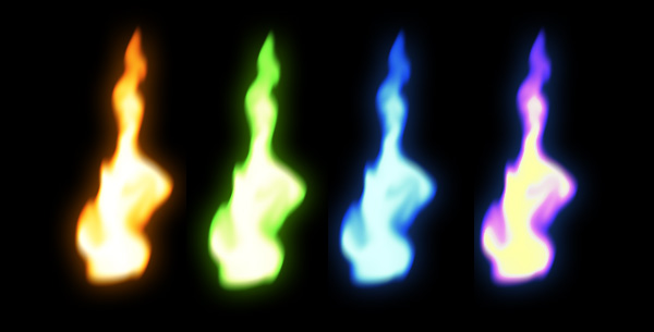


 a
a


