Using different brushes, textures, and layer styles can be a great way of building up a detailed text effect. This tutorial will show you how to use those three elements, along with some other tools and settings, to create a text effect inspired by delicious British scones. Let’s get started!
Tutorial Assets
The following assets were used during the production of this tutorial:
Create a new 838 x 530px document. Place the Texture: Wood Floor image on top of the Background layer, and resize it as needed.
Step 2
Add a Hue/Saturation adjustment layer and change the Saturation value to -83.
Step 3
Add a Levels adjustment layer and change the Gamma value to 1.17 and the Highlights value to 238.
Step 4
Place the MARBLE TEXTURE image on top of all layers, resize it as needed, and then change its layer’s Blend Mode to Color Burn and its Opacity to 30%.
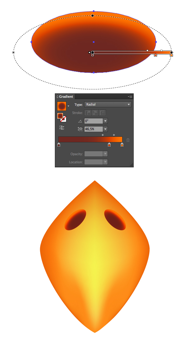
2. Creating the Text and the Work Path
Step 1
Create the text in All Caps using the font Rockin Record G, the Size235 pt, and the color #f2ece6. Set the Tracking value to 100.
Step 2
Right click the text and choose Create Work Path, and then make the text layer invisible.
3. Stroking the Work Path With Brushes 1 and 2
Step 1
Set the Foreground color to #f1ece6, create a new layer on top of all layers, and call it 1. Then stroke the path with brush 1 from the Scones Text Effect Brushes Set.
Step 2
Create a new layer on top of layer 1, call it 2, and stroke the path with the brush 2.
Duplicate layer 2, and change the copy’s Fill value to 0.
Step 3
Duplicate layer 2 copy, Command-click the text layer’s thumbnail to create a selection, and then delete the selected part from layer 2 copy 2‘s stroke.
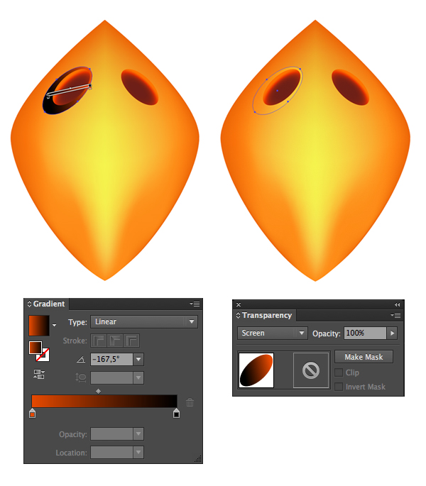
4. Stroking the Inner Work Path
Step 1
Contract the selection by 10 pixels.
Step 2
Convert the selection into a work path by clicking the Make work path from selection icon at the bottom of the Paths panel.
Step 3
Create a new layer on top of all layers, call it 3, stroke the path with brush 3, duplicate layer 3, and change its Fill value to 0.
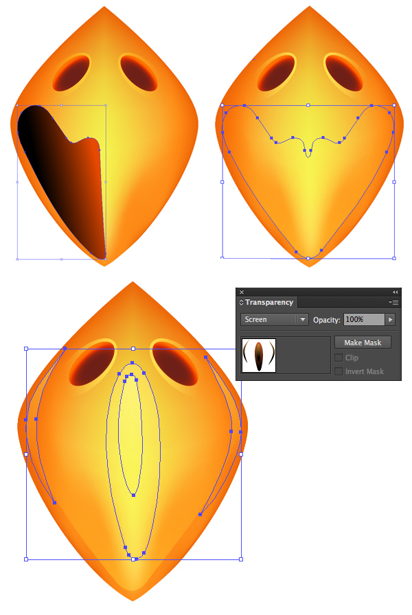
Step 4
Create a selection from the original text once again, and contract the selection by 15 pixels.
Create a new layer on top of all layers, call it 4, and fill the selection with the Foreground color.
Step 5
Convert the selection into a work path, and stroke it with brush 3.
5. Styling Layer 1
Step 1
Open the Seamless Bread Texture image, and resize it to 295 x 275 px. Then go to Edit > Define Pattern, and type in Bread Texture for the Name.
Double click layer 1 to apply the following layer style:
Step 2
Add a Bevel and Emboss with these settings:
Depth: 275
Gloss Contour: Gaussian
Check the Anti-aliased box
Highlight Mode – Color: #4f3e34
Shadow Mode: Linear Burn
Color: #e6d6bf
Step 3
Add a Contour with these settings:
Contour: Half Round
Check the Anti-aliased box.
Step 4
Add a Texture with these settings:
Pattern: Bread Texture
Depth: 50%
Check the Invert box
Step 5
Add a Pattern Overlay with these settings:
Pattern: Bread Texture
Step 6
Add a Drop Shadow with these settings:
Opacity: 12%
Uncheck the Use Global Light box
Angle: 99
Distance: 18
Size: 6
This will style the edges.
6. Styling Layers 2 and 2 copy
Step 1
Change layer 2‘s Blend Mode to Multiply.
Step 2
Double click layer 2 copy to apply a Drop Shadow effect using the following settings:
Color: #6e6355
Opacity: 50%
Distance: 5
Size: 10
This will add a simple shadow to the edges.
7. Styling Layer 2 copy 2
Double click layer 2 copy 2 to apply the following layer style:
Step 1
Add a Bevel and Emboss with these settings:
Size: 10
Highlight Mode:
Color: #695041
Opacity: 50%
Shadow Mode:
Color: #aa998b
Opacity: 30%
Step 2
Add a Contour using the default values.
Step 3
Add a Texture with these settings:
Pattern: Bread Texture
Depth: 50%
This will style layer 2 copy 2.
8. Styling Layer 3
Double click layer 3 to apply the following layer style:
Step 1
Add a Bevel and Emboss with these settings:
Style: Outer Bevel
Check the Anti-aliased box
Highlight Mode: Linear Light
Opacity: 10%
Shadow Mode:
Color: #a47a54
Opacity: 15%
Step 2
Add a Contour with these settings:
Contour: Half Round
Check the Anti-aliased box
This will style layer 3.
9. Styling Layer 3 copy
Double click layer 3 copy to apply the following layer style:
Step 1
Add a Bevel and Emboss with these settings:
Size: 13
Uncheck the Use Global Light box
Angle: 27
Altitude: 69
Check the Anti-aliased box
Shadow Mode – Color: #8d672c
Step 2
Add a Texture with these settings:
Pattern: Clouds
Step 3
Add a Color Overlay with these settings:
Color: #e9e1d9
Step 4
Add a Drop Shadow with these settings:
Opacity: 94%
Distance: 1
Size: 10
This will style the clotted cream part below the jam.
10. Styling the First Jam Layer
Step 1
Change layer 4‘s Fill value to 0, and then duplicate it five times.
Double click layer 4 to apply the following layer style:
Step 2
Add a Bevel and Emboss with these settings:
Size: 32
Soften: 3
Uncheck the Use Global Light box
Angle: 27
Altitude: 69
Check the Anti-aliased box
Highlight Mode: Linear Light
Opacity: 20%
Step 3
Add a Texture with these settings:
Pattern: Clouds
Scale: 70%
Depth: 20%
Step 4
Add a Color Overlay with these settings:
Color: #330417
This is where you choose the jam’s color. So feel free to change it any time you like.
Step 5
Add a Drop Shadow with these settings:
Distance: 0
Size: 3
This will style the first layer of jam. Next, we’ll be adding layers of gloss and shine.
11. Styling the Second Jam Layer
Double click layer 4 copy to apply the following layer style:
Step 1
Add a Bevel and Emboss with these settings:
Size: 18
Soften: 1
Uncheck the Use Global Light box
Angle: 166
Altitude: 69
Gloss Contour: Cone – Inverted
Check the Anti-aliased box
Highlight Mode: Linear Light
Opacity: 50%
Shadow Mode – Opacity: 0%
Step 2
Add a Texture with these settings:
Pattern: Clouds
Depth: 20%
This will add some highlights/gloss to the jam.
12. Styling the Third Jam Layer
Copy and paste layer 4 copy‘s layer style to layer 4 copy 2, and double click layer 4 copy 2 to change a couple of the values as shown below:
Bevel and Emboss
Size: 15
Angle: -14
Highlight Mode – Opacity: 30%
This will add some more shine to the jam.
13. Styling the Fourth Jam Layer
Paste layer 4 copy‘s layer style to layer 4 copy 3, and double click layer 4 copy 3 to change a couple of the values as shown below:
Step 1
Bevel and Emboss
Size: 29
Angle: 45
Highlight Mode: Screen
Opacity: 90%
This will style the last layer of shine.
14. Styling the Jam Edges
Double click layer 4 copy 4 to apply the following layer style:
Step 1
Add a Bevel and Emboss with these settings:
Size: 24
Soften: 9
Uncheck the Use Global Light box
Angle: -22
Altitude: 64
Gloss Contour: Cone – Inverted
Check the Anti-aliased box
Highlight Mode: Linear Light
Shadow Mode – Opacity: 0%
Step 2
Add a Contour with these settings:
Contour: Cone – Inverted
Check the Anti-aliased box
Step 3
This will style the right and bottom edges of the jam. Copy and paste this layer style to layer 4 copy 5.
Step 4
Double click layer 4 copy 5 to change the Bevel and Emboss‘s Angle value to 112.
This will style the left and top edges of the jam.
15. Adding the Crumbs
Step 1
Create a text work path, create a new layer below layer 1, call it Crumbs, and stroke the path with the Crumbs brush.
Double click the Crumbs layer to apply the following layer style:
Step 2
Add a Bevel and Emboss with these settings:
Depth: 275
Size: 3
Gloss Contour: Gaussian
Check the Anti-aliased box
Highlight Mode – Color: #4f3e34
Shadow Mode – Color: #aa998b
Step 3
Add a Contour with these settings:
Check the Anti-aliased box.
Step 4
Add a Texture with these settings:
Pattern: Bread Texture
Step 5
Add a Pattern Overlay with these settings:
Pattern: Bread Texture
Step 6
Add a Drop Shadow with these settings:
Opacity: 30%
Uncheck the Use Global Light box
Angle: 99
This will style the crumbs.
16. Creating the 3D Part
Step 1
Create a selection of layers 1, 2 and the original text layers’ content.
Create a new layer (Layer 1) below the Crumbs layer, fill the selection with the Foreground color, and then deselect.
Step 2
Enter the Scale Transform Mode, and scale Layer 1‘s content down by entering the value 99% for both the W and H values in the Options bar.
Step 3
Press Option-Command-Shift-T (Alt-Control-Shift-T for Windows) twice to create two more scaled-down copies. Group all three layers in a group named 3D.
17. Styling the 3D Part
Copy and paste the Crumbs layer’s layer style to the 3D group, and double click the 3D group to change a couple of the values as shown below:
Step 1
Bevel and Emboss
Size: 5
Shadow Mode: Linear Burn
Color: #bf9876
Step 2
Texture
Check the Invert box
Step 3
Drop Shadow
Opacity: 15%
Distance: 12
Size: 6
This will style the 3D part.
18. Enhancing the Shadow
Step 1
Create a selection of layers 1, 2 and the original text layers’ content again.
Create a new layer below the 3D group, and name it Shadow.
Fill the selection with the color #4b4845, and convert the layer into a Smart Object.
Step 2
Go to Filter > Blur > Gaussian Blur, and change the Radius to 3.5.
Step 3
Change the Shadow layer’s Blend Mode to Linear Burn, and its Opacity to 25%. Then move the shadow around a little bit until you like how it looks.
19. Enhancing the Coloring and Adding the Image
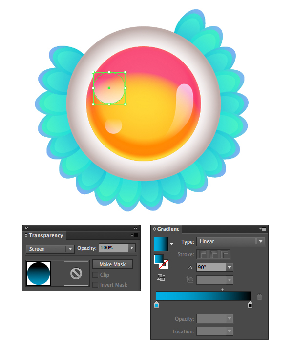
Step 1
Add a Gradient adjustment layer.
Create a transparent to fill color gradient using the color #f2ece6. Set the Style to Radial and the Scale to 500.
Then place the Gradient adjustment layer on top of all layers, and change its Blend Mode to Linear Burn.
Step 2
Open the bagels and jam image, and use the Magnetic Lasso Tool, or any other selection tools you like, to select the knife and the jam’s bowl.
Step 3
You can use the Refine Edge settings to refine your selection.
Step 4
Copy and paste the selected part to the original text effect document. Resize, rotate, and reposition it until you like how the image looks.
Step 5
Add a Hue/Saturation adjustment layer and clip it to the image’s layer.
For the Reds values, change the Hue to -30 and the Saturation to -20. We’re basically trying to match the bowl’s jam color to the text’s.
Step 6
Duplicate the image’s layer and place the copy below it.
Go to Image > Adjustments > Hue/Saturation, and change the Lightness value to -100.
Convert to a Smart Object, apply a Gaussian Blur with a 3.5 Radius, and then transform the black copy to create a shadow based on the other shadows you already have in the document.
Step 7
Finally, use the Sponge Tool to desaturate the orange parts of the knife.
Congratulations! You’re Done
In this tutorial, we created a simple background using a couple of textures, created the text, and modified some of its settings to start working on the effect.
Then we started creating selections, work paths, and layers to achieve different strokes and fills.
After that, we styled each layer to build up the different layers of the scones, creating the bread part, the cream part, and the jam part.
Finally, we created and styled the 3D part of the effect, enhanced the shadow, and added a simple image to finish off the effect.
Please feel free to leave your comments, suggestions, and outcomes below.
In the following steps you will learn how to create a detailed barbed-wire pattern brush and use it to create a nice text effect in Adobe Illustrator.
You will learn how to set up a simple grid and how to create every piece of your barbed wire. You will learn how to create pixel-perfect shapes, how to add subtle shading and highlights using basic blending and vector shape building techniques, how to work with blends and strokes, and how to save a simple graphic style.
Once you have all the pieces, you will learn how to save your own barbed-wire pattern brush and how to create a nice text effect.
1. Create a New Document and Set Up a Grid
Hit Control-N to create a new document. Select Pixels from the Units drop-down menu, enter 600 in the width and 780 in the height box, and then click the Advanced button. Select RGB, Screen (72ppi) and make sure that the Align New Objects to Pixel Grid box is unchecked before you click OK.
Enable the Grid (View > Show Grid) and the Snap to Grid (View > Snap to Grid). You will need a grid every 1 px, so simply go to Edit > Preferences > Guides > Grid, and enter 1 in the Gridline every box and 1 in the Subdivisions box. Try not to get discouraged by all that grid—it will make your work easier, and keep in mind that you can easily enable or disable it using the Control-“ keyboard shortcut.
You should also open the Info panel (Window > Info) for a live preview with the size and position of your shapes. Don’t forget to set the unit of measurement to pixels from Edit > Preferences > Units > General. All these options will significantly increase your work speed.
2. Create the First Two Pieces
Step 1
Using the Rectangle Tool (M), create an 8 x 24 px blue shape. Focus on the top side of this new rectangle, switch to the Direct Selection Tool (A), select both anchor points, and drag them 5 px to the right.
Step 2
Keep focusing on your blue shape and make sure that the Direct Selection Tool (A) is still active. Select those anchor points one by one and simply enter the values shown in the Corners boxes in the following image. In the end your blue shape should look like in the second image.
Step 3
Disable the Snap to Grid (Shift-Control-‘) and then go to Edit > Preferences > General and make sure that the Keyboard Increment is set at 1 px.
Make sure that your blue shape is still selected and go to Object > Path > Offset Path. Enter a -3.5 px Offset and then click the OK button. Fill the resulting shape with white, move it 2 px up and 1 px to the left, and then focus on the Appearance panel. Lower the Opacity to 60% and change the Blending Mode to Soft Light.
Step 4
Reselect your blue shape and make a copy in front. Select this copy, move it 1 px up and 1 px to the left, and then duplicate it. Select this new copy and move it 1 px up and 1 px to the left. Reselect both copies made in this step and click the Minus Front button from the Pathfinder panel. Select the resulting shape and simply replace the existing fill color with black.
Reselect your blue shape and make a new copy in front. Select this fresh copy along with your black shape and click the Intersect button from the Pathfinder panel. Select the resulting shape, focus on the Appearance panel, lower the Opacity to 20% and change the Blending Mode to Soft Light.
Step 5
Reselect your blue shape and make two copies in front. Select the top copy and move it 1 px up and 1 px to the left. Reselect both copies made in this step and click the Minus Front button from the Pathfinder panel. Fill the resulting shape with black, lower its Opacity to 40% and change the Blending Mode to Soft Light.
Step 6
Reselect your blue shape and go to Object > Path > Offset Path. Enter a -3 px Offset and click the OK button. Make sure that the resulting shape is selected, move it 2 px up, and simply replace the existing fill color with R=131 G=133 B=132. Reselect your blue shape and replace that blue with R=91 G=93 B=92.
Step 7
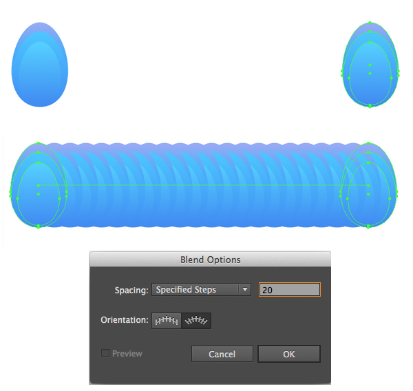
Focus on your Toolbar and simply double click on the Blend Tool to open the Blend Options window. Select Specified Steps from the Spacing drop-down menu and set it to 20. Reselect your two grey shapes and simply hit Alt-Control-B to create a new blend. In the end things should look like in the second image.
Step 8
Using the Pen Tool (P), create an oblique path roughly as shown in the following image. Make sure that it stays selected and focus on the Appearance panel. Lower the Opacity to 50%, change the Blending Mode to Soft Light and then focus on that stroke. Make it white, increase the Weight to 2 px and select Width Profile 1 from that Profile drop-down menu.
Make sure that your path stays selected, open the Graphic Styles panel and save a simple graphic style.
Step 9
Using the Pen Tool (P), create a new oblique path roughly as shown in the first image, add your graphic style, and increase the Opacity to 80%.
Create a third oblique path roughly as shown in the second image, and use that same graphic style, but increase the Opacity to 100%.
Step 10
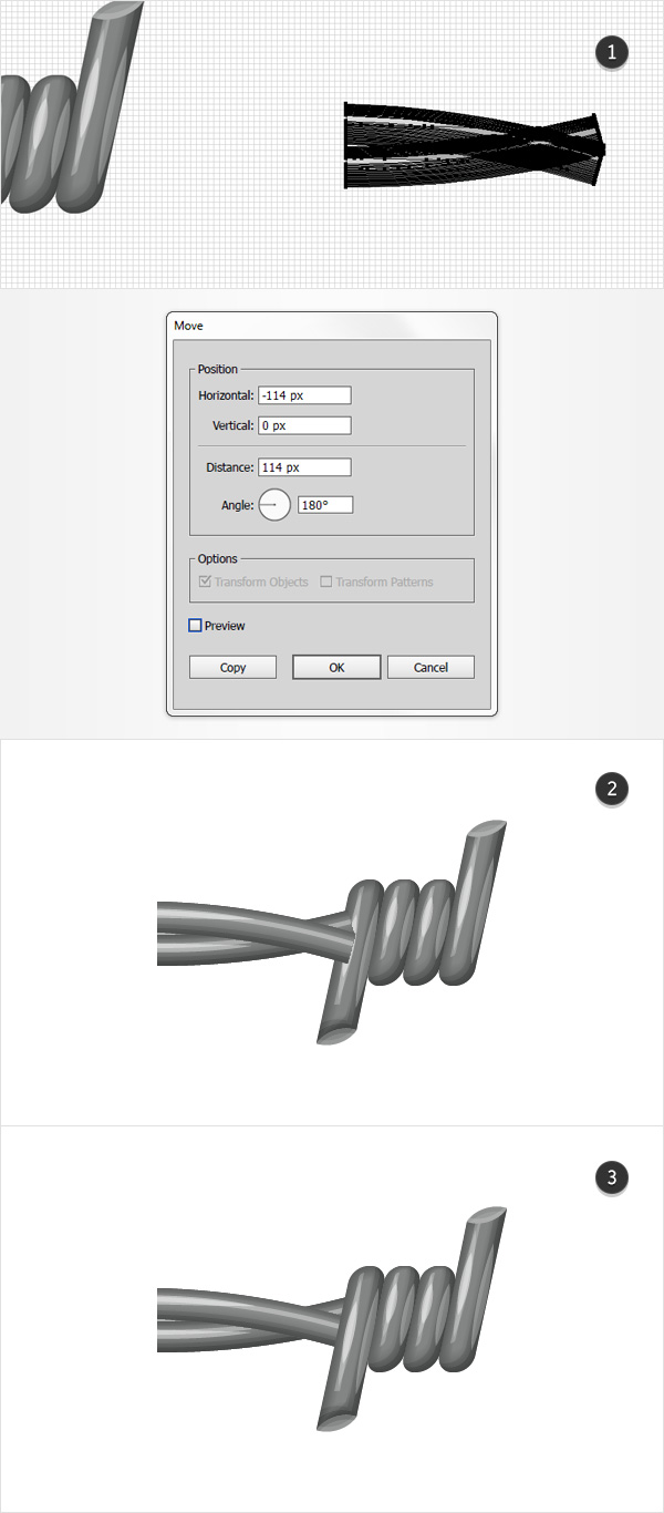
Reselect all the shapes made so far and Group them. Make sure that your group stays selected and go to Object > Transform > Move. Enter the properties shown in the following image and then click the Copy button. In the end things should look like in the second image.
3. Create the Third Piece
Step 1
Enable the Snap to Grid (Shift-Control-‘).
Using the Rectangle Tool (M), create an 8 x 34 px blue shape and place it as shown in the first image. Focus on the top side of this new rectangle, switch to the Direct Selection Tool (A), select the right anchor points, and drag it 3 px up.
Step 2
Make sure that your blue shape is still selected and keep focusing on the top anchor points. Select the right one and drag it 8 px to the right, and then select the right one and drag it 7 px to the right.
Step 3
Keep focusing on your blue shape and make sure that the Direct Selection Tool (A) is still active. Select the bottom anchor points one by one and simply enter the values shown in the Corners boxes in the following image. In the end your blue shape should look like in the second image.
Step 4
Disable the Snap to Grid (Shift-Control-‘).
Make sure that your blue shape is still selected and go to Object > Path > Offset Path. Enter a -3.5 px Offset and then click the OK button. Fill the resulting shape with white, move it 3 px up and 1 px to the left, and then focus on the Appearance panel. Lower the Opacity to 60% and change the Blending Mode to Soft Light.
Step 5
Reselect your blue shape and make a copy in front. Select this copy, move it 1 px up and 1 px to the left, and then duplicate it. Select this new copy and move it 1 px up and 1 px to the left. Reselect both copies made in this step and click the Minus Front button from the Pathfinder panel. Select the resulting shape and simply replace the existing fill color with black.
Reselect your blue shape and make a new copy in front. Select this fresh copy along with your black shape and click the Intersect button from the Pathfinder panel. Select the resulting shape, focus on the Appearance panel, lower the Opacity to 20% and change the Blending Mode to Soft Light.
Step 6
Reselect your blue shape and make two copies in front. Select the top copy and move it 1 px up and 1 px to the left. Reselect both copies made in this step and click the Minus Front button from the Pathfinder panel. Fill the resulting shape with black, lower its Opacity to 40% and change the Blending Mode to Soft Light.
Step 7
Reselect your blue shape and go to Object > Path > Offset Path. Enter a -3 px Offset and click the OK button. Make sure that the resulting shape is selected, move it 2 px up, and simply replace the existing fill color with R=131 G=133 B=132. Reselect your blue shape and replace that blue with R=91 G=93 B=92.
Step 8
Make sure that the two grey shapes made/edited in the previous step are still selected and create a new blend.
Step 9
Enable the Snap to Grid (Shift-Control-‘).
Using the Pen Tool (P), create an oblique path as shown in the first image and add your graphic style. Create a second oblique path as shown in the second image, and add that same graphic style, but increase the Opacity to 80%. Create one more oblique path as shown in the third image, add your graphic style, and increase the Opacity to 100%.
Step 10
Using the Pen Tool (P), create a 9 px horizontal path and place it exactly as shown in the first image. Select the left anchor point and drag it 3 px down. Make sure that this new path stays selected and focus on the Appearance panel. Select the stroke, make it red, increase the Weight to 3 px and select that same Profile.
Step 11
Disable the Snap to Grid (Shift-Control-‘).
Make sure that your red path is still selected and go to Object > Path > Outline Stroke. Select the resulting shape and make two copies in front. Select the top copy and move it 1 px up. Reselect both copies made in this step and click the Minus Front button from the Pathfinder panel. Fill the resulting shape with white, lower its Opacity to 40% and change the Blending Mode to Soft Light.
Step 12
Reselect your red shape and make two copies in front. Select the top copy and move it 1 px down. Reselect both copies and click the Minus Front button from the Pathfinder panel. Fill the resulting shape with black, lower its Opacity to 20% and change the Blending Mode to Soft Light. Reselect your red shape and replace the existing fill color with R=155 G=157 B=156.
Step 13
Reselect all the shapes highlighted in the following image and group them.
4. Create the Fourth Piece
Step 1
Make sure that your newest group is still selected and go to Object > Transform > Rotate. Enter a 180 degrees Angle and then click the Copy button.
Step 2
Enable the Snap to Grid (Shift-Control-‘).
Select the group copy made in the previous step and place it as shown in the first image. Ungroup this group, Release that blend, save only the two shapes that can be seen in the second image, and get rid of the rest of the shapes/paths.
Step 3
Keep focusing on the two grey shapes from the previous step. Select the tiny one and make a copy in front. Select it along with the large grey shape and click the Minus Front button from the Pathfinder panel.
Step 4
Disable the Snap to Grid (Shift-Control-‘).
Make sure that your dark grey shape is selected and go to Object > Path > Offset Path. Enter a -3.5 px Offset and then click the OK button. Fill the resulting shape with white, move it 2 px up and 1 px to the left, and then focus on the Appearance panel. Lower the Opacity to 60% and change the Blending Mode to Soft Light.
Step 5
Reselect your dark grey shape and make a copy in front. Select this copy, move it 1 px up and 1 px to the left, and then duplicate it. Select this new copy and move it 1 px up and 1 px to the left. Reselect both copies made in this step and click the Minus Front button from the Pathfinder panel. Select the resulting shape and simply replace the existing fill color with black.
Reselect your dark grey shape and make a new copy in front. Select this fresh copy along with your black shape and click the Intersect button from the Pathfinder panel. Select the resulting shape, focus on the Appearance panel, lower the Opacity to 20% and change the Blending Mode to Soft Light.
Step 6
Reselect your dark grey shape and make two copies in front. Select the top copy and move it 1 px up and 1 px to the left. Reselect both copies made in this step and click the Minus Front button from the Pathfinder panel. Fill the resulting shape with black, lower its Opacity to 40% and change the Blending Mode to Soft Light.
Step 7
Reselect your dark grey shape and go to Object > Path > Offset Path. Enter a -3 px Offset and click the OK button. Make sure that the resulting shape is selected and simply replace the existing fill color with R=131 G=133 B=132. Select this new shape along with the dark grey one and create a new blend.
Step 8
Enable the Snap to Grid (Shift-Control-‘).
Using the Pen Tool (P), create an oblique path as shown in the first image and add your graphic style. Create a second oblique path as shown in the second image, and add that same graphic style, but increase the Opacity to 80%. Create one more oblique path as shown in the third image, add your graphic style, and increase the Opacity to 100%.
Step 9
Disable the Snap to Grid (Shift-Control-‘).
Focus on the bottom grey shape and make two copies in front. Select the top copy and move it 1 px down. Reselect both copies and click the Minus Front button from the Pathfinder panel. Fill the resulting shape with black, lower its Opacity to 30% and change the Blending Mode to Soft Light.
Step 10
Make sure that your bottom grey shape is still selected and make two copies in front. Select the top copy and move it 1 px up. Reselect both copies made in this step and click the Minus Front button from the Pathfinder panel. Fill the resulting shape with white, lower its Opacity to 30% and change the Blending Mode to Soft Light.
Reselect your bottom grey shape and replace the existing fill color with R=135 G=137 B=136.
Step 11
Select all the shapes highlighted in the following image and group them.
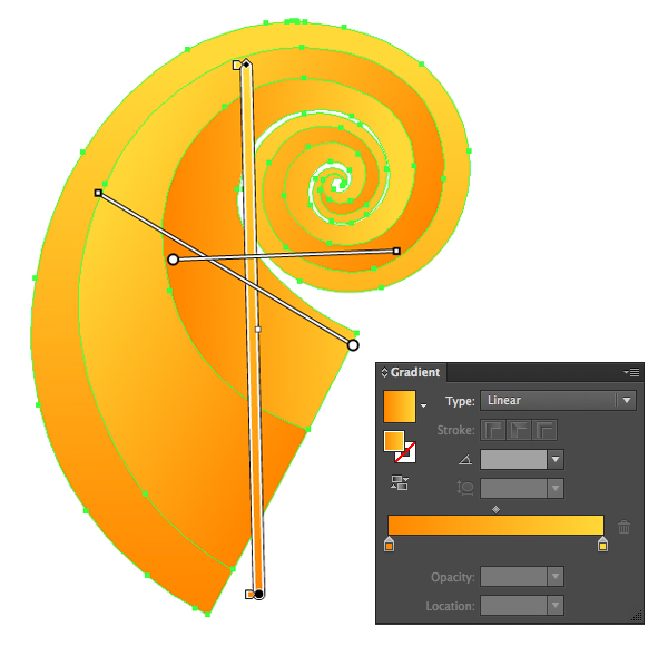
5. Create the First Bent Piece
Step 1
Enable the Snap to Grid (Shift-Control-‘).
Using the Rectangle Tool (M), create an 84 x 7 px shape, make it blue and place it exactly as shown in the first image. Make sure that it stays selected and go to Object > Warp > Arc. Enter the attributes shown in the following image and then go to Object > Expand Appearance.
Step 2
Disable the Snap to Grid (Shift-Control-‘).
Make sure that your blue shape is selected and make two copies in front. Select the top copy and move it 6 px up. Reselect both copies made in this step and click the Intersect button from the Pathfinder panel. Fill the resulting shape with black, lower its Opacity to 10% and change the Blending Mode to Soft Light.
Step 3
Reselect your blue shape and make a copy in front. Select this copy, move it 4 px up and then duplicate it. Select the new copy and move it only 1 px up. Reselect both copies made in this step and click the Minus Front button from the Pathfinder panel. Select the resulting shape and simply replace the existing fill color with white.
Reselect your blue shape and make a new copy in front. Select this fresh copy along with your white shape and click the Intersect button from the Pathfinder panel. Select the resulting shape, focus on the Appearance panel, lower the Opacity to 80% and change the Blending Mode to Soft Light.
Step 4
Reselect your blue shape and make a copy in front. Select this copy, move it 1 px up and then duplicate it. Select the new copy and move it 1 px up. Reselect both copies made in this step and click the Minus Front button from the Pathfinder panel. Select the resulting shape and simply replace the existing fill color with black.
Reselect your blue shape and make a new copy in front. Select this fresh copy along with your black shape and click the Intersect button from the Pathfinder panel. Select the resulting shape, focus on the Appearance panel, lower the Opacity to 20% and change the Blending Mode to Soft Light.
Step 5
Make sure that your blue shape is selected and make two copies in front. Select the top copy and move it 1 px up. Reselect both copies made in this step and click the Minus Front button from the Pathfinder panel. Fill the resulting shape with black, lower its Opacity to 40% and change the Blending Mode to Soft Light.
Step 6
Enable Snap to Grid (Shift-Control-‘).
Using the Pen Tool (P), create a simple path roughly as shown in the following image. Add a 2 px white stroke for this path, select that same Width Profile 1 and then go to Effect > Warp > Arc. Enter the attributes shown in the following image, click the OK button and then go to Object > Path > Outline Stroke. Make sure that the resulting shape is selected and change its Blending Mode to Soft Light.
Step 7
Disable the Snap to Grid (Shift-Control-‘).
Reselect your blue shape and make a copy in front. Select this copy, move it 4 px up and then duplicate it. Select this new copy and move it only 1 px up. Reselect both copies made in this step and click the Minus Front button from the Pathfinder panel.
Select the resulting shape and simply replace the existing fill color with R=131 G=133 B=132. Reselect your blue shape and make a new copy in front. Select this fresh copy along with the other shape made in this step and click the Intersect button from the Pathfinder panel.
Step 8
Make sure that your blue shape is selected and replace the existing fill color with R=91 G=93 B=92. Reselect this shape along with the one made in the previous step and create a simple blend.
Step 9
Reselect the blend made in the previous step and expand it. Now select all the shapes that make up this bent piece and Group them. Move to the Layers panel and rename this new group “bottomSide“.
6. Create the Second Bent Piece
Step 1
Enable the Snap to Grid (Shift-Control-‘).
Using the Rectangle Tool (M), create an 84 x 7 px shape, make it orange and place it exactly as shown in the first image. Make sure that it stays selected, grab the Direct Selection Tool (A), select only the right anchor points and simply drag them 3 px down. Reselect this orange shape and go to Object > Warp > Arc. Enter the attributes shown in the following image and then go to Object > Expand Appearance.
Step 2
Disable the Snap to Grid (Shift-Control-‘).
Make sure that your blue shape is selected and make two copies in front. Select the top copy and move it 1 px down. Reselect both copies made in this step and click the Minus Front button from the Pathfinder panel. Fill the resulting shape with black, lower its Opacity to 10% and change the Blending Mode to Soft Light.
Step 3
Reselect your orange shape and make a copy in front. Select this copy, move it 2 px down and then duplicate it. Select this new copy and move it only 1 px up. Reselect both copies made in this step and click the Minus Front button from the Pathfinder panel. Select the resulting shape and simply replace the existing fill color with white.
Reselect your orange shape and make a new copy in front. Select this fresh copy along with your white shape and click the Intersect button from the Pathfinder panel. Select the resulting shape, focus on the Appearance panel, lower the Opacity to 80% and change the Blending Mode to Soft Light.
Step 4
Make sure that your orange shape is selected and make two copies in front. Select the top copy and move it 6 px down. Reselect both copies made in this step and click the Intersect button from the Pathfinder panel. Fill the resulting shape with black, lower its Opacity to 40% and change the Blending Mode to Soft Light.
Step 5
Reselect your orange shape and make a copy in front. Select this copy, move it 5 px down and then duplicate it. Select this new copy and move it only 1 px up. Reselect both copies made in this step and click the Minus Front button from the Pathfinder panel. Select the resulting shape and simply replace the existing fill color with black.
Reselect your orange shape and make a new copy in front. Select this fresh copy along with your black shape and click the Intersect button from the Pathfinder panel. Select the resulting shape, focus on the Appearance panel, lower the Opacity to 20% and change the Blending Mode to Soft Light.
Step 6
Enable Snap to Grid (Shift-Control-‘).
Using the Pen Tool (P), create a simple path roughly as shown in the following image. Add a 2 px white stroke , select that same Width Profile 1 and then go to Effect > Warp > Arc. Enter the attributes shown in the following image, click the OK button and then go to Object > Path > Outline Stroke. Make sure that the resulting shape is selected and change its Blending Mode to Soft Light.
Step 7
Disable the Snap to Grid (Shift-Control-‘).
Reselect your orange shape and make a copy in front. Select this copy, move it 2 px up and then duplicate it. Select this new copy and move it only 1 px up. Reselect both copies made in this step and click the Minus Front button from the Pathfinder panel. Select the resulting shape and simply replace the existing fill color with R=141 G=143 B=142.
Reselect your orange shape and make a new copy in front. Select this fresh copy along with the other shape made in this step and click the Intersect button from the Pathfinder panel.
Step 8
Make sure that your orange shape is selected and replace the existing fill color with R=101 G=103 B=102. Reselect this shape along with the grey one made in the previous step and create a simple blend.
Step 9
Reselect the blend made in the previous step and expand it. Now select all the shapes that make up this second bent piece and Group them. Move to the Layers panel and rename this new group “topSide“.
7. Multiply and Slice Your Bent Pieces
Step 1
Enable the Snap to Grid (Shift-Control-‘).
Move to the Layers panel and duplicate your “bottomSide” and “topSide” groups. Focus on these copies and simply make them invisible because you’ll need them later.
Using the Rectangle Tool (M), create a 50 x 30 px shape, make it blue and place it exactly as shown in the first image. Select this new rectangle along with the visible “bottomSide” and “topSide” groups, and pick the Shape Builder Tool (Shift-M). Simply get rid of the paths that are covered by your blue rectangle and in the end things should look like in the third image.
Step 2
Select all the shapes highlighted in the following image, Group them and then go to Object > Transform > Move. Enter the properties shown in the following image and then click the OK button. Once you’re done, send this new group to back.
Step 3
Focus on the Layers panel and turn on the visibility for those “bottomSide” and “topSide” group copies. Select the “topSide” group and simply drag it below your “bottomSide” group as shown in the second image.
Step 4
Using the Rectangle Tool (M), create a new 50 x 30 px shape, make it blue and place it exactly as shown in the first image. Select this new rectangle along with the “bottomSide” and “topSide” groups and use that same Shape Builder Tool (Shift-M) to get rid of the paths that are covered by your blue rectangle. In the end things should look like in the second image. Select all the remaining paths, group them and then send the group to back.
8. Create the First Back Piece
Step 1
Using the Rectangle Tool (M), create a 7 x 17 px shape, make it orange and place it as shown in the first image.
Focus on the bottom side of this new rectangle, switch to the Direct Selection Tool (A), select the right anchor points and drag it 3 px down and 5 px to the right. Then select the left anchor point and drag it 4 px to the right.
Step 2
Using the Pen Tool (P), create an oblique path as shown in the first image. Add a 2 px stroke for this path, make it blue, and select that same Width Profile 1. Once you’re done, go to Object > Path > Outline Stroke.
Select the resulting shape along with your orange shape and click the Unite button from the Pathfinder panel. Focus on the bottom side of the resulting shape, pick the Direct Selection Tool (A), select the anchor point highlighted in the third image and enter 2 px in that Corners box.
Step 3
Duplicate your blue shape, select the copy, rotate it 180 degrees and then place it as shown in the following image.
Step 4
Disable the Snap to Grid (Shift-Control-‘).
Make sure that your bottom blue shape is still selected and go to Object > Path > Offset Path. Enter a -3.5 px Offset and then click the OK button. Fill the resulting shape with white, move it 1 px to the left and then focus on the Appearance panel. Lower the Opacity to 80% and change the Blending Mode to Soft Light.
Step 5
Reselect your bottom blue shape and make a copy in front. Select this copy, move it 2 px to the left, and duplicate it. Select this new copy and move it only 1 px to the left. Reselect both copies made in this step and click the Minus Front button from the Pathfinder panel. Select the resulting shape and simply replace the existing fill color with black.
Reselect your blue shape and make a new copy in front. Select this fresh copy along with your black shape and click the Intersect button from the Pathfinder panel. Select the resulting shape, focus on the Appearance panel, lower the Opacity to 20% and change the Blending Mode to Soft Light.
Step 6
Reselect your bottom, blue shape and make two copies in front. Select the top copy and move it 1 px to the left. Reselect both copies made in this step and click the Minus Front button from the Pathfinder panel. Fill the resulting shape with black, lower its Opacity to 40% and change the Blending Mode to Soft Light.
Step 7
Reselect your bottom blue shape and go to Object > Path > Offset Path. Enter a -3 px Offset and click the OK button. Make sure that the resulting shape is selectedand simply replace the existing fill color with R=121 G=123 B=122. Reselect your blue shape and replace that blue with R=81 G=83 B=82. Reselect both shapes made/edited in this step and use them to create a new blend.
Step 8
Enable the Snap to Grid (Shift-Control-‘).
Using the Pen Tool (P), create an oblique path roughly as shown in the first image and use your graphic style. Select this path along with the rest of the shapes highlighted in the second image, group them and then send the group to back.
9. Create the Second Back Piece
Step 1
Disable the Snap to Grid (Shift-Control-‘).
Make sure that the remaining blue shape is still selected and go to Object > Path > Offset Path. Enter a -3 px Offset and then click the OK button. Fill the resulting shape with white, move it 1 px to the left and then focus on the Appearance panel. Lower the Opacity to 80% and change the Blending Mode to Soft Light.
Step 2
Reselect your blue shape and make a copy in front. Select this copy, move it 2 px to the left and then duplicate it. Select this new copy and move it 1 px up and 2 px to the left. Reselect both copies made in this step and click the Minus Front button from the Pathfinder panel. Select the resulting shape and simply replace the existing fill color with black.
Reselect your blue shape and make a new copy in front. Select this fresh copy along with your black shape and click the Intersect button from the Pathfinder panel. Select the resulting shape, focus on the Appearance panel, lower the Opacity to 20% and change the Blending Mode to Soft Light.
Step 3
Reselect your blue shape and make two copies in front. Select the top copy and move it 1 px to the left. Reselect both copies made in this step and click the Minus Front button from the Pathfinder panel. Fill the resulting shape with black, lower its Opacity to 40% and change the Blending Mode to Soft Light.
Step 4
Reselect your blue shape and go to Object > Path > Offset Path. Enter a -3 px Offset and click the OK button. Make sure that the resulting shape is selectedand simply replace the existing fill color with R=121 G=123 B=122. Reselect your blue shape and replace that blue with R=81 G=83 B=82. Reselect both shapes made/edited in this step and use them to create a new blend.
Step 5
Enable the Snap to Grid (Shift-Control-‘).
Using the Pen Tool (P), create an oblique path roughly as shown in the first image and use your graphic style. Select this path along with the rest of the shapes highlighted in the second image, group them and then send the group to back.
10. Save Your Pattern Brush and Add a Simple Background
Step 1
Now, things should look like in the second image. Select all the shapes made so far, and use them to create a new pattern brush, naming it “Barbed Wire“. Duplicate this pattern brush and open the Pattern Brush Options window for this copy. Rename it “Barbed Wire 50%” and drag that Scale slider to 50%.
Step 2
Using the Rectangle Tool (M), create a shape that covers your entire artboard and set the fill color to R=141 G= 198 B=201. Add a second fill for this shape, make it black, lower its Opacity to 3%, and change the Blending Mode to Multiply. Then add the Film Grain effect shown in the following image.
11. Create the Text Effect
Step 1
Using the Type Tool (T), add the “GET OUT” piece of text, make it black, lower its Opacity to about 30% and use the font attributes shown in the following image.
Step 2
Pick the Brush Tool (B). Use your “Barbed Wire 50%” pattern brush to create the text and the “Barbed Wire” pattern brush to create the two horizontal paths.
Step 3
This final step might be a bit challenging for your machine, so it would be a good idea to save the work you’ve done so far. Select all your barbed wire paths and add the four Drop Shadow effects shown in the following image.
Congratulations! You’re Done!
Here is how it should look. I hope you’ve enjoyed this tutorial and can apply these techniques in your future projects.
In this
tutorial we’ll go through the process of creating a stylish smartphone case with
a colorful, detailed owl. We’ll work with gradients to create a vivid color
palette, use the Blend Tool to simplify the process of making the feathers, and add
some mesh and other effects to give our case a completed look. Let’s get
started!
1. Find the
Proper Smartphone Case Template and Make a Sketch
Step 1
Fist of
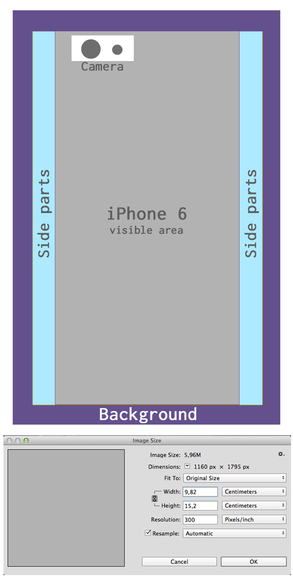
all, we need to know the size of our future case. In this tutorial
we’ll be creating a case for iPhone 6, but you can use the size of any
other device. I’ve searched for “iPhone 6 case template” and found some websites
providing real-size templates in Photoshop and Illustrator formats. They differ
a bit, depending on the website, but mostly they look quite similar. For
example, you can get a template for iPhone 6 or for Phone 6+ and use it to make your own design
to print on the real case later.
I’ve used
this simple template (you can find the *.psd version in the attachment to this tutorial) to paint a sketch, based on the
template sizes.
Step 2
I’ve made
this sketch right above the template. Remember to keep all the main elements of
our image, such as eyes, beak and the face itself, in the visible area of the
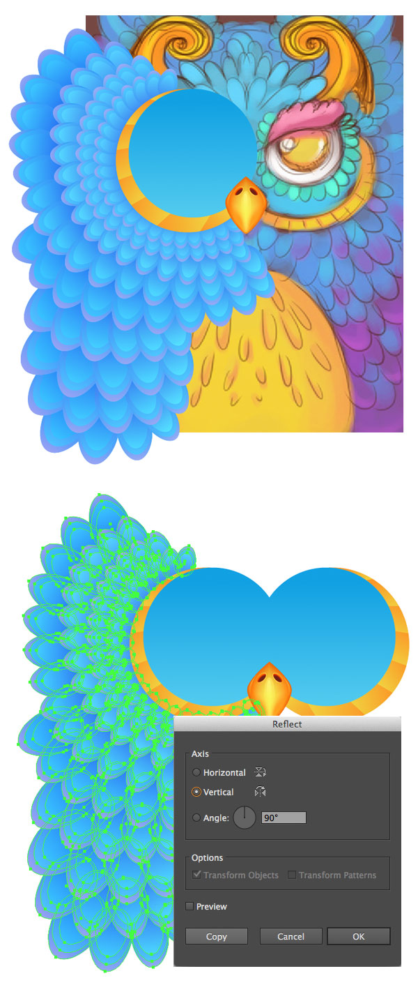
case, closer to the center. Make the sketch of your owl symmetrical by drawing only one part of it and then flipping it horizontally. This will save a lot of time and will look more cohesive and neat.
Step 3
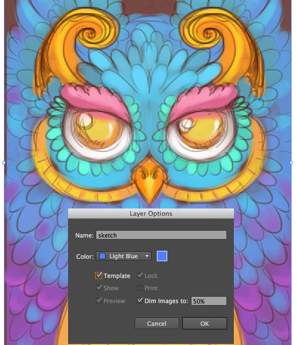
File > Place your sketch in Adobe Illustrator and turn it
into a template by double-clicking the sketch layer.
2. Form the
Beak Using the Mesh Tool
Step 1
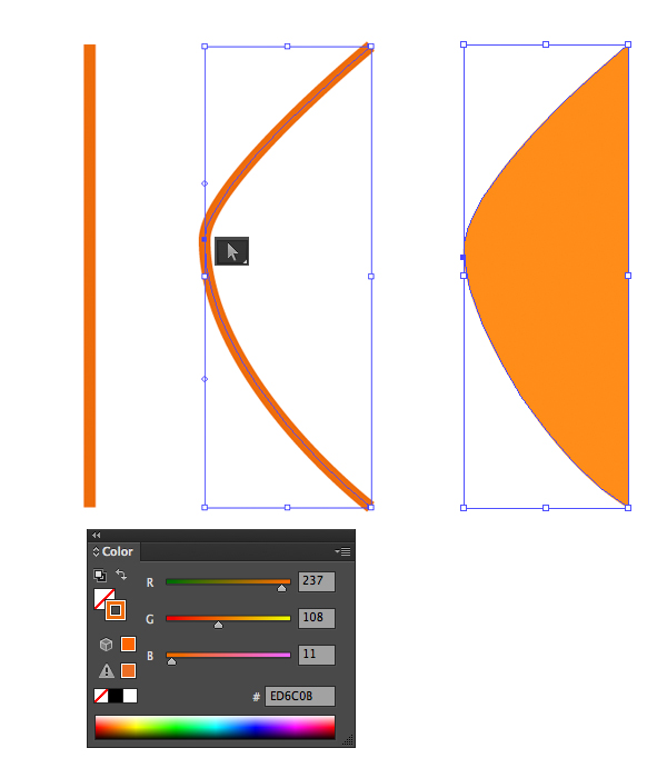
Start by
making a vertical line either with the Line
Tool (\) or with the Pen Tool (P). Add
the anchor point in the middle of the line with the Add Anchor Point Tool (+) and drag it to the left with the Direct Selection Tool (A). Swap Fill and
Stroke (Shift-X) colors, thus forming the left part of the beak.
Step 2
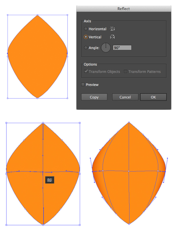
Use the Reflect Tool (O) to mirror the beak
over the vertical axis and Unite
both parts in Pathfinder to form a
single shape. Take the Mesh Tool (U) and
click in the middle of the created shape to create a crossing row and column. Click
on the horizontal line to create more columns and make the edges of the beak
darker by selecting the edge anchor points with the Direct Selection Tool (A) and filling them with darker orange, thus
adding dimension to the beak.
Step 3
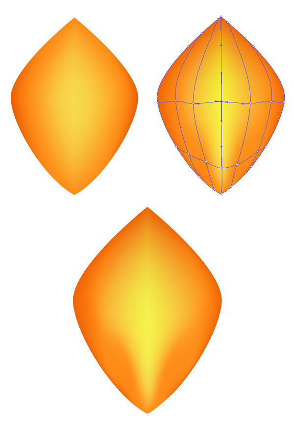
Add some
more columns with the Mesh Tool (U)
and make the middle part of the beak brighter by selecting the anchor points along the
central vertical line and filling them with yellow color. Move the lower anchor
points around to achieve a more realistic effect for the bird’s beak, as in the
screenshot below.
Step 4
Let’s form
the nostrils. Create an ellipse with the Ellipse
Tool (L) and fill in with radial gradient from bright-orange to dark-brown,
forming the depth. Place two ellipses in the upper part of the beak, depicting the nostrils.
Step 5
We need to
add some details to make our beak look more interesting and realistic. Create a
bigger ellipse beneath the nostril and fill with orange-black linear gradient.
Switch the Blending Mode to Screen, turning it into a highlight.
Step 6
Take the Pencil Tool (N) and add more highlights
to our beak, using the same orange-black gradients and Screen Blending Mode.
Here is how
the beak looks now.
3. Form a
Radiant Plumage With the Blend Tool
Step 1
First of
all, we’ll render the area around the eyes and then
start adding feathers around it row by row. Form an even circle with the Ellipse Tool (L) by holding the Shift button and fill it with golden
linear gradient from orange to yellow. Add a smaller circle above and fill it
with blue color. Send both circles to back (Shift-Control-[), under the
beak.
Step 2
Let’s split
the golden circle into parts to make it more detailed. Start by making a
vertical line with the Line Segment Tool
(\) and place in right in the center of the golden circle, making the gold
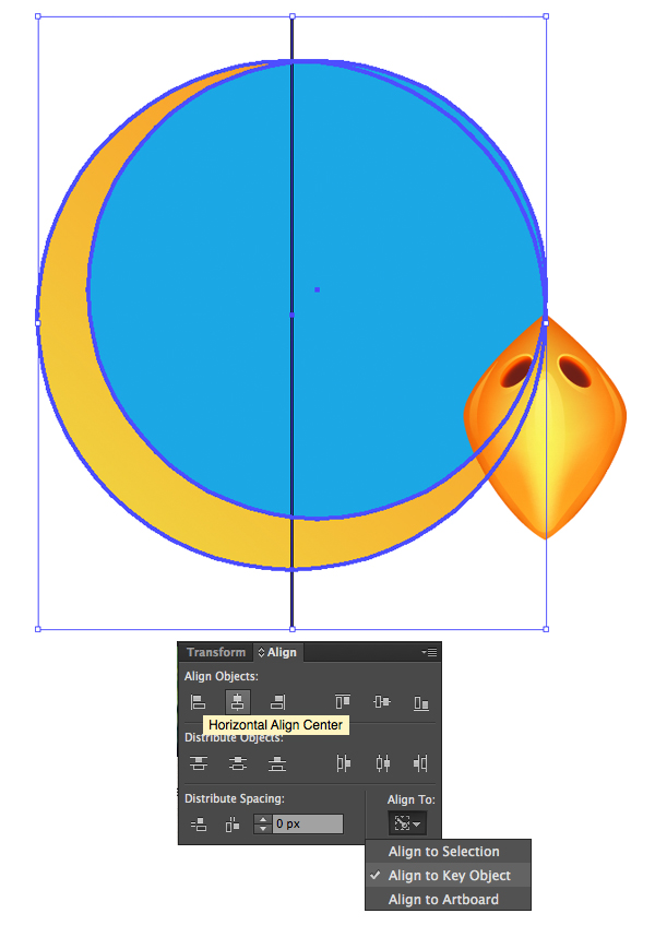
circle a Key Object by clicking
it while holding the Alt key and
then using the Horizontal Align Center
function of the Align panel.
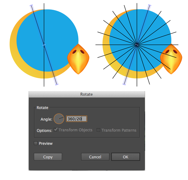
Keeping the
line selected, double-click the Rotate
Tool (R) to call the pop-up options window. Set the Angle value to 360/20,
so that Adobe Illustrator can automatically calculate the necessary angle for 20
copies of our object. Press Control-D multiple times to repeat our last action and make as many copies as
needed.
Step 3
Now we can
select all the created lines and the gold circle and slice it into pieces like
grandma’s pie with the help of the Divide
function in the Pathfinder panel.
Use the Gradient Tool (G) to
reposition the linear gradient for each piece, creating an interesting effect.
Step 4
Let’s start
forming the feathers! According to our initial sketch, the owl will have a
radiant blue plumage. We’ll stick to this color palette, picking the colors
from the sketch with the Eyedropper Tool
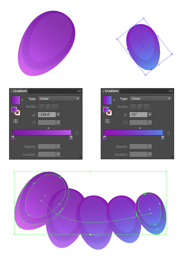
(I) and creating an even circle with the Ellipse
Tool (L), filling it with vivid linear gradient from dark blue on top to
lighter blue in the bottom.
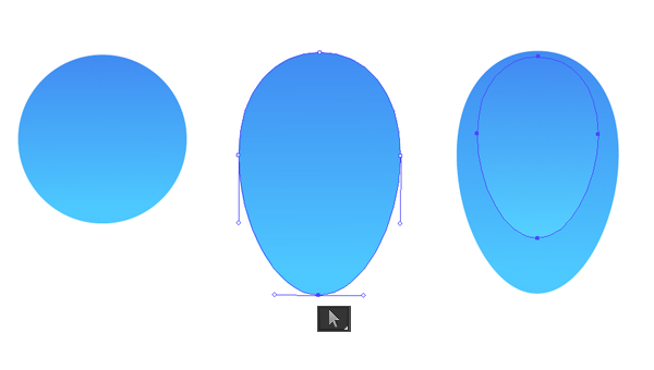
Drag the lower anchor point down using the Direct Selection Tool (A) to give the
circle an upside-down egg shape. Finally, Copy
the shape, Paste in Front (Control-C
> Control-F) and make the copy slightly smaller and the colors a bit
lighter.
Step 5
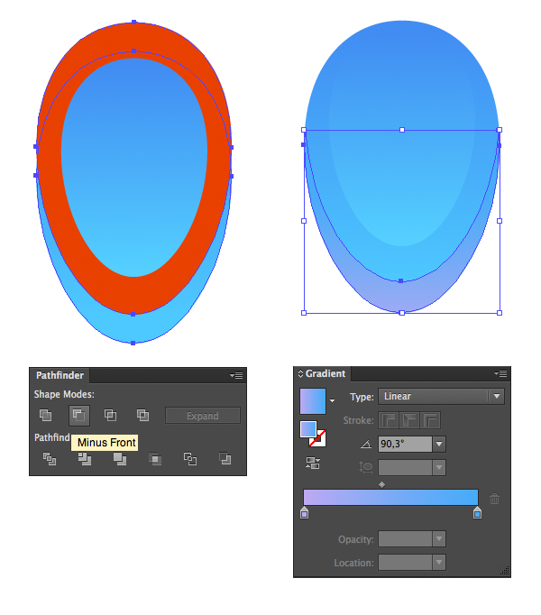
Duplicate
the lower shape twice and move one of the copies up a bit (shown red in the
screenshot). Select the replaced copy and the one beneath it and use the Minus Front function of the Pathfinder panel to cut off the
unwanted pieces, leaving only a narrow crescent-shaped part on the tip of our
feather. Fill this part with a gentle lilac-blue gradient.
Step 6
Now that
our feather is ready, let’s group
(Control-G) all its parts and make a copy of the feather, placing it aside at some distance.
Keeping both feathers selected, go to Object
> Blend > Make and then to Object
> Blend > Blend Options (or double click the Blend Tool in the Tools
panel). Set the Spacing to Specified
Steps with value equals 20, thus
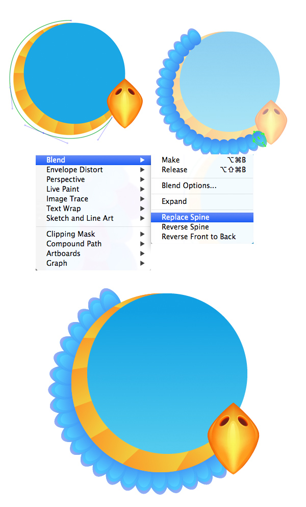
creating a row of repeating feathers.
Step 7
Take the Pencil Tool (N) and draw a rounded line
along the edge of the golden circle. Select both the line and the blend group
and go to Object > Blend > Replace
Spine. Great! Now we have a smooth row of feathers running along the circle
eye area.
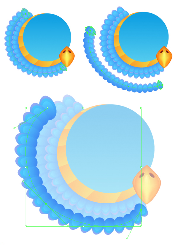
Step 8
Draw
a bigger arched line with the Pencil
tool (N), and then duplicate our first blending group of feathers and reapply
the Replace Spine effect to a new
curve, thus forming the second row.
Place
the created feathers under the first group (Control-[)
and add the next row in the same way. You can double-click on the row to enter
the Isolation Mode and edit the
initial feathers of the blending group separately. For example, let’s make the
upper feather bigger and the lower one smaller. All other feathers between them
will gradually change their size too.
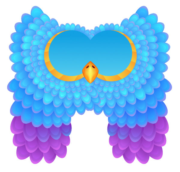
Continue
forming new rows of feathers, making a fluffy plumage by varying the size of some
feathers, making the feathers in the lower rows much larger than those around
the eye.
Step 9
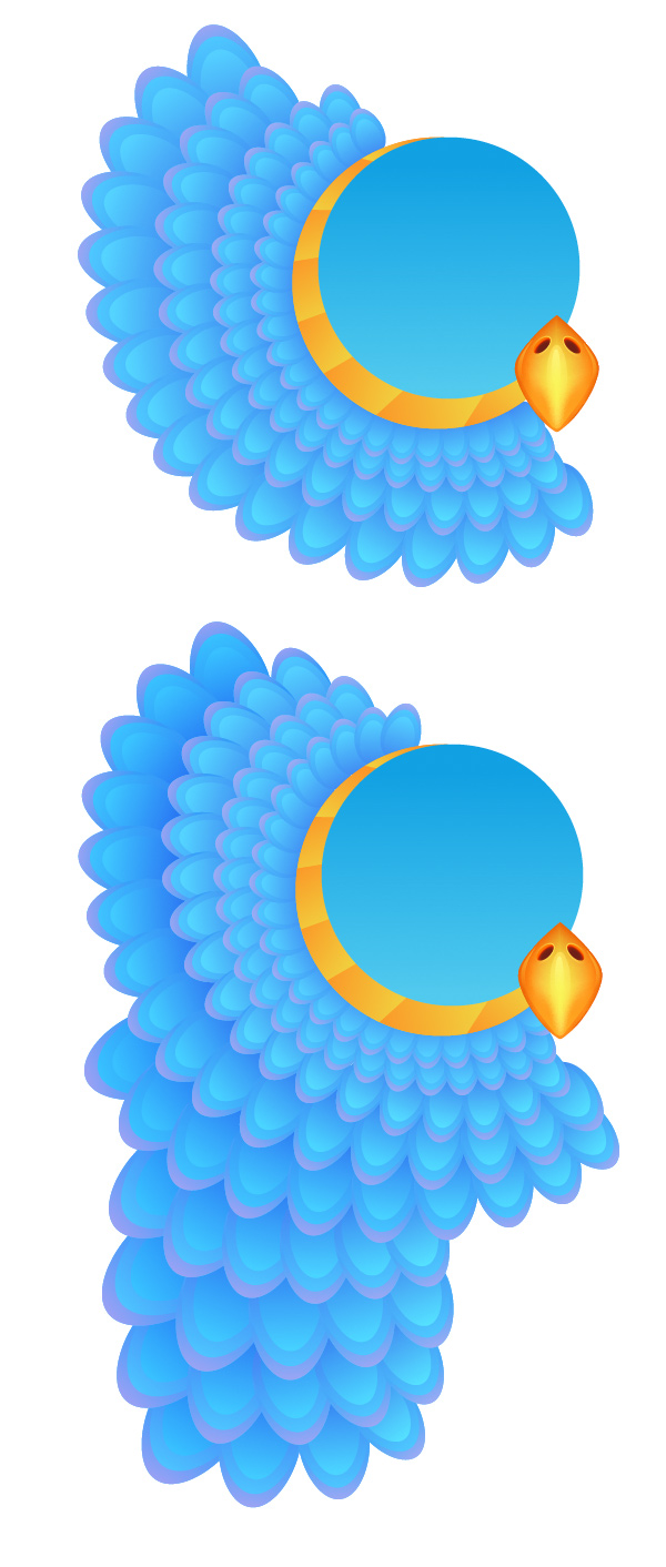
Compare the
created forms with the initial sketch and use the Reflect Tool (O) to flip the created parts over the Vertical Axis, forming the second half
of our owl.
Step 10
Now that
the plumage is formed, let’s make the colors more diverse. Select one of the blending groups of feathers in the lower part of the owl and this time make the first feather in the
group bright lilac and fill the second one with a gentle gradient from violet
to blue. The colors of other feathers in the group will be adjusted
automatically, forming a smooth gradient inside the blending group.
Step 11
Apply new
vivid colors to the lower rows of feathers on both sides of our owl.
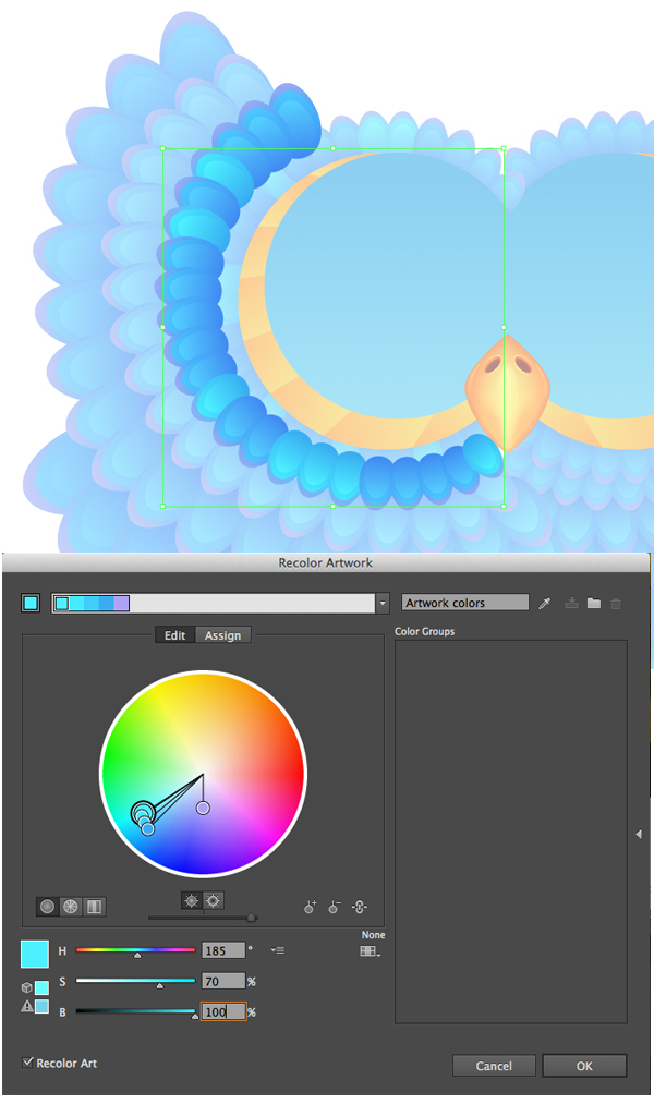
Object > Blend > Expand all the rows to turn the blending
groups into sets of separate objects. Now we can select separate feathers and
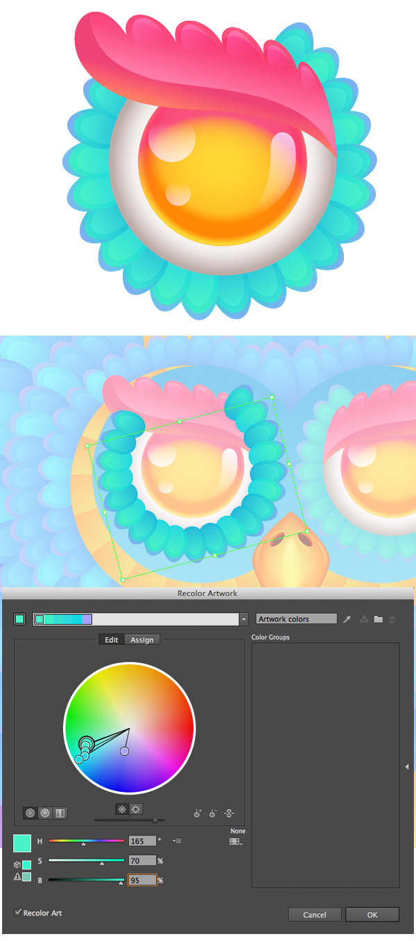
make some of them brighter with the help of the Recolor Artwork function, which is located in the upper control
panel. Select random feathers around the eye area and open the Recolor Artwork options window. Go to Edit, press on the chain icon to Link
harmony colors and set the Hue value
to 185, Saturation to 70 and Brightness to 100, making the selected feathers lighter.
Step 12
Add some
more lilac feathers here and there to make the image more diverse. Form the
owl’s tummy by creating an ellipse with the Ellipse Tool (L) and filling it with radial gradient from darker
orange at the edges to bright-yellow in the center. Speckle small feathers all
over the tummy, filling them with the same colors as the highlights on the
owl’s beak and switching to Screen
Blending Mode.
Step 13
Let’s add
some swirly elements to the head of the owl to make it look more intricate.
Draw a smooth curve with the Pencil Tool
(N), select its bottom anchor point with the Width Tool (Shift-W) and drag to make the whole shape wider.
Step 14
Object > Expand Appearance of the line and use the Direct Selection Tool (A) to move the
anchor points of the created shape, giving it a twisted spiral look. Fill the
shape with golden gradient, the same as we have in the eye area.
Step 15
Draw two
more swirls inside the golden shape with the Pencil Tool (N). Select all three objects and Divide them in Pathfinder
to split the golden shape into three separate parts.
Change the
direction of linear gradients for each piece with the Gradient Tool (G), making the shape more three-dimensional and realistic.
Step 16
Place the
created golden horns on top of the owl’s head and surround them with feathers.
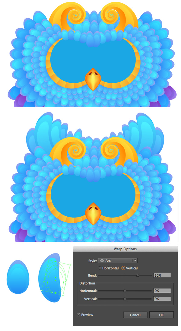
Add some larger arched feathers in the upper part of the head, transforming them with the
help of the Warp Effect. For this
purpose, select a feather and go to Effect
> Warp > Arc, setting the Vertical
Bend value to 50%. Expand Appearance if you’re happy with the result to apply the effect.
4. Render
the Eyes of the Owl
Step 1
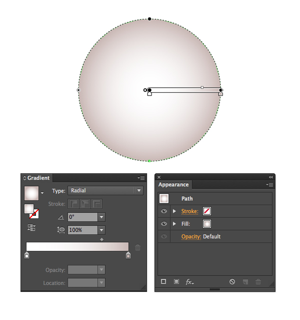
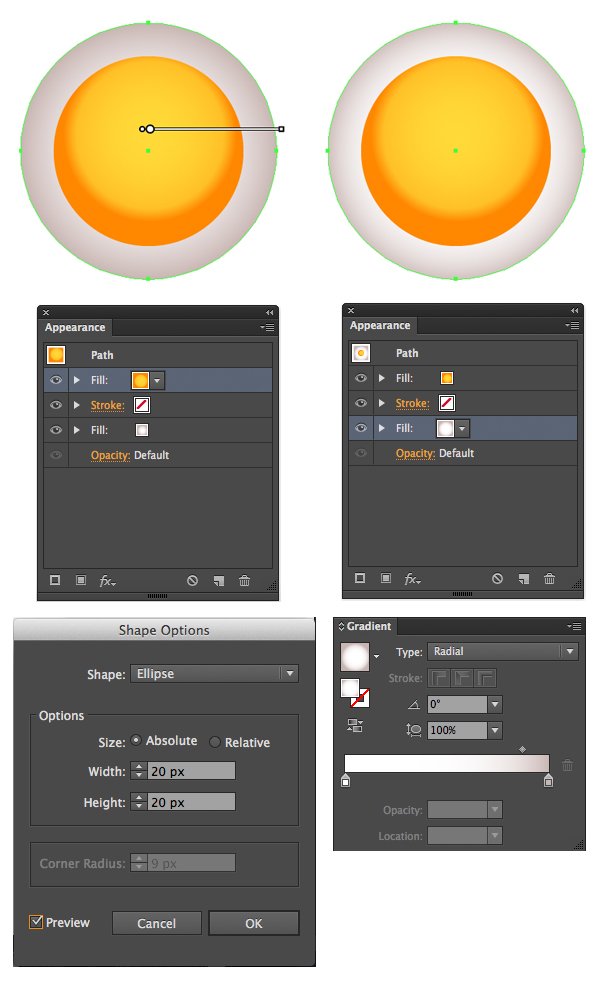
To make the creation process simple and time saving, we’ll use the advantages of the Appearance panel. Start by making an
even circle and fill it with radial gradient from white in the center to darker
grey at the edge. It will be displayed as the Fill in the Appearance
panel.
Step 2
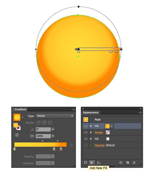
Add New Fill in the Appearance
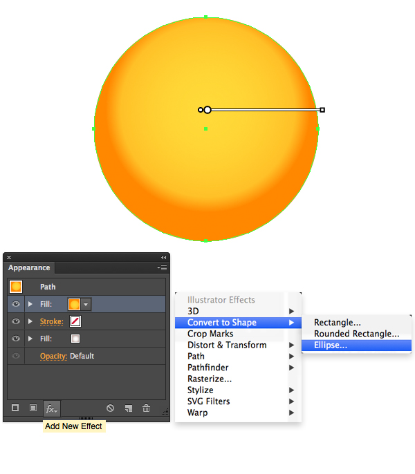
panel and apply a vivid radial gradient from bright-yellow to orange. Move the
center of the gradient closer to the top part of our circle.
Step 3
Keeping the
new yellow Fill selected in the Appearance panel, Add New Effect and select Convert
to Shape > Ellipse.
In the
pop-up Shape Options menu, reduce
the Absolute size of the Fill, setting its Width and Height to 20 px (or another value that makes the
yellow circle smaller than the grey one). Go back to the grey Fill, select it in the Appearance
panel and edit the gradient, making the white area larger and moving the grey
closer to the edge.
Step 4
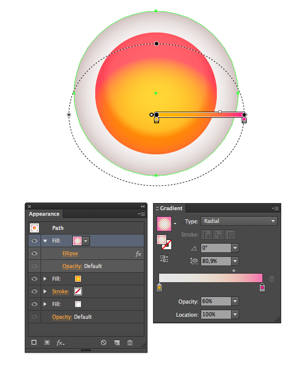
Duplicate
the yellow Fill in the Appearance panel and change the color
of the copy to linear gradient from yellow to bright-pink. Set the Opacity of the yellow side to 0% and the Opacity of the pink side to 60%
in the Gradient panel. Squash the
gradient with the help of the Gradient
Tool (G) and make it cover the upper part of the yellow Fill.
Step 5
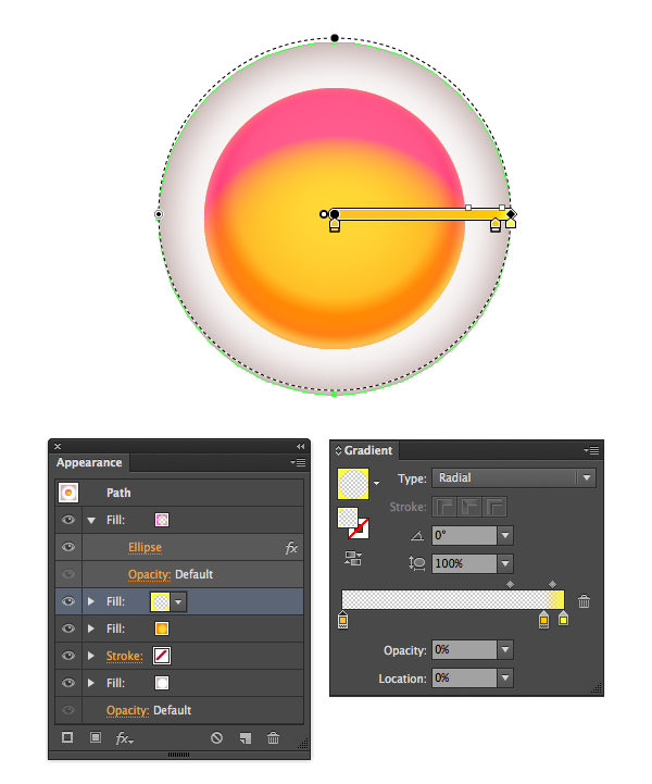
If you wish
to add more glow to the eyes, add another Fill
above the yellow one and fill it with radial gradient from transparent yellow
to bright yellow, creating a bright glowing ring around the iris.
Step 6
Surround
the eye with tiny turquoise feathers and add highlights to the eye, filling
them with black-to-blue gradient and switching to Screen Blending Mode.
Step 7
Let’s
create a whimsical brow to make the owl’s look more serious. Draw a freehand shape
with the Pencil Tool (N) and fill it
with yummy-looking pink gradient. Split the shape into two parts the same way
as we did with the golden horn, and edit the fill color of the lower part,
making it an orange-pink gradient.
Step 8
Add some
highlights on top of the shape, switching to Screen Blending Mode.
Step 9
Place the
brow on top of the eye and edit the feathers, making some of them brighter with
the Recolor Artwork option.
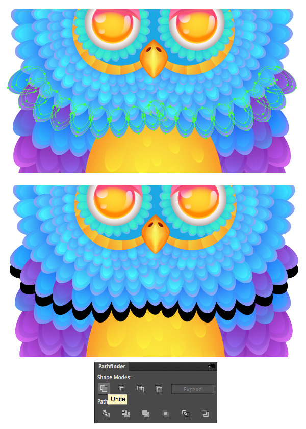
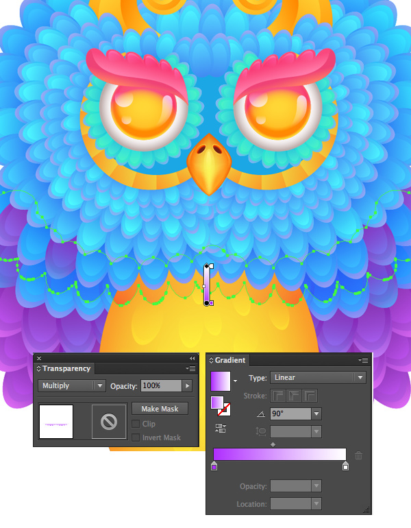
5. Add
Minor Details to Give the Case a Finished Look
Step 1
Let’s make
our owl more three-dimensional by adding shadows to separate the rows of feathers from each other.
Select a group of feathers, Copy it
and Paste in Back (Control-C >
Control-B). Unite the parts of the copy in Pathfinder, turning it into a single silhouette.
Step 2
Fill the
created silhouette with linear gradient from white to purple and switch it to Multiply Blending Mode, thus creating a
subtle shadow.
Add more
shadows between feather groups and around the eyes, using the same technique.
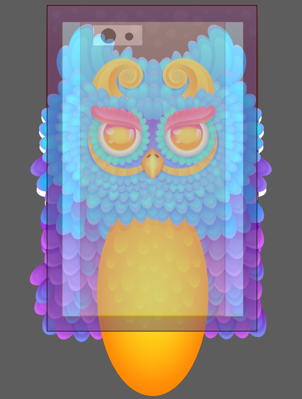
Step 3
Now we can File > Place the iPhone case
template in our file and put additional feathers at the edges, covering the
blank spaces. Remember to keep the owl’s face in the center of the template.
Add a dark-brown background beneath the owl with the Rectangle Tool (M) to fill the empty space above its head.
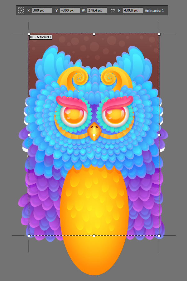
Step 4
Adjust the
size of our Artboard according to
the size of the template with the help of the Artboard Tool (Shift-O). One of the advantages of vector graphics
is that you can scale down your artwork and set a size several times smaller than the original and then
just Export it with the necessary
dimensions (for example, 300 dpi for print).
Step 5
Let’s hide
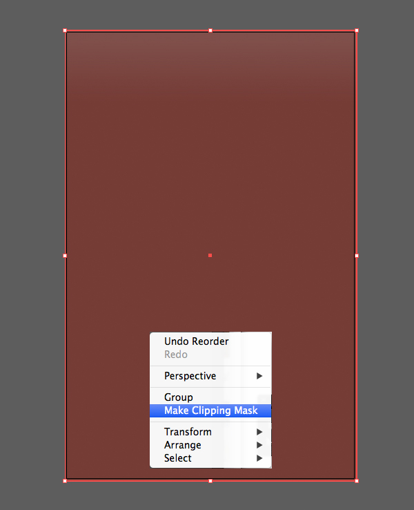
the unwanted parts that are crossing the edges of our Artboard to make our work
look neater and cleaner. Copy the background rectangle and Send it in Front, placing it on top of all other objects (Shift-Control-]). Select all the
created elements, including the upper rectangle, press the right mouse button and choose Make
Clipping Mask in the drop-down menu.
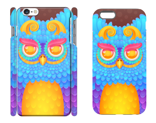
Step 6
Now we can
try uploading our design on various websites that offer iPhone case printing and
choose the most suitable one.
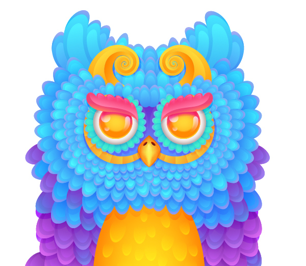
Great Job! We’ve Finished!
Our radiant
owl iPhone 6 case design is ready! I hope you’ve enjoyed following this
tutorial and found some useful tips and tricks on using the Blend Tool and
other Adobe Illustrator features. Good luck in creating your fancy and stylish
smartphone cases!
The Brush Tool is the most important tool for a digital artist, but it’s also one of the trickiest ones. When you’re just starting, you get this feeling that you need a separate brush for every effect you want. The default brushes in Photoshop don’t seem too useful for this purpose, but professional artists often share their palettes, so you can always download something more powerful.
The problem is that the more complicated the brush, the harder it is to use it properly. And if you observed these professionals at work, you’d see they use a simple round or slightly textured brush most of the time. You could give them this default brush set and they’d still paint a beautiful artwork with it. Why can’t you?
Using Photoshop is not really about “pressing buttons” and waiting for the program to do something for us. You can’t just take a brush, try to paint something with it, and search for a new brush when you fail. This isn’t about brushes, but about the person who’s using them!
In this tutorial I’ll show you how to create a basic set of brushes. It will be smaller than the default set, and definitely less confusing. I’ll also show you how to use them in the process of creating a detailed artwork. This way you’ll understand how to create freely, without trying new brushes all the time.
1. Create a Textured Brush for Sketchy Ideas
Before we start, open the brush menu (where you select your sets) and click Reset Brushes. Don’t forget to save your current set before this!
Step 1
Create a New File. Take the Polygon Tool and set Sides to 3. Then draw a black triangle with it.
Step 2
Create a New Layer. Draw a rectangle with the Rectangle Tool (U) in Pixel mode.
Step 3
Go to Filter > Noise > Add Noise. Select Gaussian and drag the slider to the maximum.
Step 4
Clip the noise rectangle to the triangle with Control-Alt-G.
Step 5
Resize the noise layer with the Free Transform Tool (Control-T) to make the white areas more apparent.
Step 6
Go to Edit > Define Brush Preset. We’re going to use it as a part of our more complex brush, so don’t worry about the name.
Go to Brush Settings (F5). Select Chalk from the list of default brushes. Set its size to 30.
Step 7
Select Transfer, Noise, and Smoothing.
Step 8
Check Dual Brush. Find our triangle on the list and select it. Then set its options as shown below:
Save the brush by hitting the white card icon. Name it Texture Sketch.
This is my favorite brush, a very universal one. It’s chaotic and precise at the same time. You can use it in the first stage of drawing to sketch an idea before even realizing what you’re drawing. Starting a picture with a loose sketch is the best way to create something out of nothing, without planning, which makes the result more natural.
2. Create a Brush for Detailed Sketches
Select the Hard Round brush. Change its Size and Spacing, and check Transfer.
That’s all! Save the brush with the name Sketch Detail and test it.
This brush is best used as a normal pencil. The less confident you are, the more transparent the lines, meaning the mistakes are easy to fix. It feels very comfortable and natural, and it’s great for detailed sketches.
3. Create a Brush for Blocking Shapes and Lighting
Step 1
Create a New File and use the Polygon Tool with 6 sides to draw a hexagon. Go to Edit > Define Brush Preset.
Step 2
Go to Brush Settings and set the Spacing to 1%. Use a big Size.
Step 3
Check Transfer. Make the Opacity dependent upon Pen Pressure.
Save the brush as Block.
This brush is big and bulky, so it’s impossible to paint details with it. Which is just what we want! It’s great for blocking shapes or defining light and shadow areas. It’s hard, but at the same time it allows a subtle blending.
A Blending Tip
A lot of brush sets have a “blending brush”. It’s used to hide borders between colors and shades. However, it’s important to understand that blending is all about details! If you shade your creature and then blend the shading with something soft, you automatically make the surface smooth as plastic. When painting non-smooth objects, don’t blend with a big brush. Instead, use the Texture Sketch brush to paint big details by picking the colors/shades from both sides of every border.
And don’t worry if this phase takes a lot of time. This is normal!
4. Create a Brush for Inking, Sharp Details, and Clipping Masks
Step 1
Once again select the Hard Round brush. Make it smaller and smoother.
Step 2
Check Shape Dynamics and make the size dependent upon Pen Pressure.
Save the brush as Ink.
The purpose of this brush is quite obvious. You can draw clean line art with it, or define a hard outline without half-transparent spots. Here I’ve used it to erase the area outside the bird by painting with the brush on Layer Mask. This brush is perfect when you’re sure about what you’re drawing and you don’t want any surprises or even creative mistakes.
5. Create a Brush for Coloring and Masking
Step 1
Select the Soft Round brush. Make it quite big, and make sure Shape Dynamics is turned off.
Step 2
Select Transfer. Make it active only for Flow.
Save it as Soft.
This brush is present in every set, but it’s not really as useful as beginners tend to think. You can use it for blending on a Layer Mask, selecting in Quick Mask Mode (Q), and coloring.
In my case I’ve used a copy of the base to create a Clipping Mask for the colors, set the Blend Mode of the grayscale layer to Multiply, and painted the colors below. It makes nice gradual changes between tones. If you want to color some part separately, select it using the Lasso Tool (L) or by making a mask. It will give you a more natural effect than coloring with a harder brush.
A Coloring Tip
You can easily change the colors of light and shadow with Blending Options, without selecting these areas manually. Duplicate (Control-J) the grayscale layer twice and put the copies above it. Use Control-B to make the first of them yellow, and then double click it and make the dark areas transparent by adjusting the Blend If slider. Then change the Blend Mode to Soft Light.
Hold Alt to split the marker
Do the same with the other copy, this time regarding shadow. Make it blue, hide bright areas, and set the Blend Mode to Hue.
6. Create a Brush for Details
This will be easy—we’ll just create a modification of the Texture Sketch brush. Select it, and then check Pen Pressure and make its size variable.
Save it as a new brush, Rendering.
This brush feels small, no matter which size you choose. This way you’re forced to draw details with it instead of covering big areas, which is the number one reason for flat objects.
Use this brush on a separate layer. Pick colors from the illuminated area, make them brighter, and paint fine details there. Don’t paint these details in the shadow!
Then create a New Layer, again pick the colors and make them brighter, but this time paint on the opposite side. Leave a dark area between the main light and this secondary light. Use Control-B to make these details bluer, and lower the Opacity.
Additional Tips
When your main work is done, you can find additional applications for the brushes. For example, you can create a brightening outline with the Ink brush…
… and a glow below the creature with the Soft brush to make it stand out.
7. Make Your Basic Brush Set More Accessible
Step 1
These are the brushes you should use the most. You can have hundreds of others, but you’ll probably use them occasionally. This is why this set should be more accessible and easy to find.
To have all these basic brushes within your reach, you can save them as Tool Presets. Open this panel by going to Window > Tool Presets. Then remove the default ones.
Step 2
Select a brush from the palette and click the white card icon. Give the preset a name and hit OK.
Step 3
Do the same with every brush you want to have on this quick-access list. Now, even if you load another set of brushes to the right-click palette, these will stay with you! You can finally keep your specialized brushes in separate sets, loading only the one you need at the moment, without losing the basic ones.
Awesome Work, You’re Now Done!
Now you have your basic set of brushes that you actually know how to use! Of course, it doesn’t mean you are not allowed to use anything more, but I suggest you stick to them for the learning phase. In this case less is more!
Believe me—all professional artists have this basic set of three to ten brushes they use 90% of the time, and these sets are nearly identical for all of them! Don’t run in circles trying to find a perfect set for you; just master the one you already have.
It is hard to find anyone who doesn’t have an affection for an animal of one type or another, but more often than not people will fall for the cutest, most furriest animals there are in the natural world. It is a great challenge for any artist to try and replicate this on paper. Come with me as we explore the methods you can use to draw and render a cute, furry terrier puppy.
What You Will Need
Drawing paper or newsprint
Drawing board (optional)
Masking tape
Pencils (Types, 7B to 2H)
Mechanical pencils (Types 6B to 2H)
Pencil sharpener
Steel ruler
T-ruler
Black coloured pencil
Compressed charcoal sticks (Extra soft)
Charcoal pencil
Tissue/toilet paper
Cotton buds
Kneaded eraser
Gum eraser
Tombow Square and Circular detailed erasers
Varied size blending nubs
Tub of graphite powder
Soft paint brush
Artists fixative
1. Setting Up Your Reference
Step 1
From the off, make sure you have a good quality photograph to work from, as it will be very important for working with later on in
this tutorial. You can find the reference we shall be using here from PhotoDune.
Using Adobe Photoshop, open the photograph at a reasonable size. For this tutorial I shall be working a reference that is A4 paper size (11¾ x 8¼ inches).
Step 2
In the View button
on the top bar, look for the Show
option, and click Grid to
show a default grid on your image.
Step 3
This may need adjustment in order to make it
easier to draw the image so look for the Preferences
option within the Photoshop button and
adjust the grid lines to the size you require. For this tutorial we are going
on a gridline division of 8 cm by a subdivision of 2 cm.
Step 4
Once your grid is set up correctly, press Shift-Command-4 to take a screenshot and then paste the screen shot on top
of your original photo. Using the resize command (Command-T) adjust your image so it matches the canvas size. Then crop the edges
with the Crop Tool.
You may want to label your grid axis both across the top and
down the side as shown below. I prefer to label mine 1, 2, 3 across the top and
A, B, C down the sides. Doing this can help you keep track of your grid and can
ensure you do not get lost in the reference.
2. Prepare Your Paper
For this tutorial we will be working on A3 size paper (11¾ x
8¼ inches). If you have a drawing board to hand, secure your paper onto it with
tape so that does not slide around as you are drawing. Personally I find a
standard smooth Bristol board is best for this type of drawing.
3. Drawing Your Grid
Step 1
Start by measuring out how big you want this drawing to be.
You can either work to the exact size of the paper or, as I will be doing for
this tutorial, you can work slightly smaller. With your steel ruler, measure
out a box whose width is half a
centimetre smaller than the size of the paper.
Step 2
Use your ruler to measure out the size of your grid. It
would be best to avoid drawing too small a box, as this can complicate the
construction of the image. My best advice would be to use a box that is either
1 x 1 inches or larger. For this tutorial I have decided to use a box measuring
1.9 x 1.9 inches exactly.
Step 3
Draw out your grid on the paper using your T-ruler and a sharp 2B pencil with a moderate touch, as you
may need to erase these lines later. Remember that pressing too
hard on the paper or using too hard a lead can leave unwanted indentations that
you may not be able to erase.
Step 4
If you wish to do so, label your grid axis 1, 2, 3 across
the top and A, B, C down the sides. Make sure the labelling is identical to the
one on the photograph reference.
4. Constructing Your Image
Step 1
For drawing it is best to continue using the 2B pencil. Before
starting to draw, be sure to sharpen your pencil, as one of the most common
mistakes I see with this type of work is artists using a blunt pencil to draw.
Using the reference, choose a focus point to begin your
drawing. Personally, I would choose to start with the puppy’s head as it is a
main point of the image and is easy to construct with a simple circle. Use a
moderate to light touch with your pencil when drawing, as you may need to erase
some lines later on.
Step 2
Continue drawing out basic shapes to define areas of the
image. If you have labelled your grid as explained earlier, it should be easy for
you to draw these points on the image.
Step 3
Once you have all the basic shapes in place, we now have to
fill in the details. At this point, take care when drawing, and be sure to go
back to your reference regularly, as a poor drawing at this stage will be reflected when we come to rendering. Clean up any loose lines with your putty eraser and
make sure you have a clean image to work with for the next stage.
Step 4
You can now erase your grid lines if you wish to do so before we begin the rendering stage.
5. Begin Rendering Your Image
Step 1
Now that we have the outline of the image, we can begin to fill
in the details and create our fur effects. We shall be working from left to
right on the paper to avoid smudging the graphite and charcoal, but if you are left-handed you can do the opposite to this.
My best advice to you too at this point
is to only work a section at a time and avoid working on too much of the image. If you do work on too much of the image at once, you will find smudging becomes
more of a hazard as you fill in the details.
We will be using three methods of applying graphite to the
paper with pencils and graphite powder:
circulism
cross-hatching
overlaying
Circulism
involves rotating your pencil with moderate pressure in a circular motion
whilst moving the pencil across the page as shown below. Like hatching, this can
be used to build up tone depending on the pressure applied to the paper and how
many times you repeat the motions. I use circulism more for darker tones, and it
is especially useful for black areas as it gives good coverage on the paper.
Cross-hatching is applied by a series of strokes in a diagonal direction going one
way, then repeating the motion in the opposite direction. Levels of tone can be
built up in this method by bringing hatchings closer together or repeating the
motions time and again. You can also choose to blend the area you have shaded
afterwards with a cotton bud or tissue paper if you so wish.
Overlaying
involves laying down a light to medium base tone applied using circulism
and then on top of this, using a 2B
pencil or darker and using medium pressure, stroking the pencil across the paper
repeatedly to give the impression of fur. Be sure to note which direction your
fur is going before you begin this process. Change to a darker pencil and
continue the motions to build up tone.
Step 2
Start by using a small amount of graphite powder on your soft paint brush to lay down a light base tone on the paper. Apply using the circulismmethod described earlier. Continue reloading your brush
with powder and working into the paper. Remember to only cover a limited area
of the puppy at this stage.
Step 3
Once the first layer is put down on the paper, take a cotton
bud and work over the top of this layer using the circulism method, again with graphite powder picking out darker tones. Be sure to follow your reference at
this stage to check where these are.
Continue applying more graphite powder as
and where needed to build up tone. At this point check your reference and if your image is not quite matching the reference, additional tone may need to be added. For this I would use a soft lead (either a 5B or a 6B) and use a tight cross-hatching technique. Additional blending with your tissue paper will be needed here.
Step 4
Now we move on to one of the trickier parts of rendering
fur: working with charcoal. This can be a messy business (even more so with a soft charcoal stick) but if you are careful you can make it work. As in the previous
steps, use the stick to draw in where the black tones might be.
Step 5
Now you blend in the charcoal you have drawn in with another
cotton bud. At this point do not worry about fine details—just concentrate on
getting your tones right. After you have finished blending the first round of
tones together, you may need to go over this layer again as you might find your
tones look more grey than black.
Step 6
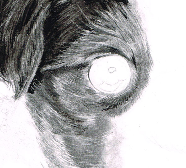
Now we go from working in black tones to drawing out white
tones. Using either of our Tombow detailed erasers, take the edge of the
eraser, and using a limited amount of the overlay technique, erase parts of the
charcoal and create the effect of lighter hairs in the puppy’s ear.
Step 7
Now you hopefully have your lighter tones sculpted out. We
can now go in again with a charcoal pencil and a black coloured pencil and draw
in individual hairs both inside the ear and on the edge of it.
As in the previous
step, it is very worthwhile taking your time with this one, as
concentrating on details like fine hairs will make a massive impact at the end
of the drawing. For really fine hairs, it is my best advice to use a sharpblack
coloured pencil to draw these, and make sure you keep sharpening it regularly.
6. Rendering Lighter Tones, the Head
Step 1
Now we move down the image a little and we begin rendering a
section of the puppy’s head. Begin as in the previous section by laying down a graphite powder base. Next, instead of applying compressed charcoal, continue applying graphite to areas of the reference that appear darker. You should be left with
a base that we can now work on.
Step 2
We shall now begin using the overlay technique we talked
about earlier. Using a sharp4B, 5B or 6B pencil and with a moderate touch, begin to overlay pencil strokes in the direction the
puppy’s fur is going. It is obviously important to pay close
attention to your reference to see which direction the fur is actually going.
Step 3
Now
take one of your Tombow erasers and, using the edge of the eraser, begin
carving out highlights in the puppy’s fur. As in the previous section, if you
have done the first steps right this step should be no problem. Just be sure to
take care when you erase, and do not go overboard.
Step 4
If
you find you have any darker hairs that need touching in, you can use either a 7B or a black coloured pencil to do this. Lighter hairs can be drawn in using a HB, 2B or a 4Bmechanical
pencil.
7. The Left Side and the Lower Legs
Step
1
Now
we continue moving down the body but still working on the left side of the
puppy. For this first part of this section we are going to use the same methods we used to render the puppy’s ear. Start off by applying a layer of graphite powder, and then blend it in using a cotton bud or your soft paint brush.
Step 2
Once you have applied your base, fill in any black areas with a layer of charcoal using your soft charcoal stick and then blend this in too using another clean cotton bud.
Step 3
Once you have your charcoal layer down on the paper, take your circular Tombow eraser and, using a light touch and only short strokes, erase the edges of the puppy’s legs.
If you are using the right amount of pressure you will find that you will be left with a light grey tone on the paper. This is ideal, because if you look at your reference the fur of the edge of the puppy’s legs is highlighted, and it is this effect we are looking to achieve in this step.
Finally, using your black colour pencil, draw in any fine details like tufts of hair. Remember not to rush this step, as these tiny details matter.
Step 4
Moving on now to his forelegs, you need to follow the same method we used in previous
sections, starting again by laying down a base tone using graphite powder.
Step 5
Returning
to the technique of overlaying, using a 4B
pencil, begin drawing in the hairs on the puppy’s legs. Use only a moderate
touch to build up the layers here, as once this stage is complete we will need
to resort to our Tombow erasers to bring out the lighter hairs.
Step 6
Moving
on to the darker sections of fur, using a regular or mechanical 6B pencil or darker, touch in darker
hairs using the overlay method. For very fine black hairs on the puppy’s feet, it’s best to use your black coloured pencil, although remember to keep it sharpened.
8. Working on the Bridge of the Nose
Step
1
Now
we come to another focal part of this image, the bridge of the nose. Start as
in previous steps by laying down our graphite base. Because the bridge of
the puppy’s nose is quite dark, it might be worth your while working over the
base with more graphite powder to darken the tones.
Step
2
After
you have laid the base tones with short overlaying strokes, build up your fur
layers with a 5Bpencil. This is another
one of those steps where paying close attention to your reference will pay
dividends in the long run.
Step
3
When
it comes to working in darker hairs, my best advice would be to use a sharp 7B or black coloured pencil. This
section of the image may take a while to build up as the hairs are only short,
but it is one of the main focal points on the picture so taking care is
essential.
Lighter hairs are few and far between in this part of the image, but
any that do need working in are best created using our square Tombow eraser.
9. Working on the Underbody
Step 1
For the lower parts of the puppy’s underbody, it is best to follow the same technique as we have used on his head, applying a layer of charcoal with our soft charcoal stick and then working into it with a cotton bud. After applying the base layer, take your Tombow erasers or putty eraser if you wish and, using a light touch, draw out lighter hairs on the body.
Step 2
Following the overlay technique we have used throughout this tutorial, you should have no problem rendering the fine, dark hairs on the puppy’s underbody. It is best to do this stage with either a 6Bmechanical pencil, a sharp 7B regular pencil or a black colour pencil.
10. Back Legs and Adding Lens Blur
Step
1
Now
we shall move on to the parts of the puppy which, if you notice in our reference,
are slightly out of focus in the shot. To create this we begin as we have done
in previous steps by putting down a base layer of graphite powder and then
working over the top with our soft charcoal.
Step
2
Next,
if you have blended the charcoal, take your square Tombow eraser and begin
carving out lighter tones, but only use a light touch to carve out hairs. This
is because we do not want to be left with big white spaces—as you will notice
in your reference, the hairs on his back legs are not that well highlighted due
to being out of focus.
Step
3
To
further dull the features, you can either use a cotton bud, soft brush or tissue
paper to blend the tones on the puppy’s back legs. For the edges of the legs it
will best to use a clean cotton bud or medium blending nub to work on these,
using tight circulism with a light touch to blend the edges.
You may need to go
over the edges a few times to achieve the right effect and, again, pay close
attention to your reference, as this is another one of those points where you
may need to work hard but the payoff is more than worth it.
After you have
finished blending, you may want to come in with your square Tombow eraser or regular gum eraser to clean up the edges where you have been blending.
11. Creating Floor Shadows
Step
1
Now
for a relatively simple part of our process, working on the shadows underneath
the puppy. To work on this, take a sharpB
pencil and, using light cross-hatching, work in a light tone underneath the
puppy. Nearer the back legs it might be worthwhile going over your hatchings
again to darken the tones.
For blending, take a piece of tissue paper and, using
the circulism method, bring your tones together.
Step
2
Paying
close attention to our reference again, you may notice on the floor there is a
slight reflection of the puppy’s claws. To simply create this, take your round
Tombow eraser and remove a section of tone where the reflection is.
12. Working on the Eyes
Step
1
One
of the main focal points of this image is the puppy’s eyes. They
are one of the main features that make him so loveable, so it is worthwhile
paying very close attention to them.
Start by laying down a layer of graphite using your cotton bud in the
highlights of his eye, but only use a light
touch at this stage as we may need to erase areas of these as we proceed.
Afterward, take
one of your compressed charcoal sticks and with a moderate touch, begin working in the black areas such as the pupils
and shadow around the eye. Avoid filling the edges near the highlights for now.
Step 2
Take
a clean cotton bud and, using our reference, begin blending the edges of our
black areas to give the impression of shadows in the eyes.
As before, you may
notice that blending does draw out the charcoal, giving it a “grey” look
rather than pure black. To fix this it might be worthwhile taking a charcoal
pencil and going over the pupils and other black areas that require a fine
touch.
Step 3
Now
we move on to the reflections in the eyes and, if you have done the first steps
properly, this should be straightforward. It is worth remembering that there
are no pure whites in the eyes themselves, and even the so called “white of the
eyes” have a little tone in them. The only pure white is for our specular
highlights.
So for this step, take an HB
or a B pencil and, using light cross-hatching, blend in lighter tones in the iris and then take a small blending nub
to blend these together. Any fine details in the iris can be drawn in with a mechanical HBor 2B pencil.
Finally,
for the specular highlights in the eye, take your circular Tombow eraser and
remove any traces of graphite in this area. Now you should have an eye that
will strike any viewer of your work.
13. Working on the Nose
Step
1
Having
worked on breathing life into a dog’s soulful eyes, we now move on to another
part of a dog which really adds cuteness: his wet nose. For this we begin by placing a few layers of graphite using our cotton buds and circulism
application methods to create a good base.
Step
2
Now
to begin creating the “wet look” on his nose, take your circular Tombow eraser
and begin “tapping” the paper with a light touch to create the pores on his
nose. For pores that are quite highly reflective, use a harder touch to remove
the graphite.
At this point, take note of your reference closely and do not go
crazy in creating pointless effects, a useful tip being “less is more”.
Step
3
Now
for the darker tones, using a sharp 6B or 7B pencil, touch in darker pores
along what would be the edge of the puppy’s nose. As with the above, be measured in how many
pores you wish to put in, and remember to pay close attention to your reference.
For
the nostrils, continue using your 6B pencil to fill in shadow areas. For pure blacks, take one of your black colour
pencils and work this in using tight circulism. It may be necessary to use your putty eraser for the dull highlights under the nostrils.
14. Finishing Touches
You
should now have an image that is more or less finished! At this point I
would recommend you go over your work and check it carefully against our
reference to make sure you have not missed any details. If you have been
careful and have taken your time with this image, hopefully you will find that this
is not the case.
To
seal your work, you should now spray your drawing with artist’s fixative. This
substance prevents any accidental smudging of your drawing when it is in
storage or on display.
And at Last We Are Done!
Now you have a cutesy, cuddly drawing that either you or others can treasure for many years to come. Also, you now hopefully have the knowledge to take forward and try drawing and rendering your own pets at home or ones you observe in the natural world.
In this tutorial I’ll show you how to create a funny surreal scene using a variety of photo manipulation techniques.
First we’ll combine several stock images to make a natural underground scene. Then we’ll add other elements, such as the skull, nest, egg and bird, and blend them together using adjustment layers, masking and brushes.
Later we’ll add more natural elements (a tree and leaves) and use the same techniques to make them parts of the scene. We’ll finish it up with several adjustment layers. As you follow this tutorial, you’ll learn how to manage your layers, work with groups, and focus on the correct details.
Tutorial Assets
The following assets were used during the production of this tutorial:
Create a new 1500 x 1500 px document with the settings below:
Step 2
Open the sky image. Select the sky part using the Rectangular Marquee Tool (M).
Drag the sky part into the white canvas using the Move Tool (V), and place it at the top.
Step 3
To add some depth to the scene, go to Filter > Blur > Gaussian Blur and set the Radius to 6 px.
Step 4
To change the sky hue a little, go to Layer > New Adjustment Layer > Color Balance:
Step 5
Open the soil 1 image (choose image 2). Use the Rectangular Marquee
Tool to select the soil part and place it under the sky.
Step 6
Make a Curves adjustment layer (set as Clipping Mask) to darken the soil part.
Step 7
To desaturate the soil color, make a Hue/Saturation adjustment layer
(set as Clipping Mask) and change the Saturation value to -82:
Step 8
Create a new layer (set as Clipping Mask), change the mode to Overlay 100% and fill with 50% gray:
Active
the Burn Tool (O) with Midtones Range, Exposure about 10–15% to darken
some areas at the edges of the soil a bit. You can see how I did it with Normal mode and the result with Overlay mode:
Step 9
Open the soil 2 image (choose image 4). Select the upper part of the soil with the Rectangular Marquee Tool.
Place this selected part above the soil 1 area.
Click
the second icon at the bottom of the Layers panel to add a mask to this
layer. Use a soft round brush with black color (soft black brush) to
remove the hard edges and blend this soil part smoothly with the rest.
Step 10
Make a Curves adjustment layer (set as Clipping Mask) to darken this soil part.
On this layer mask, use a soft black brush to erase the upper part of the soil as it gets some light from the sky.
Step 11
Make a Hue/Saturation adjustment layer and bring the Saturation value down to -75:
Step 12
Open the grass image. Select the grass part with the Rectangular Marquee Tool.
Drag this selection into our main document and use the Free Transform Tool(Control-T) to enlarge the bottom of this grass part.
Add
a mask to this layer and use a soft black brush to remove the hard
edges and blend the grass smoothly with the soil and the sky.
Step 13
On the grass layer, go to Filter > Blur > Gaussian Blur and set the Radius to 3 px.
On
this filter mask, use a soft black brush to erase the most of the grass
area and make the blur effect only visible at the furthest background.
This step is to increase the depth of the scene.
Step 14
There are some unwanted shades on the grass. Make a new
layer (set as Clipping Mask) and use the Clone Tool (S) to remove
them.
Step 15
Use a Color Balance adjustment layer (set as Clipping Mask) and increase the Red, Green and Blue values of the Midtones.
Step 16
I aim to make the main light source come from the left side to the right to fit
the sky light. Create a Curves adjustment layer (set as Clipping Mask) and
increase the lightness:
On this layer mask, use a soft black brush to reduce the lightness at the lower edges, especially the bottom right of the grass.
Step 17
Create a Curves adjustment layer to darken the right edge of the grass.
On this layer mask, use a soft black brush to erase the upper left of the grass.
2. Adding the Skull
Step 1
Open the skull image. Select the skull only using the Polygonal Lasso Tool (L).
Place the skull in the middle of the image, between the grass and the soil, and rotate it using Control-T.
Add
a mask to this layer and use a soft black brush to erase the skull’s middle section to make it look as if it’s stuck between the
grass and soil.
Step 2
Create a Hue/Saturation adjustment layer (set as Clipping Mask) and change the Saturation to -52.
Step 3
The light on the original skull is from the front and from the lower side. To correct its light and shade to fit the background, we’ll use
several layers (set as Clipping Mask).
First create a Curves adjustment layer to darken the lower part of the skull (as it’s below the soil surface).
On this layer mask, use a soft black brush to erase the upper part to maintain the lightness there.
Step 4
Create another Curves adjustment layer to brighten the upper part.
On this layer mask, use a soft black brush to erase the front of the skull.
Step 5
Create a new layer, change the mode to Overlay 100% and fill with 50%
gray. Use the Dodge and Burn Tool (O) with Midtones Range, Exposure
about 15-20% to add more light to the upper part of the skull, and also
increase the shade and contrast of the eyes. Here are the results with Normal mode and Overlay mode.
Step 6
Make a new layer under the skull one. Use a soft black brush with the Opacity about 40–45% to paint the shadow of the skull on the grass (it
should be thin and long, as the light comes straight from left to
right).
3. Adding the Root
Step 1
Open the root image. Place it in the underground area using the Move Tool and rotate it a bit using Control-T.
Use a layer mask to erase the hard edges and blend the root with the soil.
Step 2
Select
a root part from the original image with the Lasso Tool, and then position it in the left of the underground area. Use a layer mask to blend them with the first
root.
Step 3
Duplicate
this layer and move it to the lower middle section of the underground. Use a
layer mask to make it blend together with the other root parts.
Step 4
Select all the root layers and press Control-G to make a group for
them. Change the mode of this group from Pass Through (default group
mode) to Normal 100%.
Make a Curves adjustment layer on top of the root ones (within this group) and decrease the lightness.
Step 5
Use a Levels adjustment layer to make some root areas darker, especially the area below the soil surface.
On this layer mask, use a soft black brush to erase the lower part, as it should be less dark than the upper one.
4. Adding the Nest
Step 1
Open the nest image. Use the Move Tool to drag it onto the skull.
Step 2
Make a new layer under the nest one. Use a soft black brush with the Opacity about 40–45% to paint the shadow below the nest.
Step 3
On a new layer (still under the skull one) use a soft black brush with
the Opacity about 30% to paint the shadow of the nest on the skull and
the grass.
Step 4
Create a Curves adjustment layer (set as Clipping Mask) to brighten the nest, as it looks darker than the background at the moment.
On this layer mask, use a soft black brush to erase the right side of the nest (from the viewer) to maintain the shade there.
Step 5
To reduce the nest saturation, create a Hue/Saturation adjustment layer (set as Clipping Mask) and change the Saturation to -28.
5. Adding the Egg and Bird
Step 1
Open the egg image. Select the egg using the Magic Wand Tool .
Place
the egg in the upper area of the nest. Use a layer mask with a hard
black brush to erase the lower part of the egg to make it look as if it’s lying inside the nest (you should pay attention to the tiny holes in the
nest).
Step 2
Create a Curves adjustment layer (set as Clipping Mask) to darken the
egg. On this layer mask, use a soft black brush to erase the upper area to keep the light on this part.
Step 3
Open
the bird image and isolate him from the background using the Polygonal
Lasso Tool or any tools you’re familiar with. Place him onto the edge
of the nest.
Step 4
Create
a new layer under the bird one. Use a soft black brush with the Opacity
about 30–35% to paint the bird shadow on the nest and grass. The thing
you should remember is that the bird is on the top of the nest (further
from the ground than the skull) so the shadow should be lighter.
Step 5
Create a Curves adjustment layer (set as Clipping Mask) to reduce the
highlight on the bird’s body. On this layer mask, use a soft black brush
to erase the upper part and the left side, as they should be brighter than
the rest.
Step 6
Make a new layer (set as Clipping Mask), change the mode to Overlay
100% and fill with 50% gray. Use the Dodge Tool to brighten the tail and
the left leg, and the Burn Tool to darken the right leg of the bird.
6. Adding the Tree
Step 1
Open the tree image and use the Move Tool to add it to the top right of the scene.
Go to Filter > Blur > Gaussian Blur and set the Radius to 5 px.
Step 2
To alter the tree color a bit, use a Color Balance adjustment layer
(set as Clipping Mask) and change the Red value of the Midtones.
Step 3
Use a Curves adjustment layer to brighten the tree, as it lacks light at the moment.
On
this layer mask, use a soft black brush to refine the light and shade
between the leaves. You can see the result on the layer mask and the
result on the picture.
7. Adding the Leaves
Step 1
Open the leaf image. Drag it into our working document using the Move
Tool and use Control-T to rotate it a little. Place it under the tree
position (or anywhere you feel suitable).
Step 2
Duplicate this layer several times and arrange them around the skull,
especially placing one to fit the direction of the skull’s gaze. On
each of these layers, go to Filter > Blur > Gaussian Blur and
change the Radius to 3 px.
Step 3
Duplicate one of the leaf layers twice and enlarge them using Control-T. Place them at the right edge and the foreground, and change the Gaussian BlurRadius to 12 px.
Step 4
Make
a group for the leaf layers as we did with the root ones. To change the color of the leaves, create a Color Balance adjustment layer and increase the
Red and Yellow values of the Midtones.
Step 5
To make some light on the leaves, create a Curves adjustment layer and increase the lightness.
On
this layer mask, use a soft black brush with the Opacity varied from
20–100% to erase the right side of some leaves to fit the light of the
background.
8. The Final Color Adjustment
Step 1
It’s
time to color the whole scene. Create a Gradient Map adjustment
layer and pick the colors #7d6a51 and #a2b54a. Change this layer mode to Soft Light 50%.
Step 2
Make a Color Balance adjustment layer and change the Red and Yellow values of the Midtones.
Step 3
Use a Curves adjustment layer to change the color and increase the contrast of the scene.
Step 4
Make a Vibrance adjustment layer to enhance the final effect.
Congratulations, You’re Done!
You can see the final outcome below. I hope that you’ve enjoyed this tutorial and learned some new techniques. If you have a question or idea, feel free to leave it in the comment box below.
Dive on into a fantastically cute world with illustrator and designer Michelle Romo. Her brand, Crowded Teeth, has been featured on a variety of products for kids and adults alike from companies such as The Land of Nod and Japan LA, as well as in gallery shows and both group and solo exhibitions over the years. Get inspired with Michelle’s work and experiences below!
Hey Michelle! Thanks so much for the interview. Let’s start at the top: how did you get into art?
I’ve been into making art since I was a little baby! It
has always been a big part of my life. My mom is a painter, and my dad is a builder, so someone around me was always making something.
I remember when I was 10 l would set up drawings and
hand sewn items on the kitchen table and sell them to my parents when they got
home from work. I got into drawing using a computer when I was 16. My mom was a
graphic designer and brought home a fancy computer so that she could work from
home. I started playing around in
Photoshop and Illustrator and eventually got better at it.
Michelle Romo
What inspires you and your work?
A lot of my inspiration is from books and knickknacks
that were around when I was growing up. On my Dad’s side of the family my
grandparents had a kitschy vibe, and on my Mom’s side of the family my
grandparents were sending me toys and snacks from Japan. I think I melted those
two influences into my style, as well as just being influenced by friends and
the universe.
Storytelling and humor also sneak into my pieces because
of the nerdy things I like. I’m a Simpsons fan, and I love old video games.
Sketch for her Flaming Lips piece.
Mary Blair is a huge influence. I’ve loved It’s A Small
World since I was 4. I saw her art in storybooks and didn’t realize who she was
until I was older. She’s amazing. The Flaming Lips inspired me a few years ago just to
spread a general message of love.
I’m lucky enough to work for The Land of Nod these days,
and everyone I work with is inspiring and lovely.
The Flaming Lips vector piece.
Are you formally trained? If so, tell me about it! If not, how did you work up your portfolio for
professional work?
I am not formally trained! I started learning by playing
in Illustrator and asking my mom a lot of questions. Early on I gave myself projects, and I just went for it
and started my own business. At the time I had no business starting a business—my artwork wasn’t very good—but I wanted to be the next Paul Frank / Sanrio and was trying to figure out how to
do that.
I had day jobs that made me better at the programs I wanted to learn. I did “graphic design” for a small copy
shop, which was really just doing business cards and fliers for local
businesses. I retouched headshots, I worked in a small print shop, and I eventually
got a design job doing product development for juniors accessories and
apparel.
Mostly I just drew the things I wanted to draw in my free time until
eventually I got better and settled into a style that I felt was representative
of what I wanted to put out in the world.
What
is your creative process like?
Usually it starts with an indecipherable sketch that
only I can understand, and then a loose sketch in Illustrator to find out how
the pieces should fit together. After that it’s just hours of refinement in Illustrator
and Photoshop. I usually am working on a bunch of different things at once—some for freelance, some personal.
What programs or media do you prefer?
I work about 99% in Illustrator and some work in
Photoshop. I also make things out of paper and wood which is either hand cut,
or laser cut.
For
how long have you worked professionally?
Man — TECHNICALLY? 15 years. About 8-10 less embarrassing years. 5-7 really great
years that I’m proud of.
What
is your typical workday like?
Before a few months ago it was much more loose. I was
freelancing full time so I was setting my own schedule. Recently I took a
position with The Land of Nod as their in-house illustrator. So now my day starts with them! I just wrapped up an
activity book that will be given out at their stores, and also worked on their
tour bus redesign. I also do some product development. So my time there is a
mix of super fun projects.
Then when I get home I work on Crowded Teeth which has
been on a little bit of a hiatus. Lately it’s a mix of answering emails,
figuring out contracts, and making new artwork.
Right now I’m doing a push for a line of board books,
thinking about my new collaboration with JapanLA Clothing, and working on a
redesign for my webstore. There’s also just remembering what art shows I signed on
to do, what freelance is coming up, and taking naps. I take a lot of naps.
Dress collaboration with JapanLA Clothing.
What’s your workspace like?
Mostly I just sit at my desk. It’s not very exciting. I
like to put on awful TV or romcoms in the background when I work. The romcoms
have to be organic—on TV, no Netflix. There have to be rules or I would just
watch awful things all the time, haha. Somehow it helps with the work flow. I
don’t have an explanation for this!
Let’s
discuss your brand, Crowded Teeth, as an ongoing art project. What started it?
Crowded Teeth started out as “Yellow Toothpick”. When I
was 18 I loved Paul Frank and Sanrio, and there was also a brand Yum Pop that I
really admired. I saw what they were doing and was like, “HOW DO I DO THAT?”
I wanted to start by making t-shirts so I bought a heat
transfer press, then upgraded to a 6 color screen printing machine.
I did that for about 4 years and also made handmade
goodies. In 2004 my illustration style changed a little bit. I was having
outside printers do my tees and started getting into doing trade shows. That’s
when I decided to change to Crowded Teeth. It started as tees, and other screen
printed items. I wanted to expand the product line and started having knit
goods and metal jewelry made in China.
In 2006-2007 production and distribution became too much
for me to handle on my own and I was in a weird place where I wasn’t sure how I
wanted to grow. I didn’t like doing all of the business things (shipping,
invoicing, customer service, etc.) but I wasn’t making enough to hire anyone to
help (or I didn’t know how to properly ask for help?). In 2008 I decided to make the change to licensing. I figured I could do the
artwork, and have people who knew what they were doing and specialized in
production to make the products I wanted to make. I thought that since the art
making part was what I was best at and what I wanted to do most, this would be a good direction to take.
Right now I’m settling into a place where I am producing
my own goods again in small quantities, and also finding awesome partners to
license my artwork to.
What are your plans for this year with
your personal artwork?
My plans for this year are to go back to creating
artwork. I did a big business push last year and focused on licensing. I really
miss just making art for no reason. I just want to make things I like without
an agenda. I think it will allow me to grow, and to make things that are a
little more weird.
As
a merchandise/lifestyle brand, what’s your experience been licensing your work
to companies like The Land of Nod and Japan LA? How’d you get into licensing work
and where do you hope for it to go?
Licensing has been great! I wanted to do a big growth
spurt with licensing last year but it didn’t turn out exactly how I wanted. I
feel like I am still learning about my brand and how it fits into the world.
Cute plush designs for The Land of Nod.
I’m very fortunate to have really wonderful partners
that make beautiful products. JapanLA, The Land of Nod, and Loungefly are all really
great partners to have. I license my artwork to and have worked for all of
those companies and they have been great partners and employers.
Cute chair designs for The Land of Nod.
How do you manage your online shop?
Right now a third party manages and fulfills my
merchandise. Before that I would buy product from my licensees and do fulfillment
myself. Before that I produced myself.
I’ve always had my own web store! I thought of it like a
project. I wanted to know the ins and outs of everything I wanted to do: how
you set it up, how credit card processing works, what the shipping options were,
etc. It was important for me to learn how to set up everything myself.
I’ve been so impressed by your gallery pieces and various event pieces you’ve created.
Let’s start with gallery pieces: What are some of the shows you’ve been
involved with? What media have you presented work in?
Thank you! I’ve consistently been in group shows at
Wonderground Gallery, JapanLA, Leanna Lin’s Wonderland, Flower Pepper Gallery,
Q Pop, and Spoke Art. I’m always happy to accept invitations to shows. Making
originals is always a super fun process. I usually start by drawing the piece
in Illustrator and then breaking it down and building it out of wood or paper.
I’ve had the opportunity to do a couple big solo shows.
One at JapanLA and one at the Womb Gallery. The Womb Gallery show was the
biggest space I’ve ever had to fill so I had an opportunity to make really big
pieces which was fun. I built these 4-5ft pieces out of wood, I did some
stained glass stuff and had a rug made. I also had an extra room that I filled
with these giant printed cutouts so that people could explore a little Crowded
Teeth city.
Michelle’s solo show at the Womb Gallery.
What other sort of events have you done?
I did the Licensing Expo last year. I went all out for
it! I had that sculpture made, and I painted it by hand. The display is mostly product that has been produced by
my licensing partners. It was to show off what I had produced in the past and
try to find new partners. I really love doing display design. I want to spend more
time building big installations.
You’ve worked in a variety of media (acrylic, glad,
paper, wood) in addition to traditional and digital pieces. What media do you
find most rewarding to exhibit and is there anything you haven’t yet worked in you’d
like to?
I really want to make a neon sign! That might be my next
project.
Everything starts digitally, but I really love building
things out of wood. I’ve always loved the look of wooden toys and so when I get
to build things that way it strikes a certain nostalgia nerve for me.
Closeup of paper and wood cut artwork.
Let’s talk about Cute Friends!
What is Cute Friends? What are your plans for it?
Cute
Friends was an idea for a single-panel weekly comic. I wanted to try to
do a little more character development and storytelling. I started to develop
the characters’ personalities but never got into making the comics. It’s sorta
on hold right now. I wanted to focus more on making originals and art pieces so
right now it’s just a side project waiting to happen!
What
words of advice do you have for aspiring artists?
Keep at it FOREVER! But remember to stop and enjoy
nachos and romcoms and hugs from your friends. I think that it’s important to give yourself projects of
the things you want to do—don’t wait for people to give you projects. And if you really want to make anything it’s easier than
you think; if you have questions someone can help you. Ask for help, be kind to fellow artists and humans, and
enjoy the things you make.
Many thanks to Michelle for sharing her work and experiences with us today. You can check out more of her work and follow her around the web in the links below!
Maria Carriedo I guess I should start by saying that you should always start with a concept you love, since you’re going to spend a lot of time working on it. In this case, I wanted to do something tribal, and after a long search I ran across an amazing Dutch artist, Hendrik Visser.
The Tuts+ Community Journal Project challenges you to use everyday equipment from your office and design tools, to get creative and log it in a journal of your choosing.
In this challenge, we’re asking you to make something out of that pesky junk mail which comes through the letterbox.
What You’ll Need
You’ll need the following things in order to create your own mosaic. However you’re free to use alternatives where you feel you can:
Journal
Junk mail (alternatively you could use newspapers, magazines, food labels)
Scissors
Glue
Pencil
Eraser
Challenge Overview
For this challenge, you’re essentially recycling materials many of us have coming through the door. Alternatively you can use magazines, newspapers and food labels around the home.
The challenge is to cut your junk mail into squares or tiles, and then glue them onto a sketch to create a mosaic or collage. How you approach this challenge is completely up to you. It doesn’t matter if you’ve created a masterpiece or a hot mess, as long as you’re exercising your creative side!
To help you in this challenge, I’m going to show you what I did with this task.
1. Cut the Tiles and Sketch
Thankfully this year is an election year, so I have a great range of coloured flyers being posted through the door. However you can also include textures which are of a similar colour. For instance, if there is a flyer with pizza or even a grassy field, you can great a pile of coloured tiles from that.
I’ve then organised my tiles into a gradient. I started this task without a clear idea of what I was going to be creating. I decided to just see what colours I had available first and then gain inspiration from there.
So I’ve decided in this instance that I’m going to create a gradient rainbow stripe across the middle of my page. With the pencil, I draw a band down the middle as a guide.
2. Glue Those Tiles!
I’m using a colour magic Pritt Stick, so you can see where I’ve placed the glue. It goes on blue but dries clear.
I start by adding a colour that I have most of, so red in this case, as it will be the beginning and end of my rainbow. I then use a dithering technique to blend the colours into each other.
Tip: add a little bit of glue onto the tip of your pencil to pick up your tiles quickly and easily.
3. Create a Frame
I’ve finished my gradient and I’ve decided to frame it with long pieces of white paper from the junk mail, to clean up the edges.
I then cover the entire rainbow and frame in glue to give it a polished sheen and to ensure everything is glued into place.
Rainbow Gradients Are Always Awesome!
With that, I’m done! I think the whole task took a little under an hour, although this included taking photos to document it.
You don’t need to spend too much time on your mosaic—only enough to make you feel you’ve stretched and exercised your creative muscles.
Want to Join the Tuts+ Journal Showcase?
Guidelines
Upload a clear shot of your journal art to the comments section in order to be included in the community showcase. The deadline for submissions to be included in the showcase article is June 14th, 2015. However you’re free to continue putting together your journal after this date.
For the best results: Try to shoot your pictures using ample lighting. Natural/outdoor lighting works best!
Traditional media only. Because we all have to get dirty from time to time!
When you publish your artwork on this article, you agree that the graphic can be included in one or more articles on Tuts+ and perhaps shared with other readers on the Tuts+ network via social media.