Big data and the internet is not the same thing, although the internet helps you get access to the endless data you can use for further insights to plummet your business forward. Big data means making sense of and comprehending information from large piles of data in a way it’s useful to the business. Big Read More …
Topics of Interest: PHP, WordPress, Laravel, Magento, Marketing
Occupation: Web developer
In our series of Tuts+ community stories so far, you’ve met South African graphic artist Catherine Dawes, Brazilian web designer Tassia Pellegrini, and Malaysian front-end developer Ajmal Afif, among others.
Today we’re taking you to the Philippines, to hear how Andrew Garcia transitioned from a customer support role to become the main web developer for both SocialTap and Madhatter Media.
Getting Started
Five years ago, Andrew Garcia was working in a customer support role and aspiring to write code for the web. But it was proving difficult to transition from one to the other.
Computer books can get quite expensive here. And taking special classes wasn’t an option with a full-time job.
So in his spare time, he mined the internet for guides and tutorials about web development. One of the sites he found was the Tuts+ Code section (named Nettuts back then). He used the tutorials and courses to teach himself web development skills (both front-end and back-end). Some of the subjects he learned include CodeIgniter, Laravel, WordPress and PHP.
Nettuts is one of resources I credit for giving me the knowledge and skills to transition from my old job, to a more rewarding career in web development.
He says he still follows new articles and courses to keep his skills current, and to discover new and interesting topics.
Making Another Transition
Andrew has now fulfilled his ambition of working as a web developer. He works as the main developer for two companies, and has also completed many freelance assignments, like creating the website pictured here:
WowCow website design by Andrew Garcia
But as he achieves one goal, he sets himself more. He’s noticed that lots of startups have been setting up shop in Manila, and wants to work more closely with them, as well as developing more apps for online marketing. So now he’s turned to the Tuts+ Business section to learn about marketing on the web.
“Quick shoutout to David Masters,” he says. “Your articles on freelancing and marketing are awesome!”
Words of Advice
So what has Andrew learned in this journey from customer support to web development and beyond?
First of all, he says, learning web development is equal parts “theory” and “practice”. When starting out, invest in good resources that’ll cover all the basics, but be on the lookout for opportunities to put your skills into practice.
Secondly, don’t turn your nose up at small projects, because they can often lead to something bigger in the end:
It’s not uncommon to start off with small projects, and grow from there.
And finally, he says, it’s crucial to keep learning at all times:
A huge challenge for any web developer is keeping their skills current. So cultivate a healthy thirst for new knowledge, and allocate time to learn new skills. Consider it as part of the job.
Connect With Andrew
If you’d like to connect with Andrew to hear more about his career and projects, or perhaps to collaborate with him, you can reach him via the Madhatter Media website, or on LinkedIn.
Or leave a comment or question below, and I’m sure he’d be happy to respond!
In this tutorial I’ll show you how to create a Batman-inspired artwork using a variety of photo-manipulation techniques in Adobe Photoshop. We’ll use sky and wall images to create the base scene at the start, and then blend them together using adjustment layers, masking and brushes.
Then we’ll add the moon and the model, and repeat the same techniques to make them part of the scene. We’ll continue to add other elements, such as the branches, smoke, bats and particles. We’ll finish it up with several adjustment layers.
During this tutorial you’ll also learn how to enhance the light and contrast, apply texture, create a dark atmosphere, make depth of field, and more.
Tutorial Assets
The following assets were used during the production of this tutorial:
Create a new 1700 x 1500 px document in Photoshop with the settings below:
Step 2
Open the sky image. Use the Retangular Marquee Tool (M) to select the sky part:
Drag it into the white canvas using the Move Tool (V). Use the Free Transform Tool (Control-T) to stretch the height a bit.
Step 3
Go to Filter > Blur > Gaussian Blur and set the Radius to 6px:
Step 4
Create an adjustment layer and set it as Clipping Mask to desaturate the
sky color. Go to Layer > New Adjustment Layer > Hue/Saturation and
change the Saturation value to -96.
Step 5
Make a Curves adjustment layer to darken the sky.
On this layer mask, use a soft round brush with black color (soft black
brush) with the opacity about 20-25% to reduce the effect on the top
middle of the sky. Here are the results on the layer mask and on the picture:
Step 6
Use a Levels adjustment layer to darken the sky more.
On this layer mask, use a soft black brush to erase the sides of the sky as they look too dark at the moment.
Step 7
Open the wall image. Select the wall part using the Polygonal Lasso Tool (L).
Place it in the lower part of the working document and use Control-T to rotate the wall a bit.
Step 8
Make a Hue/Saturation adjustment layer (set as Clipping Mask) and reduce the Saturation value to -88.
Step 9
Use a Curves adjustment layer (set as Clipping Mask) to darken the wall.
On this layer mask, use a soft black brush to erase the horizontal
contour on the top of the wall to keep the lightness there (we aim to make the main light source on the top middle).
Step 10
Create a new layer (set as Clipping Mask), change the mode to Overlay 100% and fill with 50% gray:
Active the Dodge Tool (O) with Midtones Range, Exposure about 30-40% to
brighten the horizontal contour of the wall. You can see how I did it
with Normal mode and the result with Overlay mode:
Step 11
To make the highlight on the wall contour stronger and more visible,
create a new layer and active the Line Tool (U). Change the foreground
color to #d9d9da and set Weight to 2px. Drag a line along this
horizontal contour of the wall.
2. Adding the Moon
Step 1
Open the moon image and grab the moon using the Elliptical Marquee Tool (M).
Drag it onto the top middle of the working document and rotate it using Control-T.
Step 2
Go to Filter > Blur > Gaussian Blur and set the Radius to 6px.
Step 3
Create a Hue/Saturation adjustment layer (set as Clipping Mask) to
desaturate the moon color. Change the Saturation value to -94.
Step 4
To add some glowing light to the moon, double click the moon layer, and choose Outer Glow and Inner Glow. Set the color of the glow to #fcfcfc.
Step 5
The moon, especially its middle section, still looks a bit dark, so make a new
layer and use a soft white brush to paint over the moon area. Change
this layer mode to Soft Light 100%.
3. Adding the Model
Step 1
Open the model image. Select the model using the Polygonal Lasso Tool, and then place him onto the wall.
Step 2
Make a new layer under the model one. Use a soft black brush with the
opacity about 40% to paint the shadow of the model on the wall.
Step 3
Use a Curves adjustment layer (set as Clipping Mask) to darken the
model. On this layer mask, use a soft black brush to erase the
outside to keep the lightness there.
Step 4
Make a Hue/Saturation adjustment layer and bring the Saturation value down to -75.
Step 5
Create a new layer, change the mode to Overlay 100% and fill with 50% gray:
Active
the Dodge and Burn Tool with Midtones Range, Exposure about 20-30%
to refine the light and shade on the model. Use the Dodge Tool to bring
more light to the outside and the Burn Tool to strengthen the shade.
4. Adding the Branches
Step 1
Open the branches image. Use the Magic Wand Tool to select the branches part, and then place it over the working document and avoid hiding any details of the model.
Add a mask to this layer and erase the branches beside the model.
Step 2
Go to Filter > Blur > Gaussian Blur and change the Radius to 8px.
Step 3
Create a Curves adjustment layer (set as Clipping Mask) to brighten the branches.
On this layer mask, use a soft black brush to erase the lower part of the branches to match its light and shade with the background light.
Step 4
Make a new layer, change the mode to Overlay and fill with 50% gray. Use
the Dodge Tool to make the light stronger on the branches, especially the lower
ones.
5. Adding the Smoke
Step 1
Open the sky image again and place it in the lower part of our main document. We’re going to use it to make the smoke.
Add a mask to this layer and use a soft black brush to erase the hard edges and reduce the smoke intensity.
Step 2
Make a Hue/Saturation adjustment layer and decrease the Saturation value to -100.
Step 3
Create a Curves adjustment layer to darken the smoke.
On this layer mask, use a soft black brush with a very low opacity (about 10%) to reduce the effect on the sides of the smoke to make
these areas a bit more visible.
6. Adding the Bats
Step 1
Open the bats image and cut them out from the background using the Magic Wand Tool.
Select the different bats and position them around the model, duplicating if needed. Use Control-T to vary their size to create depth of field.
Step 2
Apply a Gaussian Blur with the Radius set to 4px to each of these bat layers.
Step 3
Add another bat to the right side of the scene, and then apply a Gaussian Blur and change the Radius to 8px.
Step 4
Add another bat to the bottom of the image and enlarge its size using Control-T. Apply a Gaussian Blur with the Radius increased to 12px. This step is to increase the depth of field.
Step 5
Select all the bat layers and press Control-G to make a group for them.
Change this layer mode from Pass Through (default group mode) to Normal
100%. Create a Hue/Saturation within this group and bring the Saturation
value down to -91.
Step 6
Make a Curves adjustment layer to brighten the bats.
On
this layer mask, use a soft black brush to reduce the lightness on the
lower and further bats from the moon as they get less light than the
others.
Step 7
With the bat at the right corner, its body should be a bit darker. To
correct it, make a new layer (set as Clipping Mask), change the mode to Overlay and fill with 50% gray. Use the Burn Tool to darken this indicated area.
7. Adding the Particles
Step 1
We’ll be adding particles to increase the dark atmosphere for the scene. Drag the particles texture into our main document and change the mode to Multiply 100%.
Don’t worry about the black background—we’ll correct it immediately.
Step 2
Make an Invert adjustment layer (set as Clipping Mask) to remove the dark background and reveal the particles and the scene.
Step 3
Add a mask to the particles layer and erase the particles covering the
moon and the model area. Also reduce the particles’ intensity:
Step 4
Go to Filter > Blur > Gaussian Blur and set the Radius to 5px to soften the look.
8. The Final Adjustment
Step 1
Create a Color Balance adjustment layer on top of all the layers and change the Midtones settings.
Step 2
Make a Gradient Map adjustment layer and pick the colors #ae7272 and #c0dd97. Change this layer mode to Soft Light 100%.
Step 3
Add a Curves adjustment layer to darken the scene.
On this layer mask, use a soft black brush to erase the moonlight area,
the model and the top of the wall to keep the brightness there.
Step 4
Use a Vibrance adjustment layer to enhance the final effect.
Congratulations, You’re Done!
I hope that you’ve enjoyed my tutorial and learned some new techniques. I’d love to hear your feedback, so feel free to leave it in the comment box below.
Alternative movie posters are having a moment in the graphic design world. Designers and fans are creating their own quirky posters to advertise their favorite cult and indie movies.
In this beginners tutorial we’ll be creating a fan-art poster for indie favorite ‘Like Crazy’, and look at how you can bring an authentic fan-art style to your own poster designs. We’ll be using Adobe InDesign, and also dipping into Adobe Illustrator to create and edit graphics.
What exactly is an ‘alternative’ movie poster? Graphic designers and illustrators give a unique spin on the studio-approved artwork (and sometimes overtake the original poster in popularity and recognition), highlighting the key themes of a movie and showcasing them in on-trend matte colors and striking graphics. Take a look at the work of celebrated alternative poster designers like Brandon Schaefer and Jacob Wise to get inspired.
In this tutorial we’ll walk through the steps of creating our own unique version of a movie poster, and give you some tips and pointers for tackling your own alternative movie posters. Let’s get started!
1. Set Up the Poster Size Correctly
Step 1
Movie posters come in a range of sizes, but most countries have a set of standard poster sizes, which most posters should be designed to.
Here, we’ll be creating a poster at a US ‘Half-Sheet’ size, which is in landscape orientation, and 22 inches high and 28 inches wide.
First up, get InDesign opened up, and go to File > New > Document. Keep the Intent of the new document set to Print, and the Number of Pages to 1. Uncheck Facing Pages.
Under Page Size select Custom… to open the Custom Page Size window.
Type Movie Half-Sheet into the Name box and type in 711 mm (28 in) for the Width and 559 mm (22 in) for the Height. Click Add, and then click OK.
Step 2
Back in the New Document window, set the Margins on all sides to 30 mm and the Bleed on all sides to 5 mm.
Click OK to create your new poster page.
2. Structure Your Design With Layers
Organizing your artwork into layers will help you keep different elements on your poster easy to lock, unlock, hide and edit. Layering in InDesign is good practice for organized designing, so start as you mean to go on!
Step 1
Open the Layers panel (Window > Layers) and double-click on the default Layer 1 name to open the Layer Options window. Rename the layer as Paper Background and click OK.
Create a new layer by clicking the Create New Layer button at the bottom right of the Layers panel, or select New Layer… from the panel’s drop-down menu (accessible from the top-right corner of the panel).
Double-click the new layer’s default name, and rename it as Color Background.
Step 2
Create a further three layers, using the same process described in the previous step, in the following order: Typography, Planes and finally, Clouds, at the top of the series of layers.
Lock all the layers except the bottom layer, Paper Background, and click the layer to activate it.
3. Introduce Texture and Color
An alternative movie poster doesn’t have the same purpose as a commercial movie poster. Fan art is about having fun, and giving a design-focussed look to the layout.
Giving movie posters for modern-day movies a retro-inspired look really helps to tap into the fan-art trend. Two ways of achieving this are to give the layout an on-trend matte texture and a vintage-inspired color palette.
Step 1
Remaining on the Paper Background layer, take the Rectangle Frame Tool (F) from the Tools panel and drag to create an image frame that extends across the whole of the page, right up to the edges of the bleed on all sides.
Placing a paper-texture image here will give the poster a lovely vintage-style texture. Here, I’ve used this image from PhotoDune, just opening it in Photoshop first and warming it up a bit to give it a more golden color, and then resaving.
Go to File > Place and select the paper image; click Open. Choose Fill Frame Proportionally from the Controls panel running along the top of the workspace, or double-click in the frame to directly select the image and use Shift to resize, until the paper fills the frame as best it can.
Step 2
Return to the Layers panel and Lock the Paper Background layer. Unlock the Color Background layer.
Open the Swatches panel (Window > Color > Swatches) and click the New Swatch button at the bottom right of the panel. Double-click the new swatch to edit it in the Swatch Options window. Rename the new CMYK Swatch as Mustard and set the values to: C=0 M=35 Y=93 K=0. Click OK.
Create a further two new CMYK swatches with the following names and values:
Brown: C=56 M=60 Y=86 K=71
Blue: C=59 M=0 Y=18 K=0
Step 3
Remaining on the Color Background layer, select the Rectangle Tool (M) and drag to create a rectangle that extends across the width of the page, up to the top bleed, and drag downwards to the halfway point of the page (InDesign will flag up a pink line where the center point lies).
Set the Stroke Color to [None] and the Fill Color to Blue.
With the frame selected, head up to the top menu and select Object > Effects > Transparency. Set the Mode to Multiply and reduce the Opacity to 83%. Click OK.
Step 4
Select the shape and Edit > Copy, Edit > Paste. Move the pasted rectangle below the first, on the lower half of the page. Adjust the Fill Color to Mustard.
Return to the Layers panel and Lock the Color Background layer. Unlock the Planes layer.
4. Simple Graphics Make a Statement
For this poster we’re going to be giving a unique spin on the poster design for the indie movie ‘Like Crazy’. The studio poster for the film pictures the stars in a romantic embrace, but we can give this a more quirky spin in our own poster design.
The film tells the story of a transatlantic young couple, one British, one American, and the problems they encounter while trying to sustain a long-distance relationship.
Let’s communicate the theme of the film with a simple graphic: a plane!
Step 1
If you feel confident using Adobe Illustrator or CorelDRAW, you can choose to create your own graphic. Here, I’ve lifted an element from this graphic from GraphicRiver, isolating a single plane image in Illustrator.
If you’re doing the same in Illustrator you can simply Edit > Copy the vector in Illustrator, and then return to InDesign and Edit > Paste directly into your document.
Position the plane vector at the top left corner of the page, and adjust the Fill Color of the vector (from the Swatches panel) to Mustard.
Step 2
Edit > Copy and Edit > Paste the plane vector, then Right-Click (Windows) or Control-Click (Mac OS) > Transform > Flip Horizontal.
Holding Shift, drag the corner of the pasted plane upwards to make it a little bigger, then adjust the Fill Color to Brown. Position in the lower right corner of the page, as shown.
Step 3
Take the Line Tool (\) from the Tools panel and, holding Shift, drag your mouse from left to right to create a line about 245 mm in Length. Set the Stroke Color of the line to [Paper] (White). Position to the right of the mustard-colored plane, extending from the top of the tail of the plane.
With the line selected, go to Object > Effects > Gradient Feather. Pull the Gradient Stops a little closer together, and flip the direction of the gradient by clicking the button to the right of the sliding scale. Click OK.
Select the line and Edit > Copy, Edit > Paste. Position below the first line, extending from the bottom of the plane’s tail.
Drag to select both white lines and Edit > Copy, Edit > Paste. Then Right-Click (Windows) or Control-Click (Mac OS) > Transform > Flip Horizontal.
Position to the right of the brown plane, adjusting the gap between the lines to match the width of the plane’s tail.
Return to the Layers panel and Lock the Planes layer. Unlock the layer below, Typography.
5. Use Clean and Vintage-Inspired Fonts
Step 1
We’ll be using just one font across the poster design: Futura Std (Light and Book). You’ll probably have Futura Std installed by default as part of the Adobe set of typefaces, but if not you can download the font or use Futura instead (which has a different selection of weights).
In your InDesign document, and on the Typography layer, select the Type Tool (T) and drag to create a text frame 110 mm in Width and 95 mm in Height.
Type ‘LIK’ and set the Font to Futura Std Light, Size 280 pt, and the Font Color to [Paper].
Position the text frame between the top set of white lines, to the right of the mustard-colored plane.
Select the text frame and Copy, Paste. Edit the text to read just a single letter, ‘E’, and position to the right of the ‘LIK’ text frame. With the ‘E’ frame selected, go to Object > Effects > Gradient Feather and pull the gradient stops closer together. You may need to flip the direction of the gradient, so that the E fades from left to right.
Step 2
Do the same for the lower part of the poster, instead typing ‘RAZY’ into one frame, and ‘C’ into the other. Apply the gradient to just the ‘C’ text frame, and allow the gradient to fade from right to left instead.
Step 3
Remaining still on the Typography layer, take the Type Tool (T) and create a new, smaller text frame. Type ‘FELICITY JONES’ into the frame and set the Font to Futura Book, Size 70 pt, Align Right and Font Color [Paper]. Position the text frame in the top half of the page, to the right side, close to the halfway point of the layout.
Copy and Paste the text frame, adjusting the text to read ‘ANTON YELCHIN’ and the alignment to Align Left, and position to the left of the layout, at the top of the mustard half of the page.
Create a final text frame, typing in ‘OFFICIAL SELECTION (paragraph break) BFI LONDON (paragraph break) FILM FESTIVAL’ and setting the Font to Futura Book, Align Center.
Highlight just ‘OFFICIAL SELECTION’ and set the Font Color to Brown and Size to 22 pt. Highlight the remainder of the text and set the Font Color to [Paper] and the Size to 35 pt.
Position this text frame at the top right corner of the page, as shown.
Back in the Layers panel Lock the Typography layer and Unlock the layer at the top, Clouds.
6. Final Touches!
Your poster’s looking great!
We can now just add a couple of finishing touches to give it that extra edge…
Step 1
Open Adobe Illustrator and create a new document at any size.
You can create a very simple cloud shape using the Arc Tool (find it under the Line Segment Tool drop-down menu, in the Tools panel).
Click and drag to create a simple sequence of curves, working from left to right. Use the Direct Selection Tool (A) to edit the depth of the curves until you’re happy with the shape.
Move around in a rough oval, until you have a cloud shape like this:
Then, with all the lines selected, go to Object > Path > Join to create an enclosed shape.
Finally, select the shape and go to Edit > Copy.
Step 2
Return to InDesign and your poster document. Go to Edit > Paste to drop in the cloud vector.
You can treat the vector as you would a shape or frame in InDesign. From the top control panel, adjust the Stroke Color to [None] and set the Fill Color to [Paper].
With the shape selected, go to Object > Effects > Transparency. Set the Mode to Overlay, and reduce the Opacity to 20%. Click OK.
You can Copy and Paste the cloud a couple more times, and adjust its size, placing one smaller cloud behind the BFI text, and another just overlaying the name of Felicity Jones.
Your poster artwork is complete, and it looks fantastic. Great work!
Step 3
If you’d like to export your poster ready for sending to professional printing, go up to File > Export, selecting Adobe PDF (Print) from the drop-down menu. Set the Adobe PDF Preset to Press Quality.
Make sure to include Printer’s Marks and your pre-prepared Bleed before you hit the Export button.
Ta-dah! Your poster is ready for printing. Congratulations!
Conclusion
Fan-art movie posters are really fun to put together, and can present movies in a completely different light to the studio-generated designs. To create your own alternative movie poster, consider incorporating some of these tips and tricks to give your poster an on-trend, design-led look:
Use papery background textures to give the poster an authentic, retro-inspired feel.
Consider using a limited number of colors to keep the poster design simple and striking.
Choose strong, simple graphics to communicate the main theme of the movie.
Keep your fonts simple, classic and legible to complement minimal designs.
As I have a little daughter, I’ve become a fan of Strawberry Shortcake,
Lillifee, My Little Pony, and of course, Hello Kitty. This tutorial will help you create a piece of fan art, totally dedicated to Hello Kitty. I adore this cute little kitten!
If, by some horrible mistake, you still don’t know who Hello
Kitty is—check out the official website.
Hello
Kitty is a little explorer of fun and joy, and she is always creative
and a game lover. That’s why I decided to present her with candy cart
and balloons—a little scene at the amusement park. As always, we will
use basic shapes and warp effects to complete this scene.
Can’t wait to start with you!
1. Drawing the Head and Face
Step 1
After creating a new document (Control-N), we will draw the head of our
little kitten. Take the Ellipse Tool (L) and draw an ellipse with white
fill color and black stroke. Now, go to Effect > Warp > Arc. In
the new dialogue window, enter the options you see in the image below:
Step 2
To achieve the perfect shape of the head, we still need to warp a little
more. Go to Effect > Warp > Arc, and enter the options:
Step 3
Now the head is ready, so let’s add two eyes. With the help of the Ellipse Tool (L), draw two ellipses with black fill color and no stroke.
Then again, choose a black stroke color and yellow (R=245 G=237 B=96) fill color, and draw a nose.
Step 4
Now we will draw the ear. Make sure that you still have a white fill color
and black stroke color; using the Ellipse Tool (L), draw an ellipse.
Take
the Direct Selection Tool (A) and select the right and left anchor
points. Shift them down a little bit, and you will get an egg shape. Remember
this simple movement for your future projects—for example, when you
create something with an Easter theme.
Step 5
But now let’s return to Hello Kitty. Rotate the ear you created
in the previous step to the left, and place it as shown below. Do not forget to place
this ear behind the head (Control-X, Control-B).
Keep the ear selected
and take the Reflect Tool (O); while holding the Alt key, click the
middle of the face. You just created a reflection of the ear. In the new
dialogue window, check Vertical, Angle 90 degrees and press Copy. Move
the right ear to the right side of the head.
Step 6
Delete the fill color and look at the Stroke panel. Check off Round Cap.
Then using the Pencil Tool (N), draw three whiskers on the left side of
the face. Keep the whiskers selected and hit the Reflect Tool (O). Make
a vertical reflection as you did before with the ears.
If you’re not
familiar with the Pencil Tool (N), you can use the Line Segment Tool (\)
for drawing the whiskers and then move the handles using the Direct
Selection Tool (A) to achieve the result you want.
2. Creating the Bow
Step 1
Keep the black stroke color and choose the fill color R=218 G=30 B=74.
Create a circle. Using the Direct Selection Tool (A), select the top and
bottom anchor points and shift them to the right. That is the left part
of the bow.
Step 2
Draw one more circle as shown in the image below. Then make a vertical
reflection of the left side of the bow to create the right side of the
bow, just as you did for the ears and whiskers.
Step 3
Placing two ellipses between the middle circle and the left and right
parts of the bow will complete the whole bow. Group it (right-click > Group).
Step 4
Place the bow on the right ear of the kitten.
3. Creating the Dress
Step 1
Let’s start with the neck. Draw a circle under the head with white fill color and black stroke.
Step 2
Now take the Eye Dropper Tool (I) and click on the bow. You will get the
same red color. With this color, you need to draw a dress. So take the
Rectangle Tool (M) and create a rectangle, and then enter the options you see
below:
Step 3
And warp it again:
Step 4
Place the dress under the neck of the kitten.
4. Creating the Legs
Step 1
To create the leg, we will start from an ellipse. You should already
know which tool to use to create this! Now, take the Direct Selection
Tool (A) and click directly on the stroke, and you will see handles. Move them to achieve the result which you see in the image
below. After that, make a vertical reflection to create another leg.
Step 2
Put the legs in their place.
5. Creating the Arms
Step 1
We will need a rotated ellipse and a little circle to make the arm.
Select these two shapes and on the Pathfinder panel (Window > Pathfinder), press the Unite
button.
Step 2
Place the arm on the left side of the body, but under the dress. Then make a vertical reflection to create another arm.
6. Creating the Candy Cart
Step 1
Change the fill color to R=245 G=237 B=96, click the Rectangle Tool (M)
and draw a rectangle. Add a narrow pink rectangle on the bottom (fill
color R=247 G=170 B=188). Return to the previous yellow fill color and
using the Rounded Rectangle Tool, add a small rounded rectangle. Place it
behind the two previous rectangles (Control-X, Control-B).
Step 2
Let’s draw the wheel now. Create two circles, a small one over the bigger
one, and set the fill color to R=163 G=165 B=16. Go to the Pathfinder
(Window > Pathfinder) panel and press the Exclude button.
Step 3
Add a small circle in the middle. To place it exactly in the middle,
select all the circles and on the Align panel (Window > Align) press
the Horizontal Align Center and Vertical Align Center buttons.
Then
delete the fill color and draw a line using the Line Segment Tool (\). Place this line behind (Control-X, Control-B).
Keep it selected and
press the Rotate Tool (R),and at the same time press the Enter key on
your keyboard. In the new dialogue window, enter Angle 45 degrees and
press Copy. Keep pressing Control-D on your keyboard to repeat the last
movement. Stop when you have filled the wheel.
Group the whole wheel (right-click > Group).
Step 4
Place the wheel on the cart.
Step 5
Now we will draw decorations for the candy cart. Using the Eye Dropper Tool
(I), take the fill color from the wheel and draw a small circle. While
holding down the Shift and Alt buttons, start moving the circle. You
should get two circles. Then keep pressing Control-D until you have a
line of circles.
After that, delete the fill color and with any
stroke color, draw a rectangle exactly the way it is shown in the image
below. Select this rectangle and all the green circles. Press Crop in Pathfinder.
Keep your result selected, because now we need to clean it. Go to Object > Path > Clean Up. Be sure that all fields are
checked and press OK. And finally, using the Eye Dropper Tool (I), take
the same color from the wheel.
Step 6
Position this decoration as shown in the image below. Add two pink vertical rectangles (R=247 G=170 B=188).
Step 7
Let’s draw the handle. A tiny yellow rectangle (R=245 G=237 B=96) and a
rounded pink (R=247 G=170 B=188) rectangle will create the handle.
Step 8
Let’s place a roof on the candy cart. Start with white fill color and
black stroke and draw a rectangle. After that, delete the stroke color
and change the fill color to R=218 G=30 B=74.
Draw a rectangle like the one in
the image below. Duplicate it by holding down Shift-Alt and moving
it to the right at the same time, as we did before. Press Control-D a few times. Make sure that the red rectangles are in the middle of
the white one. Select the whole thing and group it (right-click >
Group). Go to Effect > Warp > Arc and enter the following options:
Step 9
Take the green decorations you made for the candy cart before, make another
copy and attach it to the roof. Then change the fill color of the
decoration to alternating red and white. Use the Eye Dropper Tool (I) to
set the right color.
Step 10
Place the roof on the top of the candy cart. Voila! it is ready!
7. Creating the Ice Cream
Step 1
One large orange circle and three little circles at the bottom will help us
start creating our ice cream. The fill color is R=250 G=166 B=52. Select
all of them and in Pathfinder, press Unite.
Step 2
Let’s move on to the cone. Keep the black stroke color and create a
triangle. First, set the fill color to R=187 G=129 B=59, and then take the Polygon Tool and click on your art board. In the new dialogue window,
make 3 Sides and click OK. The radius doesn’t matter.
By making a Horizontal reflection, reflect the triangle upside down and stretch it a
little. Now we need to make rounded corners. So go to Effect >
Stylize > Round Corners. In the new window, enter Radius 10 px and
click OK.
Let’s concentrate on the Appearance panel. Click on the
tiny triangle on the top right corner and in the pop-up menu, select Add New Fill. Now look at the Swatches panel. Go to Swatches >
Patterns > Basic Graphics > Basic Graphics_Textures and select the Diamond pattern for this new fill. Set the Opacity to Soft Light.
Step 3
Make few different flavors of the ice cream by combining different
colors of scoops with cones. I chose blue (R=164 G=215 B=244) and green
(R=163 G=165 B=16) colors.
8. Creating the Cotton Candy
Step 1
After you’ve created a circle (R=183 G=0 B=80), go to Object > Path >
Add Anchor Points. You will get four more anchor points like in the
image below (the second circle). Then go to Effect > Distort &
Transform > Pucker & Bloat and set the slider to 13%.
Step 2
Add a tiny, narrow rounded rectangle using the Rounded Rectangle Tool
(fill color R=187 G=129 B=59). And one more piece of cotton candy with a lighter
pink color (R=247 G=170 B=188). But they shouldn’t fly in midair,
right? So let’s add a stick—with a yellow (R=245 G=237 B=96) rectangle.
9. Placing the Ice Creams and Cotton Candies on the Candy Cart
Put all the elements in their places. Or position them as you like!
10. Creating a Jar With Lollipops
Step 1
Set the fill color to R=164 G=215 B=244 and draw a rounded rectangle.
Add one more on top. Then draw an ellipse behind them and a small circle
on the top. The jar is ready!
Step 2
For our lollipop, draw a pink (R=247 G=170 B=188) circle and a narrow
rounded rectangle, as you did for the cotton candy. Add a new fill
as you did for the ice-cream cone (Swatches > Patterns >
Basic Graphics > Basic Graphics_Lines and select the 10 dpi 50%). Set
the Opacity to Overlay.
Step 3
Make different flavors of the lollipop by changing the fill color. But
be careful here: on the Appearance panel, you need to select the bottom
layer and just change that, not the fill with lines. I chose hot pink
(R=198 G=0 B=111) and orange (R=250 G=166 B=52).
Step 4
Now put the lollipops in the jar.
Step 5
Place that jar on the candy cart.
11. Creating the Balloons
Step 1
Draw a blue ellipse using the Ellipse Tool (L), and set the fill color to
R=164 G=215 B=244. Take the Direct Selection Tool (A), select the
left and right anchor points, and move them down. Create a circle on
top, much bigger. We just created a balloon!
Step 2
Using the same process, create two more balloons of different colors. I
chose R=245 G=237 B=96 for the yellow one and R=247 G=170 B=188 for the pink.
Step 3
Place all the balloons close to the candy cart. To create a string for the balloons, we will use the Line Segment Tool (\). Choose that tool
on your Tools panel and draw a line. Take the Direct Selection Tool (A)
and, by moving the anchor points and handles, stretch this line: one end
to one balloon, the other to the candy cart.
Then draw another line and
move one anchor point to the balloon, and the other to the candy cart. Repeat
this with the last balloon. Don’t forget to place all the strings behind
the balloons (Control-X, Control-B).
12. Placing It All Together and Creating the Background
Step 1
Group Hello Kitty for convenience (right-click > Group), and place her close to the candy cart.
Step 2
Draw a square for the background, with the fill color R=253 G=234 B=237
and at size 600 px in width and height. Be sure that the background
is behind everything (Control-X, Control-B).
Step 3
Add a new fill to the background as you did for the lollipops and ice cream
cones (Swatches > Patterns > Basic Graphics > Basic
Graphics_Dots and select the 6 dpi 20%). Set the Opacity to Soft Light.
You’ve done it! The illustration is now ready!
Conclusion
Hooray! Today’s was a huge job, but you’ve made it. If you didn’t like Hello Kitty before, I hope you will now.
Most of us are familiar with the idea of a mascot. It can represent a place or idea that we feel needs a physical representation in order to convey our thoughts and emotions to others. In a sense, it comes to the forefront of communication.
In this tutorial, I’ll be showing you how to render your own little mascot, using an awesome sketch created by the ever-creative Monika Zagrobelna. This was a collaborative project, so you’ll want to see how this little guy came into existence.
1. Creating a Body
Step 1
First, we’ll bring in our sketch. I’m working in Adobe Illustrator at a size of 11 x 8.5 inches for this specific project. I like to label this first layer as “Sketch” in order to lessen confusion. Another good idea is to immediately lock this layer to avoid accidentally deleting or moving your sketch.
Step 2
Our sketch is brought to us from the mind of Monika Zagrobelna, and the idea for this little mascot stems from our own beloved Tuts+. From the colors of its fur to the mole on its pinch-able cheek, each element was painstakingly considered. Most mascots are not created overnight. They’re a labor of love, and if you’re creating it for the right reasons, you’re creating it with quite a bit of patience and care. For more on the process, see Monika’s tutorial on designing and drawing the mascot.
Step 3
My intention was to stay as close to the original design as possible, so the colors are extremely close. In fact, I sampled the original colors using my Eyedropper Tool (I) to select my initial Fill and Stroke for our mascot’s body.
Step 4
Using our Pen Tool (P), we’ll start to outline our little friend, giving him a 2 pt Stroke line. If you find yourself with any lines that look a bit too sharp, as I found with the end of his tail, I would advise you to smooth your edges by clicking Cap: Round Cap and Joint: Round Join in your Stroke settings.
Step 5
Next, we can add wings and ears to our little animal. I’ve used a darker tone, to define them as separate features of the body.
Once we’ve accomplished this, we can add a Duplicate layer to each of our lighter colored body parts. I’ve used a lighter orange and our Feather effect at a Radius of 0.3 in for the head and body, while using a Radius of 0.2 in will give us a seamless surface, with just a hint of roundness and dimension.
Step 6
As for the stomach and muzzle, I’ll start with a light blue and a slightly darker blue for my Fill and Stroke. I’ve also gone ahead and created my other facial elements in the same color, but I can easily change these as I’m ready to work with them.
Once I create my stomach and muzzle, I can Duplicate these layers as well, and Feather them as we did previously with his body.
2. Adding Facial Features
Step 1
Our next task is creating our character’s eyes. The green color really helps our mascot to stand out. I’m using the same method, but with a 1.5 pt Stroke line.
Step 2
At this stage, we’ve added black pupils and our first set of reflective marks to the eyes. We’ve also recolored his mole/beauty mark, nose, and mouth. He’s beginning to look more like ‘himself’.
Step 3
We’ll add an additional set of reflective marks to the pupils, but we’ll give them a 50% Transparency.
Step 4
I absolutely love these horns! As I said before, each element was carefully thought out when developing this little guy. His horns were fashioned to look like sharpened pencil tips, so we’ll give them just as much attention as we gave his face.
You’ll notice that the main part of his horns were treated in the same way as his stomach and muzzle. We’re adding dimension to a flat character, so even this little bit is very noticeable against the dark, flat tips of his horns. Don’t worry, we’ll be working to bring these out as well.
Step 5
You’ll notice that I’ve added a little highlight to his nose and I’ve changed the color of his mouth again. It’s a healthy magenta color that gives him a little more life. If we compared both versions, you’d see a difference. It seems to make him more approachable.
3. Adding Details
Step 1
We can finally add in a bit of shine to our flat pencil tips. I’ve used a Linear Gradient of oranges, with one side brought to 0% Transparency. This allows me to create the illusion of dimension.
I can then use this technique on the main body of my horns for a subtle round quality.
Step 2
Using a Radial Gradient, with one side brought to 0% Transparency, we’ll start to form simplistic feathers on our mascot. Start with the longest back feathers and work your way up to the shorter feathers.
Step 3
Once the feathers are complete, we can work in shadows behind the body, but in front of the wing itself. This separates our body parts and shows that everything isn’t merged together.
Step 4
Here, we can see a side by side of the original artwork and the work in progress. We’re really starting to see this little guy coming into his own.
4. Creating Highlights and Shading
Step 1
With many mascots, such as that of Mozilla’s Firefox, you’ll see highlights to the body. There’s a warmth to the skin/coat and a glow that I’d like to recreate here with our own mascot. This is made again using a Radial Gradient, with one side brought to 0% Transparency. As you can see, I’m a huge fan of Radial Gradients and Transparencies.
Step 2
Where there are highlights, there will also be low-lights and shadows. His sunny little disposition won’t shine through without a little dark, so embolden his features.
To make his eyes pop out more, we’ll put a bit of dark behind them. This mimics the idea of eyes sitting inside a skull.
Step 5
While we’re adding highlights, we can add just a bit of light to his nose.
Step 6
Using similar coloring from his nose, we’ll add a bit of fur texture to his cheeks and other areas of his body.
Step 7
We can’t forget to add a bit of shading under his upper jaw and muzzle. Our intention is to make him feel as three-dimensional as possible while staying true to the original drawing.
Step 8
Add a little feather fur above his eyes for a fully awake and alert appearance.
5. Finishing Your Mascot
Step 1
By this step, we’ll have a nearly complete mascot. He looks as if he’s ready to leap off the screen.
Step 2
Duplicate your entire mascot layer. Select all of the pieces and using our Pathfinder tab (Shift-Control-F9), we can Unite all of our pieces to form one body outline. We’ll once again smooth out our pointy edges by clicking Cap: Round Cap and Joint: Round Join in our Stroke settings. I’ve increased our Stroke to 7 pt to make sure we won’t lose him to any background he might be placed on later.
Huzzah! Your Mascot Is Ready to Represent!
Congratulations! After just a few steps and one afternoon, you should have your very own mascot, ready and raring to rumble. As this was a collaborative project, I encourage you to try different projects, not just by yourselves but with other art enthusiasts. Working with someone else gives you a whole new dynamic, and it can be quite a lot of fun creating the unexpected.
Interlaced strapwork, meaning knots and woven motifs, is the next level of complexity in Islamic geometric patterns, and was originally inspired by the abundance of Roman-era knotwork in the Levant, in architecture, mosaics, window grills and handicrafts.
This strapwork is sometimes referred to as girih, from the Persian word گره for “knot”. Yet such patterns are hardly exclusive to or even typical of Islamic art, and they abound in the arts of other cultures, most famously Celtic art.
Strapwork is not a different kind of construction, but an extra step that can be added to pretty much any pattern, either finite or infinite, to turn the lines into shapes, which can then be coloured, made to look like interlaced bands, and/or treated with any degree of ornamentation.
Interlaced effect in marble mosaics from Mamluk Egypt.
Ceiling of Nasr el Molk mosque showing elaborately treated bands.
Intricate knot in a Chinese Qur’an manuscript.
Today we will learn two very different-looking knots made on exactly the same grid, and then convert a basic pattern into an interlaced one.
Seven-Circle Knot (Rose-Shaped)
Step 1
Start by drawing a circle divided into six (cf. Working With 6 and 12). The parts of the outside circles that are within the central circle can be omitted in order to make the construction clearer.
Step 2
Reduce the compass opening slightly, and return the dry point to the centre of one of the circles to draw a smaller circle inside it, again leaving out whatever crosses over into the central circle.
Do this with the other five circles.
Step 3
Now we’ll create the central knot. Place the point of the compass on one of the outermost intersection points, and set the opening as shown here. Draw the arc contained within the central circle. It links up smoothly with two arcs on the outside of it.
Repeat this around the circle, keeping the same compass opening.
Step 4
Now, returning to the first point in step 3, increase the compass opening to match the measurement shown. Be very careful not to reduce it, an easy mistake to make since we did just that in step 2!
Repeat around the circle.
Step 5
The groundwork is ready, and all that’s left to do is to ink the final design. Here’s a way to pick out the lines to achieve the original knotted motif.
Another possibility is to only ink the outer lines, for a cloisonné effect. Each enclosed area can then be coloured separately.
Seven-Circle Knot (in Circle)
Step 1
Draw a circle divided into six, again leaving out the arcs that cross into the central circle. Work large, because we’ll need to draw very small circles later on.
Step 2
Reduce the compass opening slightly, and return the dry point to the
centre of one of the circles to draw a smaller circle inside it. So far the steps are the same as in the previous knot.
Repeat around the circle.
Step 3
Using the points on its circumference, draw an extended diameter of the central circle—we only really need the section that is not
dotted, at the top here, to define a few points with precision. Place
the dry point where this line cuts the outer circle, and set the opening to where it cuts the inner one. Draw a circle.
Step 4
Now, return the compass to the original centre, set the opening to the centre of the small circle, and draw the large circle that circumscribes (surrounds) the whole
construction.
Step 5
Open the compass to reach the point defined by the small circle cutting the extended diameter, and draw another large circle. Notice what happened: using this small circle as measurement allowed us to create an outer band that is the same width as the bands formed by the six circles.
Step 6
Use the following lines to mark intersections on the outer circles. We also need just one point on the central circle. As usual, the dotted lines can be left out for clarity, but feel free to draw them if you find them helpful.
Step 7
Place the dry point on the intersection shown here, and set the opening to that point we just marked on the central circle. Draw the part of the circle that is within the largest circle.
Repeat all around, keeping the same compass opening.
Step 8
Return the compass to the opening of the small circle, but place the dry point as shown here and draw another small circle.
Step 9
Use this latter as a reference to change the compass opening and draw smaller circles inside the six we drew in step 7.
Step 10
Now set the dry point and compass opening as shown here. Make sure you catch the right points. Draw the arc contained in the central circle.
Do this all around.
Step 11
With the same centres as before, but with the opening below, draw another arc…
… and repeat all around. This completes our groundwork.
Step 12
Ink as follows for the full knotted effect. If you look carefully (and this is more visible when coloured), you can see that the central part is made of three slightly hourglass-shaped units that are interlaced together, and with the outer part that is a single unit looping over itself.
A cloisonné-type of inking is also possible:
Converting Flat Patterns Into Weaves
The previous motif introduced the idea of using small circles to give width to the lines. This simple device is actually the key to turning any geometric pattern into strapwork, or at least to widening the outlines so that the space between the shapes becomes itself a shape, to be filled with anything from a plain colour to freehand arabesque. A simple construction can then lead to a highly ornamental and multi-layered final product.
This elaborate illuminated page attributed to Ibn al-Bawwâb is built on the very basic construction shown on the right. The lines have been thickened, filled with patterns, and given outlines that were themselves turned into interweaving bands, while the spaces defined were entirely filled with arabesque or geometric patterns; finally the entire composition is framed in an elaborate plaited border.
Of course, this can take a certain amount of time, depending on the base pattern, but it is not difficult. To illustrate this conversion step, we’ll revise a pattern we learned previously in our lesson on Working With 4 and 8.
Breath of the Compassionate (Woven Version)
Remember this pattern? Let’s give it that extra level of detail.
Step 1
Start by drawing the full five-circle grid described step by step in Working With 4 and 8, including the horizontals and verticals which we added in the first two steps of the Breath of the Compassionate pattern. Make sure to use a hard pencil throughout and switch to something slightly softer for the lines that are darker here, as they are the ones we need from this point on.
Step 2
Place your compass point on one of the outside intersections, and draw a tiny circle. The diameter of the circle determines the width of the bands, and the opening must be set to half that! A high quality compass is needed for this kind of detail work, but you can also find circular templates (among architecture supplies) for very small circles. Only bear in mind it is tricky to achieve real precision with them without some practice.
Draw similar circles centered on all the equivalent points around the pattern.
Step 3
Connect the points marked by these circles on the original grid, to produce new sets of diagonals. First from one angle…
… then the other.
The reason we placed our reference circles on the outer edge of the composition is that the more distant the two points we are connecting, the more accurate the result, as the line cannot deviate between them. If we try to extend it beyond the two points, on the other hand, we can’t guarantee it won’t deviate a little.
Step 4
Repeat the marking of circles (same diameter) on the intersections of the straight lines.
Step 5
Connect the horizontals…
… then the verticals.
Step 6
You can now ink the pattern, either with a woven effect…
… or cloisonné.
Now that you’re familiar with the technique, why not try to convert the following patterns?
We’ve now been introduced to a way of adding dimensionality and/or complexity to a pattern by turning them into strapwork. Next we will try our hand at some more complex, classic Islamic patterns.
If you live in the Northern Hemisphere, it’s coming towards summer! In celebration of the hopefully milder, warmer weather, I’m going to show you how to create a portrait from a stock image, using summer colours, in Adobe Illustrator.
This is an advanced tutorial, so previous portrait/vector knowledge is assumed. If you’re needing help with creating vector portraits, why not check out my many Tuts+ Courses or consider using Tuts+ Experts for one-on-one tutoring.
Tutorial Assets
In order to complete this tutorial you’ll need:
A portrait image… I’ve picked one from PhotoDune as I can clearly see the shadows on her skin. This makes it easier for me to render in vector. Keep this in mind should you wish to select your own photograph for this project.
1. Prepare the Document
Step 1
After creating a New document, I File > Place my stock image on the artboard. I then create new layers: one for my base shape of the face, and one with a white filled Rectangle (M) set to 50% Opacity. This is so I can just click hide/unhide on this layer to enable the dimming effect of the white layer with a click of the eye icon.
Step 2
Using the Pen Tool (P), I draw around the entire shape of the head, ignoring the hair as I’m going to alter this later on in the tutorial. I’m going to fill it with white.
Step 3
The composition I had in mind is a minimalist looking portrait, with white hair and only dashes of colour for the face shading and details. I’d like to use vibrant colours which remind me of summer, so with that, it’s time to use Adobe Color.
If you’re using Adobe Creative Cloud, you can download swatches directly from the Color website into Adobe Illustrator via the Color Themes panel. I’ve searched on “summer” and picked out two swatches which have similar hues. I’ve then created transparent Radial Gradients for each colour and added them to my Swatches panel. It’s these gradients that I’ll be using for the skin shading.
2. Begin Skin Shading
Step 1
I create a layer to place my skin shading shapes in. Using the Pen Tool, I draw around the shadows on the skin. I’ll be using a similar method to what is shown in my Skin Shading tutorial.
I start with using the lightest, saturated gradient (the yellow from the “Summer” swatch) to create the largest areas of shadow. I don’t modify the gradients in any way (moving the centre of the gradient within the shape).
Step 2
I create several shapes for the first colour (the yellow from “Summer”) and set these shapes to Blending Mode Multiply, Opacity 25%. The aim is to add several shapes of low opacity to create a smooth shading style.
Step 3
Once I’ve created my first set of shapes for shading, I Group them together (Control-G). I then use a duplicate of the base shape and create a Clipping Mask (Control-7) to hide the overlapping edges. Future shading shapes will be added to this clipping mask.
Step 4
The next series of shapes use the orange hue from the “Summer” swatch. These shapes are set to Blending Mode Multiply, Opacity 15%. As the fill colour gets darker, the shapes get smaller. I’m effectively replacing the shadows of the face with colourful gradients to product this abstract shading style.
Step 5
Now it’s time to use the red gradients from the “Summer” swatch. These are set to Blending Mode Multiply, Opacity 10%.
Step 6
I then add the pink gradients from the “Summer” swatch. Although these are being used in the darker areas, I’m also using them to add a pink hue to the cheeks and nose tip to enhance these features. These shapes are set to Blending Mode Multiply, Opacity 10%.
Step 7
Now that I’ve got the initial shading laid down, I’m going to use the less saturated gradients to push the colours further. I do this by adding larger shapes to the clipping mask. The first is using the orange shade from the “Summer Decadence” swatch.
I’m using it as a fill on a duplicate of the skin base and modifying the dimensions of the gradient using the Gradient Tool (G). This shape is set to Blending Mode Multiply, Opacity 50%. This is so it darkens the area on the back of the neck.
Step 8
I’m doing the same with the pink from the “Summer” swatch. This time it’s set to Blending Mode Multiply, Opacity 30%.
Step 9
To soften the gradients and to lighten up the areas which need more light, I’m going to use some white transparent radial gradients. These are set to Blending Mode Normal, Opacity 30%.
Step 10
Using the Direct Selection Tool (A), I’ve modified some of the shapes. For instance, along the cheek bone I felt the shape was a bit too blunt. Then in places where I felt there was missing shading, I’ve added the appropriate gradient. For example, I added a subtle shadow where the eye area meets the temple.
Step 11
Using the Blob Brush Tool (Shift-B), I add shapes using the appropriate shades and previously used Transparency panel settings around the portrait. The Blob Brush Tool helps me create small, quick shapes which help refine those little details.
I feel my shading is near complete. Here is what I currently have. You’ll notice the minimal details in the eyes and eyebrows, as I’ll be adding those details later.
3. Create the Hair
Step 1
It’s time to start adding the hair to the portrait, which also includes adding the eyebrows. In order to do this, I first create a tapered Art Brush.
Step 2
Using the Paintbrush Tool (B), I draw strokes of red and pink (set to Blending Mode Multiply, Opacity 10% and 25% respectively) using the tapered brush. By layering two colours, you create a great texture for the eyebrows.
Step 3
Now to begin adding hair to the scalp. I first need to map out the hairline and the skull in order to begin creating a hairstyle from scratch.
Then, using the Blob Brush Tool (B), I sketch a hairstyle which shows off the shading in the neck and ear. I don’t want these elements covered too much as I feel I’ve put a lot of work into those features… so let’s make them a focal point in the portrait.
Step 5
Using the sketch as a guide, I first use the Pen Tool (P) to create a base shape of the hair. I then use the tapered Art Brush and the Paintbrush Tool (B) to add strands coming away from the base.
These initial strands will have a much larger Stroke Weight of say 5 pt…
Step 6
…then as I add more detail to the silhouette of the hair, I use a smaller Stroke Weight of say 0.5 pt. I want to make sure I cover the majority of the base’s outline to create a more organic-looking shape.
Step 7
Once the hair is complete, I select it all and then Object > Expand it and use Pathfinder > Unite to create one shape. I’ll be changing the fill to white, but until the project is finished, the hair will show as pink to make it easier to see in this tutorial.
4. Add the Finer Details
Step 1
Just as I’ve done with the eyebrows, I’m going to add the eyelashes to the portrait using two shades. This will be the same pink and red. I’ve used the stock image as a guide to where I should place the eyelashes.
Step 2
Using the Pen Tool (P), I add red shapes around the eyes to help define them. These are set to Blending Mode Multiply, Opacity 20%.
Step 3
With the Pen Tool (P), I add white to the eyeballs. Then with the Blob Brush Tool (Shift-B), I add a shimmer effect to the eyelids and socket.
Step 4
I then add further depth to the shadows around the nostril, ear and lips using the appropriate gradients and settings. They’re only subtle, but they help those features stand out more clearly.
Someone Pass Me an Ice Cream, I’m Done!
After adding my usual moles to the skin, I’m then done.
I’m a big fan of skin shading and often think it’s overlooked by some portrait artists. If you put more focus on the skin by making the hair one colour or using a monochrome colour scheme, you can really show off your skin-shading skills.
If you’ve created a portrait in this style, please share it in the comments! Until next time, enjoy the warm weather, and someone get me an ice cream!
Shading with colors is not an easy thing. All those hues with different saturations and brightnesses can make you dizzy! Black and white, in this case, should be much less complicated, but that’s not true at all. If you want to learn how to shade very dark and very bright objects, especially in terms of living creatures and realistic lighting, keep on reading!
A Little Bit of Theory
As you have probably heard, white objects are capable of reflecting all the light hitting them. Black objects, on the other hand, are unable to reflect any light at all. But if it were that simple, we wouldn’t need to shade these objects at all! A white ball would look like a white circle, and the same with a black ball.
We all know that’s not the case, so we shade these balls anyway. The most intuitive method is to make the shade brighter in the light and darker in the shadow. It gives us a proper 3D form, and may look all right as an element of many styles, but is it how it works in reality?
The Secret of Black
The premise of form-emphasizing shading is that an object is hit by various amounts of light depending on how each part is located towards the light source. The more light hits the area, we think, the brighter it looks. Therefore, we make the black ball black in the shadow, and then we make it gradually brighter as it’s touched by light.
However, it’s not really about light hitting the area—it’s about how the area reflects it back to our eyes! And since black doesn’t reflect anything at all, it can’t reflect more light as it gets illuminated. If something becomes gray in light it means it was already gray!
The general rule is that perfect, 100% bright and pure light reveals the “true” color of the object. When light isn’t that good, or it can’t hit a part of the object, the color gets distorted. The true color of black is… black. It doesn’t reflect anything, so it doesn’t care about the amount of light hitting it (or not).
This is actually a gray ball, the color of which is revealed by light.
How Do We See Black?
The truth is we don’t. That’s the definition of black—we can’t see it. However, none of the objects we observe on a daily basis is truly black. Dark surfaces usually reflect 15–20% of light, but they still do it. This dim light is what we see when looking at a dark object.
There are a few ways that let us see “black” objects:
Diffuse Reflection
This is the most basic one, but it’s not the most popular in the case of dark surfaces. It applies to situations where the object is dark even in full light, but it still has certain hue and saturation.
To achieve this effect, first define the brightest version of this color. Then you can shade it normally, bringing it to almost black in the shadow, but not any brighter than that base in the light. Don’t compare it to more contrasting elements of the picture. If a material is supposed to be dark, make it dark!
Specular Reflection
This kind of reflection is easy to recognize, because it moves when you move. This is that “glossy effect”. You can imagine a matte black material that has a thin, transparent layer on top. That layer stays invisible until it’s given something bright to reflect.
To achieve this effect, start with a black (or very dark) material. Then use a hard brush to paint a reflection of the light source—the smaller, the better the effect. Pay attention to other elements in the environment that reflect light very strongly, like a white floor. You can use a soft, round brush to reflect such an area on the black surface. The brighter the reflected object, the brighter the reflection.
Treat a glossy surface like a mirror reflecting only bright things and making them darker
The color of that reflective layer is important to determine what and how it’s going to reflect the environment. A white layer will be able to reflect every color, though they will be quite dark unless they come from a light source. A red layer, on the other hand, will react to a white light by reflecting red only, and it will not reflect green or blue.
Matte Specularity
This is certainly the most popular kind of reflection when it comes to black materials. Once again imagine the thin, transparent, glossy layer, but this time make it not so perfectly smooth. The reflection is going to be quite diffuse!
To achieve this effect, shade with a scattered or textured brush. Remember to leave blackness in the shadow and to treat these reflections like any other specular reflection in terms of color and brightness!
Iridescence
This one is the most fascinating. Interestingly, it doesn’t have anything to do with the pigment. It’s a structural color, which means it comes from special properties of the material. In short, the light reflected from the surface interferes with the light hitting the surface, which modifies the signal. This interference may be constructive (creating a color), or destructive (canceling any color that should be reflected and resulting in black).
The power of iridescence lies in motion—such a surface changes color depending how you look at it. It can’t be simulated perfectly on a still picture, but we can successfully use it to make a dark surface brighter.
You can use it as a specular reflection, matte or not. Iridescence lets you use colors that have nothing to do with the environment. When shading, shift Hue drastically with every level of Brightness, and you’ll see something beautiful! Magical as it may look, this is completely realistic and happens a lot in nature.
The Colors of White
All the previous tricks can be used here as well, but white brings us other problems. How dark can white be in the shadow? And how is a shaded white ball different from a shaded gray ball?
White is so hard to paint because we know it should be bright, but at the same time we want to shade it to give it a 3D form. Is there any compromise?
The Colors of the Environment
White reflects everything that can be reflected. In perfect shadow, white is black, because there’s nothing it can reflect. However, in most pictures, perfect shadow occurs only in the crevices. Anywhere else, ambient light is present, filling and brightening the shadows subtly.
This ambient light, no matter how weak, is always perfectly reflected by white materials. If that light is only 10% bright, a blue material may reflect 3% of it, while a white material will reflect it all. Therefore, it will always look brighter in the shadow than any other color.
The tricky part is that white reflects all the colors, even if they’re not emitted by a very strong light. Therefore, white is rarely white, or even gray. Put it on grass, under the sky, and it will be covered with a green-blue gradient, with the white part only visible in the highlight area.
White Balance
This also brings us to the issue of white balance. Our vision system is based on contrast—we don’t see something because of what it is, but what it isn’t. In the language of our eyes and brain, bright is the lack of darkness, and blue is the lack of yellow.
Because of this, everything we see is relative. Your computer may say that those are the same colors, but your eyes tell you something different. Do your eyes lie? Maybe, but in this case you’d need to say they never tell the truth! Our vision is based on illusions, and computers are lacking this knowledge. They’re too objective.
We say a color has a temperature. We say it’s cool if it’s bluish, and warm if it’s yellow or orange. The truth is that for our eyes a color is cool if it’s more blue than its neighbor. It doesn’t need to be bluish at all, if something placed next to it contains even less blue.
This also applies to white. You may try to make it as neutral as possible, but it will always seem cool or warm, depending on its environment. A neutral, 100% bright white will look warm when placed next to a blue-tinted white, and cool when in the company of a yellow-tinted white.
It’s very important to accept this fact. Don’t ever treat white as a pure, non-saturated color. Pay attention to the color of the light source and color everything accordingly—white included. In fact, it’s better to choose between a cream white and snow white, leaving neutral, 100% white for highlights only.
Subsurface Scattering (SSS)
It’s not always true that white reflects everything. Some white materials are translucent—the light comes into them, but instead of being absorbed, it gets reflected inside the object, making it bright under the surface.
This light isn’t brighter than the one reflected directly, but it does magic to parts in the shadow—it increases their saturation and shifts their hue toward the color of the light. It is especially useful for white organic materials. It’s the reason for the subtle difference between them and plastic of the same color. Even white fur uses this effect!
To create this effect, don’t use a darker version of warm/cool white for the shadow. Instead, make it overly saturated and relatively bright (especially in the terminator area), with the temperature of the light.
Over- and Underexposure
There is one more aspect of shading black and white. It applies mostly to what cameras show to us, but our eyes aren’t immune to it, either. When a lot of very strong light is present, the midtones of shading are literally murdered, consumed by the growing highlight area. When this happens, even black can be shaded with white!
Another side of the same situation is when there’s not enough light. Highlights disappear, and shadows consume bigger areas. In this case, white can be shaded with black.
Both these situations are generally not desired in photography, because they kill details. It’s characteristic for over-exposed pictures that they have big areas of white shades, and it’s the same with under-exposure and black. So if you find this in your picture, this is a sign you’ve got something to fix!
This is an under-exposed white ball and over-exposed black ball. Hard to tell, huh?
A Practical Example
Let’s see a quick example of using this theory in practice (you can download this file in the right sidebar).
I’ve sketched the creature, and then added lighting and base colors. Dark blue is going to be my base for black, and dark orange for white.
Preparation
I’ve sketched the creature, and then painted a base for its body—a Clipping Mask for the future layers. Notice that it’s dark, but not black yet.
Then I’ve added a New Layer and painted shadows on it. I’ve set the Blend Mode to Multiply.
White Fur
I’ve created a New Layer below the lighting, and painted a base for white patches. Notice it’s not dark white (gray), but dark orange. That’s because I’ve decided to use warm white for the fur.
Now I’ve used a dark cream white to paint a sketchy fur. If you want to learn more about painting fur this way, see this tutorial.
Now I only needed to gradually increase Brightness and decrease brush size.
In the last, near-white phase, I’ve added a hint of blue and green, depending on the imagined environment.
To make the fur translucent I’ve added some orange into the shadows.
Black
I’ve picked the color of the base with the Eyedropper Tool (I). I’ve increased its Brightness and added very subtle lighting.
Then I’ve continued, making the brush smaller and brighter with every step. The more matte the fur is, the fewer of these steps you should take. The final effect should be the result of your decision, not an accident!
I’ve decided to make the fur glossy, so I made it reflect the environment’s colors. A small brush is crucial here!
Mix
Horns, antlers and teeth tend to be smoother and brighter at
the tips because they’re worn out. That’s why I’ve decided to make a mix
of glossy white and matte black for the antlers.
Notice that every “pearl” of the antlers is shaded separately. That’s the secret of creating a texture!
A small, hard brush is the secret of glossiness!
Finally, I’ve added details.
That’s All!
“But it’s not black and white, it’s blue and yellow,” you may say. If you want to see “real” black and white, look down. In nature colors don’t exist as we imagine them. They interact with each other, so they’re never pure. By treating every color as a separate entity you go away from realism, which isn’t bad as such, but if your intention is to paint realistically, you shouldn’t ignore it.
Following from last month’s article summing up 3D printing, this month I’m going to get a bit more practical. I’m going to show you an easy way to make your first 3D printed object, a customized case for your phone.
I’m going to use the online CAD tool, Tinkercad, which offers a powerful solid-based modelling engine with a web interface and library of user-contributed parts.
The customization will be to cut a pattern, drawing inspiration from the Moorish tile work of the Alhambra, the palace citadel of Granada, the last of the Muslim Emirates of Iberia. This tile work is particularly beautiful, as a work of art but also mathematically, inspiring the likes of M.C. Escher with their tessellation and symmetry.
Finally I will 3D print it using Shapeways, a web-based 3D printing service.
The first thing we need is an SVG file with a pattern. These instructions will be for Adobe Illustrator, but you can use any vector package that can produce SVG files. I’m not going to focus too much on the details of generating this pattern, because you can simply trace it from an image, or perhaps build it from scratch using the geometric design tutorials here on Tuts+. I use a method somewhere between the two, taking rough dimensions from the image and then using rotation, translation, alignment and mirroring transformations to ensure symmetry.
Step 1
Create a New Document. Placethe Base Image asset on a layer (File > Place), and resize to fit the artboard. Finally Lock this layer.
Step 2
The tile work motif I’m interested in is the one with a blue 16-pointed star. Unfortunately it’s cut off at the top and bottom, which makes it a little trickier, but you can still see the symmetry.
Create a New Layer, and then with the Rectangle Tool (M) trace the outer large square and the long rectangle. To ensure equal distance, use the Offset Path Tool with a negative size to produce an inner square and rectangle on the other side of the white line.
Use a Non-Uniform Scale Transformation to vertically enlarge the long rectangle 1000%.
Step 3
Select all (Control-A) shapes and apply Horizontal Align Center and Vertical Align Center. Use the Rotate Transform to copy the shapes every 22.5°. Use Control-D to repeat this action.
Step 4
Copy the inner and outer parts of the fourth long rectangle created in the rotation, and Paste them onto a new layer. Set the lines drawn on the previous layer to 0.01 pt Stroke Weight and lock the layer.
Back on the new layer, drag the pasted rectangles to intersect the eight-pointed blue stars around the edge of our pattern intersected by the second long rectangle created. Ensure the center of this shape matches the center of the eight-pointed blue star.
Draw a temporary Line Segment (\) from the center of the eight-pointed blue star to the center of the 16-pointed blue star. Group (Control-G) this line segment with the long rectangles on this layer.
Use the Rotate Transform to copy the shapes every 22.5°, to produce 16sets. Drag each new shape so the temporary line segment intersects the center of the 16-pointed blue star. Finally Ungroup and delete the line segments.
Step 5
Set the lines drawn on the previous layer to 0.01 pt Stroke Weight and lock the layer.
Create a new layer and use the Pen Tool (P) to trace one of the brown five-sided stars. Align the corners with the lines created earlier instead of the actual image to ensure symmetry.
Use the Rotate Transform to copy the shapes every 22.5°, 15times. Drag each new shape to its place.
The colors aren’t required for the end product, but help you see which tiles are which (and it looks better). The Outline View may be required to draw some shapes accurately.
Repeat this process for the blue and black hexagons, the brown kites and the blue 16-pointed star.
Step 6
Unlock the non-tile layers and Copy them. Create New Layer and Paste these shapes. Drag them to intersect at the outer eight-pointed stars. Lock this new layer.
Create another New Layer and copy the blue hexagon. Use Rotate Transform to copy the shapes every 45°, for a total of eightshapes. Drag each to its correct plane around the eight-pointed star. Use the Pen Tool to trace the black kites and Rotate Transform to copy around the eight-pointed star, and then trace the blue eight-pointed star.
Select all these shapes and rotate around the central blue 16-pointed star.
Step 7
Continue in this fashion to produce a highly symmetrical pattern. Hide all the layers with guiding lines, just leaving the tiles visible. Save as an SVG file.
2. Prepare the Model
If you are not familiar with Tinkercad, consider browsing the learn section first.
The Tinkercad gallery of user-contributed parts is key to this tutorial, and a brilliant part of the maker movement in general. Something like a phone case is somewhat tricky, because you need to get the size just so: loose enough to fit, but tight enough not to fall off. You also need to get holes in the right place for buttons and connectors. Often you’d need some careful measuring, precise CAD work and even then a couple of iterations to get it right.
However, with a gallery of usable parts we can just search for, in this case Samsung S5, we can find a case for which someone else has done those initial steps so we can concentrate on the creative side of things.
Step 1
Sign in to Tinkercad, and navigate to the Samsung S5 Case or search the gallery for an alternative. Click Copy & Tinker.
Step 2
In the top left, click Design>Properties. Give your model a name, and verify that the visibility and license are set as desired (license may be determined by the parent model).
Step 3
In the top left, click Edit >Copy, and then Edit >Paste. Alternatively use Control-C and then Control-V. Click-drag the second case to one side.
Step 4
We’re going to fill the speaker hole in the case. Start by placing the workplane on the back surface of the phone case. You can find the workplane in the Helpers collapsible category on the right. Next place a Box over the hole in the case. The box can be found in the Geometric collapsible category on the right.
Step 5
Rotate the view to look from underneath by dragging the right mouse button. Reduce the Snap Grid (bottom right) to 0.1 mm increments. Scale the box to the same thickness as the case by dragging the small white cube on the underside of the box. If you are using a different case, jot down the height indicated. Group the case and box to make a single object.
Step 6
Now that we know the width of the case, we’re going to briefly look at materials offered by Shapeways.
There is a range of materials on offer, from simple rough and cheap plastic all the way up to sterling silver. We’re going to go for the inexpensive end of things, Strong and Flexible plastic. This is nylon powder fused with the SLS process. Check out last month’s article on 3D printing for more details, or the video at the bottom of the Strong and Flexible plastic page. This page also has design guidelines for the material in question, telling us how thin walls and features we can design down to.
It’s important to keep these design guidelines in mind when designing, to avoid producing a model that cannot be realized. Our case will fit within the 650 × 350 × 550 mm bounds and has walls thicker than 0.7 mm, so we should be okay to continue. If you’re using a different material or different case model, check the design guidelines carefully.
3. Customise the Model
Step 1
Import the SVG file produced earlier. The file import option can be found in the Import collapsible category on the right. Scale and Height are unimportant in this instance.
Step 2
Hold Shift and drag one of the white cubes at the corners of the pattern to scale all dimensions uniformly, scaling until the pattern is larger than the case. By dragging the black cone in its center, Move the pattern vertically to be just above the phone case. Move the pattern horizontally to align the central star in the pattern and the gap for the camera in the case. Horizontally aligning the pattern and casecan help here. This option is found under Adjust at the top.
Step 3
Vertically scale the pattern to leave 1 or 2 mm of the rim of the case exposed. This will ensure the case is strong. Convert the pattern into a Hole (in the Inspector section top left). Then group with the case—this may take some time.
Step 4 (Optional)
At this point I decided I didn’t like the area around the camera opening. I returned to Illustrator and combined the inner tiles of the central pattern, and re-exported as an SVG. Then I ungrouped and deleted the old pattern, and then imported the new pattern, realigned and scaled, converted to hole and regrouped.
Step 5
The area around the opening for charger, volume and power switches could be weak. These final steps will address that.
Moving to the second case, place Cylinders at each end of the gap and a Box lined up with the widest part of the cylinder. Change them to holes. Repeat the process for the power and volume buttons.
Step 6
Drag in a Box and scale it to encompass the entire phone case. Group this box with the hole boxes and cylinders made in the last step. Convert this composite entity into a Hole, and Group with the case to leave the regions around the charger, volume and power switches.
Step 7
Carefully Align these parts with the patterned case, and then Group everything. We should now have a nice robust case. At this point I ungrouped things and tweaked the scaling for the pattern of the holes slightly, and then regrouped everything for the final model shown below.
Step 8
The final step in Tinkercad is to export to a file for 3D printing. In the Design menu, select Download for 3D printing and you will see the dialog below. Choose the STL file format, and it should download.
4. Produce the Model
Step 1
Back to Shapeways now, where we have our final model. If you don’t have an account yet, sign up. Once signed in, go to the Design section. Hit the blue Upload button, ensure millimeters is selected for model units, and upload the STL file downloaded from Tinkercad.
Step 2
After a moment you should see the screen above, showing the model. This would be a good time to check the dimensions shown, because STL files are very simple, and whilst they have dimensions, they do not store what units they are in! This is why we had to select millimeters in the last step. Take care if you get files from elsewhere that they are the size you expect.
Below is a list of all the available materials, and after a few moments these should run automatic calculations and checks, calculating prices in each material and showing issues (if any) and price.
Oh dear! As you can see below, our model is showing issues. If you click on View Issues it will show a bit more detail.
Step 3
This shows you where the problem lies—in this case wall thickness. Although we started with a case thick enough to work in this material, where we’ve sliced there are some thin sections (orange). These sections will be a lot weaker and potentially could not even bond correctly whilst manufacturing.
There is a tool to automatically fix these problems, in this case adding material to thicken them (blue), but personally I find this a bit ugly. The proper response would be to chamfer or fillet these edges. Unfortunately Tinkercad lacks this option! We could import the STL file into another program, such as 3ds Max, but that’s beyond the scope of this tutorial.
Thankfully all these thin sections are adjacent to a thick section so shouldn’t take much stress. In this instance I decided to, as they say in Hollywood, fix it in post. I’m going to file and sand these edges on the final model if they prove to be problematic. This is an often overlooked option in 3D printing—it’s all too easy to try and perfect the model, but remember you can work on it with traditional methods afterwards if it’s easier.
Shapeways gives us the option to ignore the problems and attempt printing in its Print it anyway option. Beware, though—this sometimes goes wrong!
Step 4
Clicking Buy Now takes us to the page below. Ensuring Print in Anyway is selected, you can check out, fill in shipping and payment info, and it’s in the process. There is a manual check they do after the automated checks, but with luck within a day or so you should get an email letting you know manufacturing has begun.
Wait for the Postman…
A week or so later the postman turned up with a rather well-wrapped package, shipped from Shapeways Eindhoven in the Netherlands. As you can see below, it’s a nice fit for a first try—a little loose in places, and a little tricky to open the door for the charger, but that’s often the way with a first prototype!
Looking closely, the texture is a rough, powdery white, and you can see where the individual particles of plastic have melted. If you’d prefer a smoother finish, a polished option is available. Or simply get some wet and dry sandpaper to smooth the areas you wish. Personally I like the rough texture—it gives me a good grip to help me avoid dropping my phone.
This tutorial has shown you how to take a pattern and cut it into a 3D object, how to fill holes in that object, and how to make more complex shapes to cut parts from objects. And also a little on making patterns and printing objects.
Using the skills from this tutorial, you should be able to customize your own case or another object. If you wish to tinker with my case, it’s available on Tinkercad. Be sure to leave your comments, suggestions, and tinkered objects below.


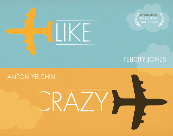


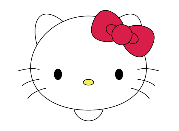


e.jpg)
e.jpg)
.jpg)
e.jpg)
a.jpg)
e.jpg)
e.jpg)
e.jpg)
.jpg)
.jpg)
.jpg)
a.jpg)
.jpg)
.jpg)
a.jpg)
.jpg)
a.jpg)

.jpg)
.jpg)
.jpg)
.jpg)
.jpg)
.jpg)
a.jpg)
a.jpg)
.jpg)
e.jpg)
.jpg)
a.jpg)
.jpg)


