I want to show you how to create a summer-inspired illustration: a cute little girl eating a watermelon. As usual, you will use basic
shapes as well as the Brush Tool to create the flowing hair. In this
tutorial, I will show you the easiest way to draw the hair, but if you are already pretty good at this and want to learn more, please check out this special tutorial.
1. Drawing the Head and the Face
Step 1
We will start from the head. Using the Ellipse Tool (L),first draw an
ellipse with the fill color shown in the image below. Then draw a
smaller ellipse for the eye, and rotate it a little to the left. Now,
draw an even smaller circle for the pupil of the eye.
After that, make a
reflection to create the right eye. To make a reflection, you
will need to select the whole eye and, using the Reflect Tool (O) while
holding down the Alt key, click the middle of the head. Then check Vertical and press Copy. Make sure that the eyes are in the middle of the head. That’s it for now.
Step 2
Let’s create the mouth. Start with a long ellipse. While keeping it
selected, using the Convert Anchor Point Tool (Shift-C), click on the
right and left anchor points to make them sharp. Continue to keep them
selected and go to Effect > Warp > Arc. In the new dialogue
window, enter the options you see in the image below:
Step 3
Place the mouth in the correct place.
Step 4
Make a copy of the mouth and adjust the Warp Options—this will be the nose. Place the nose in its place.
Step 5
Draw an ellipse for the blushing cheek. Rotate it a little to the right
and then make a reflection of the left cheek to create the right cheek.
Step 6
Using the same fill color, draw few circles around the nose—these are the freckles.
Step 7
Create a copy of the nose, expand it (Object > Expand Appearance) and
using the Eye Dropper Tool (I), take the fill color from the center of
the eye—this will be the eyebrow. After creating the left eyebrow,
rotate it to the left. Then make a vertical reflection to create the
right eyebrow.
Step 8
Two ellipses with the same fill color as the face will finish the face by adding the ears.
2. Drawing the Hair
Step 1
To draw the hair, first let’s create the base as shown in the image below.
Using the Eye Dropper Tool (I), take the fill color from the center of
the eye.
Step 2
Before we start drawing the hair, we need to create a special brush. Draw a
long, narrow ellipse (R=53 G=61 B=51). Drag it to the Brushes panel to create the new brush, set Colorization MethodTints and press OK.
Step 3
Now, let’s take this brush and draw the hair. You can increase or decrease the Stroke Weight, whatever suits best.
Step 4
Reduce the Stroke Weight, make the stroke color lighter (R=83 G=83 B=72), and draw more hair.
Step 5
Reduce the Stroke Weight once again, make the stroke color darker (R=16 G=17 B=16), and draw the hair once again.
3. Creating the Floral Wreath
Step 1
Remove the stroke color and set the fill color to R=239 G=236 B=230.
Take the Rounded Rectangle Tool and draw a few lines—two or three are
enough.
Step 2
Now for the flower. Set the fill color to R=247 G=245 B=240 and draw an
ellipse. Hit the Rotate Tool (R) and while holding the Alt key, press on
your artboard under the ellipse.
In the new Rotate window, enter Angle
72 degrees and press Copy. Keep pressing Control-D to repeat your last
movement, until you complete the flower. Place a yellow (R=255 G=229
B=130) circle in the middle to finish off the whole flower.
Step 3
Make different sizes of the flower, and spread the flowers throughout the head.
Step 4
Once you have an ellipse, fill with R=115 G=145 B=80. Pick the Convert Anchor Point Tool (Shift-C) and make sharp anchor points. You’ll
get a simple leaf shape.
Step 5
Create several copies of the leaves, make them different sizes, and place them under the flowers.
4. Creating the Cherries
Step 1
Three different circles placed as in the image below will make up the cherry.
Step 2
Put two cherries close to the girl’s ear. Using the Eyedropper Tool (I),
take the color from the leaf, but make it a stroke color. Using the
Pencil Tool (N), draw the stems connected to the cherries.
Step 3
Create a vertical reflection of the cherries for the other side.
5. Creating the Watermelon
Step 1
Draw two red ellipses which are overlapping each other. The upper
ellipse has to be over the circle. On the Pathfinder panel (Window >
Pathfinder), press Minus Front and you’ll get the watermelon base shape.
Step 2
To create the effect of a bitten watermelon, draw small circles over the
previously created shape. And press Minus Front in Pathfinder again.
Step 3
To make the rind of the watermelon, create a copy of the previously
created shape and place it behind the original shape (Control-C,
Control-B). Change the fill color to R=215 G=234 B=195 and stretch it
down little bit. We’ll do this once again, but this time, apply the color R=115 G=145 B=80. Don’t forget to stretch it down.
Step 4
For the watermelon seeds, we will make them like water drops. Set
the fill color to R=53 G=61 B=51. Draw an ellipse. Make the top anchor
point sharp using the Convert Anchor Point Tool (Shift-C). Then move the
left and right anchor points down.
Step 5
Spread the seeds over the watermelon.
Step 6
And give it to the girl.
6. Creating the Hands
Step 1
We’ll start with an ellipse and a circle to create the finger. Select
the whole finger and move it to the right. Press one more time, Control-D, as you did with the flowers before.
Step 2
Rotate her right hand and put it on the watermelon. Reflect the right hand to create her left hand.
Step 3
Now for the sleeve. On the ellipse, move the right and left anchor points down.
Step 4
Rotate it to the right and place it under the hand. Then create a vertical reflection of it to create the other sleeve.
Step 5
To make the body, simply make a copy of one of the sleeves and make it
wider. Place it under everything (Control-X, Control-B), and that completes
the body of the girl.
Step 6
We can also decorate the shirt of the girl by drawing a few navy blue (R=76 G=84 B=107)
stripes. Make one more copy of the body in front (Control-C, Control-F), and while keeping it selected, select the stripes. Press Crop in
Pathfinder. Don’t take out this selection, and go to Object > Path
> Clean Up. Make sure that all the small squares are checked and
press OK.
7. Creating the Background
Step 1
Create a gray square behind everything (Control-X, Control-B), 600px width and height. Draw in a darker circle inside.
Step 2
Place the girl in the middle of the circle. Try to put her head inside the circle; the body will overlap the circle a little bit.
Step 3
Create a copy of the background circle (Control-C, Control-F), and while
keeping it selected, select the whole girl. Or you can select
everything (Control-A) and uncheck the background square. Then go to Object > Clipping Mask > Make. Now the girl should be inside the
circle.
Conclusion
Tadaa! We are done. You completed a huge task! Maybe you learned
something new, maybe you practiced what you already knew, but I’m sure you enjoyed it!
Pirot kilims are made with some of the most beautiful
traditional Serbian design motifs. The figures all bear colorful names like
Devil’s Knees, Tulip, Turtle, Queen’s Sleeve, Hook, Snail, or Mirrors, but are
mostly variants of branched geometric forms made with straight and diagonal
lines. The predominant traditional colors are black, red and white, but other
primary colors can also make an appearance.
Here’s how you make one of your own using Adobe Photoshop.
1. Choose Your Elements
Step 1
First, grasp the basics. There are five traditional parts to the
Pirot kilim—from the outside working inwards, they are the Tassels, the Outer Frame, the Border, the Inner Frame, and the Field. The outer and inner frame are
usually single-colored, and the border and field are the most ornate and
decorated parts of the kilim.
In the image below, the Tassels are white, the Outer and Inner Frame are both black, the Border has a white background with red and blue decorative motifs, and the Field is the decorated rectangle in the middle, with a red background and black and blue motifs.
Step 2
Kilim layouts are based on various plays between straight and diagonal lines. Choose one of these traditional layouts for your kilim, or
mix, match, and modify them to create your own.
Step 3
Choose the motifs you want to use in your kilim. It’s best
to choose a few varying sizes and complexities to ensure you can make a
balanced and dynamic layout.
The motifs are mostly highly stylized geometric interpretations of the natural shapes of flowers and animals. All are formed by patching together combinations of rectangles and triangles, and after practicing on the six examples given below you’ll be able to easily create your own by following the same principles.
The figures shown below are:
Top row left to right: Devil’s Knees, Turtle, Eyeglasses
Bottom row left to right: Octopus, Dining Table, and Frog
Step 4
Decide on your colorway. Traditionally, the inner and outer
frame are both black, the border is white, and the center field is red—anywhere from light crimson to deep cherry red. Blue, yellow and
green also often make an appearance. Of course you could always decide to part
with tradition and go crazy.
Here are four colorways pulled from traditional Pirot kilim designs—I’ve given you a framework of five colors to start from, but you can always add more as you work. You can see that all the colorways share some similarities—black and red almost always make an appearance, followed by shades of white or cream. These three colors are very characteristic for Pirot kilims.
Other colors, mostly primary tones like blue, yellow and green, usually appear in the details. In spite of using very limited palettes, it’s possible to achieve a great deal of variety in kilim design.
2. Create the Motifs
Step 1
Most of the motifs are geometrical and have some symmetry,
so we’ll make one part and then use the Edit >
Transform >
Rotate, Reflect, or Flip commands to create them. Let’s start with the Dining Table, which is
fairly simple.
Make the Dining Table Base
To make the traditional Sofra or Dining Table motif, we’ll start with a long vertical rectangle. You can just drag the Rectangular Marquee Tool into the approximate shape, and then fill it with your foreground color by clicking Alt-Delete, or with your background color by clicking Control-Delete.
Next, we’ll make an equilateral triangle whose hypotenuse is somewhat shorter than our initial long rectangle, and position it as shown in the middle image. Click Control-J to make a new copy of the layer with the triangle, and then click Control-T to access the Free Transform Tool. When the Free Transform Tool commands appear, hover your mouse cursor over one of the corners of the Free Transform Tool Bounding Box, and hold Shift and drag inwards to slightly reduce the size of your triangle.
Keep making smaller triangles and layering them as shown in the image on the right.
Complete the Dining Table Motif
We want to stack a total of six progressively smaller triangles to complete one side of our Dining Table motif. As your triangles get smaller, you will want to increase their height slightly, by using the Free Transform Tool to draw out the vertex facing right—the one that isn’t touching the hypotenuse. Otherwise as the triangles get smaller, the steps of your Dining Table will grow shallower and shallower.
Once you’ve got six triangles nested inside each other, merge all the parts of your Dining Table together by going to the Layers Panel, clicking on the Layer thumbnail of the Layer with the long vertical rectangle, and then holding down the Shift key and clicking on the Layer thumbnail of the Layer with the smallest triangle. This should select all the layers you used to make the Dining Table. With all the layers selected, click Control-E to merge all the selected layers.
Once you have a single layer, use the Zoom Tool to come closer to your design and use a Hard Round Brush at a small size setting to soften the angles of your motif and make it look more organic.
Click Control-J to duplicate your new merged layer, and then go to the top menu and choose Edit >
Transform > Flip Horizontal to create the second half of the Dining Table. Align the two halves as necessary using the arrow keys, and merge them together once more.
Decorate the Dining Table Motif
The Dining Table motif is usually decorated by a few smaller versions of the same motif inlaid into its center in different colors. Instead of copying your original motif and shrinking it down, rather make new motifs with a smaller number of zig-zag steps—four and two, instead of the original six. Optionally at the end you can add a small vertical rectangle in the color of the original motif, to tie the pieces together.
And it’s done!! You’ve made your very first traditional Serbian Pirot kilim design motif!! Now that you’ve mastered the basic principle, the rest of them will be easy.
Step 2
The second figure we’ll make is the Frog.
Make the Frog Base
To make the Frog, start with a chubby rectangle using the Rectangular Marquee Tool. Next, make an equilateral triangle whose hypotenuse is somewhat shorter than the width of your base rectangle, and position it as shown in the middle image.
Then we need two smaller, long and narrow rectangles, angled at 45 degrees. You can either make them upright using the Rectangular Marquee Tool and then use the Free Transform Tool to rotate them into place, or you can just use the Polygonal Lasso Tool to draw them at an angle. There is no need to be overly precise, since original kilim designs gain softness and beauty of form from their imperfections. Slight irregularities will help us simulate a hand-made look.
Complete the Frog Motif
Click Control-J to duplicate the layer with the two thin rectangles, and then use Edit > Transform > Flip Horizontal to create the right side of the Frog. When both sides are merged, add little triangles onto the ends of the Frog’s legs, as shown in the middle image. They should be facing outwards, like little arrow heads pointing left and right.
When all the triangles are in place, merge all the Frog layers together and soften the hard angles using the Eraser Tool and the Hard Round Brush Tool.
Decorate the Frog Motif
The top part of your Frog is done, so you can use Edit > Transform > Flip Vertical to create the bottom part of the Frog. The Frog is usually decorated by a hexagonal frame which is filled with two colors that meet in a sort of thunderbolt line. I suggest using the Hard Round Brush Tool to draw the hexagonal frame, then creating a layer beneath the frame and painting in the desired colors. And your Frog is done!
Step 3
Now let’s make an Octopus.
Make the Octopus Base
To make the Octopus, start with an upright equilateral triangle. If you’re having trouble making a nice-looking triangle, make any sort of triangle you like using the Polygonal Lasso Tool.
Use the Rectangular Marquee Tool to cut off its bottom portion so you’re sure it’s straight. Then make a copy of your triangle using Control-J, use Edit > Transform > Flip Horizontal to flip the copy, and move the copied layer so the top vertices of the two triangles overlap. You now have an equilateral triangle. If you don’t like its angle you can use the Free Transform Tool by clicking Control-T and dragging the tip of the triangle to the desired height.
Next you want to add four very thin horizontal rectangles over your triangle. Space them out evenly: one just above the triangle base, one just under its tip, and two more in the middle. At the end of each ‘arm’ add another little triangle. These are the Octopus tentacles.
Complete the Octopus Motif
Make sure all your little triangles are on a single layer, and then use the Eraser Tool and the Hard Round Brush Tool to soften them a little before you copy them over to the other side. When they’re done,click Control-J to duplicate the layer and use Edit > Transform > Flip Horizontal to create the tentacles for the right side of the Octopus.
Merge everything and soften any remaining hard angles, then make a new copy of the layer and use Edit > Transform > Flip Vertical to complete the Octopus shape.
Decorate the Octopus Motif
The Octopus is usually decorated by painting the tips of the little triangles at the ends of its tentacles, as well as adding a diamond-shaped field of color in its center. This field can then be decorated by any small figure—one option is to draw a horizontal letter ‘H’ in one color, and then add a tiny two-step ziggurat in another color to each side of the ‘H’. And now you have an Octopus.
Step 4
Next we’ll make some Eyeglasses.
Make the Eyeglasses Base
To make the Eyeglasses, we will use nothing but long, thin rectangles. You can make them using the Rectangular Marquee Tool and approximate the lengths. Stack them as shown in the three figures below.
Complete the Eyeglasses Motif
Add three more layers to both sides of the Eyeglasses, and then merge everything together and soften the sharp corners using the Eraser Tool and the Hard Round Brush Tool. When the lines look natural, use Edit > Transform > Flip Vertical to create the bottom part of the Eyeglasses. Merge everything and we’re ready to add some color.
Decorate the Eyeglasses Motif
The Eyeglasses are usually decorated by filling in their center, using their outline as a guide. You can fill them with one or more colors. Traditionally Eyeglasses are often accompanied by small flecks that resemble seeds or teardrops—one fleck between the two ‘lenses’ of the Eyeglasses and three flecks in a triangular formation between two motifs.
Step 5
Let’s make a Turtle.
Make the Turtle Base
Shockingly, the Turtle motif actually ever so slightly resembles a turtle, as opposed to all the other traditional Pirot kilim motifs.But it starts at an unlikely place—from two long, thin rectangles.
The bottom rectangle should be almost three times longer than the top one. Then make an upside-down triangle with a hypotenuse somewhat wider than the small rectangle on top of it. The hypotenuse of the triangle should touch the bottom edge of the top rectangle, and the tip of the triangle should lie just beyond the bottom rectangle, as shown in the middle image below.
Add one more triangle, a little bigger than the first, but cut off its top third by selecting it with the Rectangular Marquee Tool and pressing Delete.
Complete the Turtle Motif
Next we want to add two little antennae at an angle of approximately 45 degrees on each side of the short top rectangle we started out with. In the middle image I’ve drawn frames to show you how the little rectangles are stacked to form the final shape. At the end of each antenna is a little upside-down triangle with its tip cut off. Merge everything together and soften the sharp corners using the Eraser Tool and the Hard Round Brush Tool.
Decorate the Turtle Motif
Once we use Edit > Transform > Flip Vertical to create the bottom part of the Turtle, we can start to see the resemblance (sort of). The antennae we made are the turtle’s feet, and the central part can be decorated with a nice hexagon that represents the shell.
I suggest drawing the hexagon with the Hard Round Brush Tool so it has an organic feel, rather than perfectly straight lines. The shell can further be decorated with a smaller variant of the Dining Table motif.
Step 6
Let’s tackle our biggest challenge: the Devil’s Knees motif. It got its strange name from the many kinks and twists it forms.
Make the Devil’s Knees Base
We’ll start with three long, thin rectangles of varying lengths—the middle one should be the longest, and the bottom one is the shortest. Next, we will use three progressively smaller triangles to connect the middle and top rectangles, as shown in the middle and right images below.
Complete the Devil’s Knees Motif
Make a new triangle facing in the opposite direction and use it to connect the bottom rectangle to the rest of the figure. Then add small rectangles at 45 degree angles as shown in the middle image below, and cap them off with small triangles, as shown in the image on the right.
Decorate the Devil’s Knees Motif
Once you’ve softened and rounded the corners on the figure, you can use Edit > Transform > Flip Vertical to complete it. Decorations for the Devil’s Knees can be made by drawing large triangles into the top and bottom of the motif, and some smaller triangles into its center, as shown in the image below.
This is the largest and most complex motif we’ve made, but as you can see they all use identical simple techniques and very basic shapes that stack together in different ways to produce variety. You are now ready to start playing with rectangles and triangles to make your own kilim motifs.
3. Create the Frames and Supporting Motifs
Step 1
Let’s make some frames for your kilim.
Simple Frame Designs
As we mentioned at the start, each kilim layout traditionally has two frames—one frame that goes around the entire design, and one that separates the thick decorated border from the central field.
Since both the border and the field carry lots of pretty decorations, the borders are usually made in a single color (often black), to help visually separate the border from the field. The frames can be straight lines, or they can form simple patterns like these:
More Complex Frame Designs
Kilim frames can also have slightly more elaborate designs, like the two shown below. The design on the right is particularly interesting because it creates the illusion of two interlocking patterns holding on to each other. These borders are slightly more elaborate, but still consist of basic geometric shapes, and are easy to make following the steps below, from top to bottom.
Step 2
We need some smaller motifs to fill in the gaps between the larger ones we’ve made. Here is a selection to choose from, and you can also create your own.
Each of these filler motifs was created by stacking together a few rectangles and triangles, and then smoothing over the sharp corners.
4. Put Together Your Kilim Design
This is it! You’ve learned about the different parts of the kilim, you’ve considered different layouts, you’ve created a bunch of main motifs, smaller filler motifs, and frame designs—now pick your favorite ones and put them together into an awesome Pirot kilim!
You can either start from the Outer Frame and work your way inward towards the Field, or you can first design the Field and then add frames and borders around it. Don’t forget that your border and frames don’t need to be the same all around—you can make them simple lengthwise and elaborate on the sides, or the opposite.
Kilim making is all about spontaneous and ever changing design, so the only hard and fast rule is the rule of thumb—if it looks good to you, it’s good!
Here’s my kilim below—I’d love to see what you come up with!
And Just Like That, You Have a Kilim!
Here’s a closer look at those details—TA-DAAAH!
If you would like to learn a little more about traditional Pirot kilim design, check out these handy resources:
The Pirot Kilim website shows a nice gallery of designs, but also gives some background information on their history and origins in English.
The Lady’s Heart is a traditional artisan store that specializes in the creation of kilims and other items with traditional Pirot designs. The website is in Serbian only, but the gallery shows some beautiful examples to inspire you.
In this
tutorial we’ll create a set of flat icons
for Apple Watch that can be found on the original Apple Watch Home Screen menu by
default. We’ll be using basic shapes and Warp Effects as well as some more
complicated methods of making a trendy user interface design. Let’s get started!
1. Apple Watch Icon Guidelines
Apple Watch
icons are designed in a trendy flat style very similar to the iOS icons, which
can be found in the latest iOS on iPhone, iPad or other Apple devices. Yet
there is a noticeable specific feature: the icons are round. In this tutorial
we’ll be using a round grid to create a single base for every icon. You can download a very nice icon template in vector to make it easier to work with.
Now its
time to move on and create the Apple Watch icons! If you want your icons to
be more pixel-perfect and true to life, like the original Apple Watch icons, you
can find a sample image of the Apple Watch Home Screen in Google Images. File > Place it onto your Artboard and use it as a template, drawing your icons on top of
it, preserving the desired sizes and proportions. Otherwise, just follow this
tutorial as an inspirational guide, not as a strict instruction on creating exact copies of the original icons.
2. Create
the Time, Mail and Music App Icons
Step 1
Start by
opening one of the icon templates (for this tutorial we’ll be using the 80 x 80 px icon template for 38 mm watch). Go to View > Hide Grid to make the grid
invisible if it distracts you, but be sure that you have the Smart Guides and Snapping enabled (you can find them in the same menu) to make it easier to work
with.
Step 2
Let’s start creating our first icon for the Time app by placing a 4 x 4 px
even circle in the centre of the template. Double-click the Ellipse Tool (L) to call the pop-up
options window, and then head to the Align
panel to align the circle horizontally and vertically on the Artboard. Fill the
circle with orange (#FF9506).
Step 3
Use the Rectangle Tool (M) to create a 2 x 40
px second hand of
our clock, filled with the same orange color, and place it along the central
Guide line, as shown in the screenshot.
You can align the
hand to the Key Object, by clicking
the circle while holding down the Alt key.
Step 4
Let’s copy
the second hand, make it shorter and rotate it to –60 degrees, placing it along the Guide, as shown below.
Now we’ll form the body of the minute hand.
Make a black 4 x 30 px rectangle and use the Live Corners feature to make both
ends rounded by pulling the small circle markers with the Direct Selection Tool (A) to their maximum (2 px corner radius in our case).
Step 5
Place the hand on the proper place along the guide line (you can
make it a bit smaller, so that it fits the inner circle of the icon base).
Step 6
Create another rectangle of 4 x 20 px size for the hour hand. Make it rounded, rotate
to 60 degrees and place it on the
opposite side from the minute hand.
Step 7
Finally, create an 80 x 80 px white ellipse with the Ellipse Tool (L) for the icon base and place it beneath all
other objects. Great! Our first icon is ready; let’s move to the next one.
Step 8
Now we’ll create the Mail icon. Start
forming the envelope by making a 50 x 33
px rectangle of any color.
Add a
triangle with 2 pt Stroke either
using a Polygon Tool with 3 Sides value or with the Pen Tool (P). Object > Expand the
triangle to turn it into curves.
Step 9
Add another triangle on the upper side of
the envelope base, make its lower corner rounded, and expand the shape. You can erase the top
and bottom parts of the rectangles with the Eraser Tool (Shift-E), as we won’t need them.
Delete the
top part of the lower triangle with the Eraser
Tool (Shift-E) and Unite both
parts of the triangles in Pathfinder. Finally,
make a copy of the basic envelope shape (Control-C
> Control-F), select both the rectangle and the top shape, and use the Intersect function of Pathfinder to cut off the parts outside the envelope.
Step 10
Select the rectangle and the stripes again
and apply the Minus Front function
of Pathfinder to cut out the lines.
Switch the color of the envelope to white and add a circle base for our icon,
filling it with linear gradient from darker blue (#2066F0) on top to lighter
blue (#1DD4FD) in the bottom.
Step 11
Our next icon is for the Music app, which
consists of the only element: a music note sign. Start forming the note with a 27 x 11 px rectangle. Select the anchor points on the left side of
the shape with the Direct Selection Tool
(A) and drag them down to make the shape skewed.
Step 12
Use the Rectangle Tool (M) to create two
more shapes and start forming the “leg” of the note.
Step 13
Select three anchor points of the lower
square with the Direct Selection Tool
(A) and make them rounded. Then Unite
the shapes in Pathfinder and make
the corner between the shapes rounded as well, using the Live Corners feature.
Step 14
Add the second part of the note and make
the overall shape more smooth and rounded. Finish up with the icon by making
the base, filled with linear gradient from orange (#FA5D3B) to pink (#FF2968).
3. Render the World Clock, Stopwatch, Timer
and Alarm Icons
Step 1
Now we’re moving to a set of icons connected with time, and all created in a single style. Start by forming a 48 x 48 px even circle, and a smaller
circle inside. Use the Minus Front
function of Pathfinder to create a
ring.
Step 2
Create a smaller, elliptical ring inside
the first shape and add two crossed lines, aligned to the centre.
Add a horizontal line in the upper part of
the shape and bend it with the help of Effect
> Warp > Arc. Set the Horizontal
Bend value to –35%.
Step 3
Add another
bent line in the bottom part of our globe and finish up with this icon by
expanding the globe shape and forming a gradient base with dark-orange bottom
(#ff7632) and light-orange top (#ff9408). Add a smaller circle of darker
orange color (#e45221) and hide it behind the globe shape, giving it more contrast.
Step 4
For our
next icon—the Stopwatch—we’ll use the base from the World Clock icon that
we’ve created previously. Form the center of the stopwatch by making a 8 x 8 px ellipse, aligned with a 2 x 25 px rectangle for the watch’s second-hand.
Step 5
Use the Rectangle Tool (M) to add minor details
to the top of our stopwatch. Make the button of the stopwatch more rounded,
using the Live Corners and setting the corner radius to 1.4 px.
Step 6
Let’s move
on to the Timer icon—it has the same base as the Stopwatch icon. Form a 2.5 x 13 px stripe in the center top part
of the ring with the Rectangle Tool (M). Then grab the Polygon Tool,
setting the Sides quantity to 3, or use the Pen Tool (P) to form a triangle. Place it as show on a screenshot
below, as if it’s a slice of a pie.
Step 7
Select both
the basic white ring and the triangle shape and use the Minus Front function to cut out the left part of the ring. Add a
small 6 x 6 px circle in the center of
our icon.
Step 8
Finally,
rotate the circle so that its upper anchor point is about 45 degrees to the left. Drag the anchor point with the Direct Selection Tool (A), extending
the shape. Convert selected anchor point
to corner either with the help of the Convert
button in the upper control panel or by clicking it with the Anchor Point Tool (Shift-C), thus
turning our shape into the hand of a watch.
Step 9
Our last
icon in this set is the Alarm. It has the same base with the white ring as
previous orange icons. The hands of the clock are formed with two narrow
stripes made with the Rectangle Tool (M).
Step 10
Let’s form
the upper part of the alarm clock by making an even circle with the Ellipse Tool (L) and dividing it into
two equal parts by clicking the side anchor points with the Scissors Tool (C). Place the halves on
top of the alarm, and add two small “legs” in the bottom to finish up the icon.
4. Create
the Maps, Weather and Camera App Icons
Step 1
The Maps
icon is rather simple and contains not so many elements. Start by forming its
center with a 40 x 40 px circle of a
blue (#087eff) color. Form a compass arrow from a 17 x 25 px triangle, heading up.
Step 2
Add a beige
(#e5decb) icon base. Go to Object >
Path > Add Anchor Points andselect
the anchor point in the middle on the bottom side and pull it up a bit, forming
the arrowhead.
Step 3
Place a wide
vertical stripe, made with a 26 x 83.5 px
rectangle, across the icon, and unite it with another wide stripe, placing it
perpendicular. Hide the crossed shape behind the blue circle with the arrow.
Select both the base of the icon and the crossed stripes and use the Divide function of Pathfinder to split the shape into three parts.
Step 4
Fill the
parts of the icon base with green (#78c73d) and light-pink (#fbc7d2) colors.
Step 5
Let’s move
to the Weather icon. Fill the basic sky shape with linear gradient from darker
blue (#2066f0) on top to lighter blue (#1dd4fd) in the bottom. Add a yellow
(linear gradient from #ffc505 to #fee403) circle for the sun in the left part
of the icon. Start forming the clouds with two circles: a 25.5 x 25.5 px circle in the center of the template and a 21 x 21 px circle closer to the right
part of the icon.
Step 6
Create a 43 x 16 px rectangle and make its corners
rounded with 8 px corner radius.
Align the rectangle with the circles and Unite
all three shapes in Pathfinder to
form a smooth, rounded cloud.
Step 7
Fill the
cloud with white color and make it semi-transparent, lowering the Opacity to 90%.
Step 8
Let’s move
on to the Camera icon. Make a grey basic circle, filled with linear gradient
from dark grey (#8e9196) in the bottom to lighter grey (#dadcdd) on top, and
start forming the camera silhouette from a dark-grey (#3c3c3c) rounded
rectangle.
Add a smaller 30 x 17 px
rectangle on top and make its upper left corner rounded with 7 px corner radius. Unite the shapes and make the corner
between the shapes rounded as well.
Step 9
Add a
narrow stripe in the upper part of the camera and use the Minus Front function to cut it out.
Form the
shutter icon from a 9 x 4 px
rectangle, and place it in the center of our template. Use the Pen Tool (P) to add an arrow pointing down at the shutter. Set the Stroke Weight to 4 pt and make the caps and corner of the line rounded in the Stroke panel.
Step 10
Add the
final details to our camera: form a bright-yellow (#fac81b) indicator of a 6 x 6 px size. Further, create a big circle with 4 pt Stroke Weight. Place the circle in the bottom right corner of the
camera, as shown in the screenshot.
Step 11
Object > Expand the big circle, turning it into the ring.
Select both the ring and the camera and apply Minus Front to cut out the ring, forming the object-glass. Then
select all the dark-grey parts of our camera and turn them into a single
compound shape by pressing Control-8.
Finally,
use the Shape Builder Tool (Shift-M)
or the Intersect function of Pathfinder to cut off the unneeded
parts of the camera outside the base of our icon.
5. Make the
Phone, Messages and Remote App Icons
Step 1
Let’s make
a handset for the Phone icon. Create an 8 x 40
px rectangle and use an Arc Warp Effect
with 27%Vertical Bend value to bend the rectangle to the left side. Add two 17 x 20 px rectangles in the top and bottom parts of the handset and make their
corners rounded, making the shapes smooth. Unite
all parts of the handset in Pathfinder.
Step 2
Smoothen the left side of the handset by deleting the
unneeded anchor points with the Delete Anchor
Point Tool (-) and round the inner corners with the Live Corners feature.
Finally, rotate the phone to 45 degrees and place it above the icon base,
filled with linear gradient from lighter green (#86fb71) to darker green (#0fd51c).
Step 3
Let’s form
the Message icon on the same green base that we’ve used previously. Make a 40 x 40 px white circle and extend it to
the sides a bit, making the shape squashed to 48 x 40 px. Add a tiny triangle in the bottom of the white shape,
forming a speech bubble. Make the lower corner of the triangle slightly
rounded. Use the Arc Warp Effect
with -36% Vertical Bend value to
make the triangle slightly arched.
Here’s how
the completed icon looks.
Step 4
Our next
icon is the Remote app icon, which is also very simple and consists of a
single element. First of all, form a gradient base (from dark blue #2066f0 in
the bottom to lighter blue #1dd4fd) on top. Add white stroke with 5.3 pt Stroke Weight and Align it to Inside. Place a 30 x 30 px
white triangle in the center of our icon.
Step 5
Finally,
make the corners of the triangle rounded with a 2.5Corner Radius. Great! The icon is ready, so let’s move on.
6. Create
the Workout, Settings and Photos App Icons
Step 1
The Workout
icon depicts a stylized silhouette of a running man. Create a bright icon base,
filled with linear gradient from yellowish-green (#c2ec38) on top to green in
the bottom (#a3fc3f).
Take the Pen Tool (P) and create separate lines
for the bent arms, legs and torso with 3
pt Stroke Weight and rounded caps and corners. Increase
the thickness of the Stroke Weight of the torso line to 6 pt and add a 9 x 9 px circle for the head.
Step 2
Object > Expand the lines and fill the shapes with black
color.
Step 3
The
Settings icon consists of a cog. Form the cog base from a 48 x 48 px circle with a cut-out center, making a ring. Add three lines
with 3 pt Stroke Weight, connected
in the center of the icon template.
Step 4
Now we need
to add the ripples to our cog. Form a 5 x 9
px rectangle and make its upper part a bit narrower. Make its upper corners
rounded with 1.6Corner Radius.
Place the ripples on the top and bottom parts of the cog base.
Let’s use the Rotate Tool (R) to add more elements. Select
both ripples, double-click the Rotate
Tool (R) to call the pop-up options window, and set the Rotate value to 360/18.
This way, Adobe Illustrator will automatically calculate the proper value for 18 shapes. Press the Copy button.
Step 5
Press Control-D multiple
times to repeat our last action, adding more elements. To finish up with this
icon, select all ripples, switch the fill color to white and Rotate them all together by –10 degrees.
Step 6
Our next
icon is a stylized flower for the Photos app. Start by forming the petal from a 20 x 30 px rectangle and make its
corners rounded with 10 pxCorner
Radius. Duplicate the petal and place its copy in the bottom part of the icon
template, as shown in the screenshot below. Select both petals and use the Rotate Tool (R) to make eight more copies of the petals, by
applying the 360/8 Angle value and
pressing the Copy button.
Step 7
Press Control-D several times to form the eight-petal flower. Switch the petals to Multiply
Blending Mode and lower the Opacity to 80%. Let’s apply the
appropriate color to each petal, starting from the top middle one and moving
clock-wise: orange (#fa9700), yellow (#f0e22c), green (#b5d558), turquoise (#6ec19d),
blue (#71b5e1), violet (#8f60c3), pink (#d782a4) and red (#ff2c2c).
Put the
flower on the white icon base.
7. Render
the Stocks, Activity, Passbook and Calendar Icons
Step 1
The Stocks
icon consists of a minimalist diagram. Start forming the diagram by making a
bright-blue (#02a6f5) vertical line of 3
pt size with the Line Tool (\).
Place it in the middle of our template, on a dark (#3f3f3f) icon base.
Add a
small blue circle above the middle of the template and apply a dark-grey (#3f3f3f) 1 ptStroke to it in order to separate it visually from the line. Add four more lines on the both sides of the icon, with a lighter-grey (#555555) 3 pt Stroke.
Object > Expand the
lines and cut off the unneeded parts outside the icon base, either with the Shape Builder Tool (Shift-M) or with
the help of the Pathfinder.
Step 2
Finish up
with the icon by adding a zigzagged line with 1.5 pt Stroke for the graphic using the Pen Tool (P). Expand the line and make it fit the icon base.
Step 3
The
Activity icon is more complicated and interesting to make. It consists
of three colorful gradient circles. To form such a circle, first of all we need to
make a Blend Group.
Make two
equal 6 x 7 px rectangles of pink (#ff2b91)
and red (#f1281e) colors. Select the rectangles and go to Object > Blend > Make. You can edit the settings in Object > Blend > Blend Options,
applying Smooth Color to make a nice
seamless blend. Drag the created blend group to the Brushes panel and create a new Art
Brush with default settings.
Step 4
Create a
dark-grey (#393839) circle base for our icon and place another circle on top of
it, applying our brush as a Stroke.
Adjust the size of the circle, so that it fits the outer edge of the icon
template. Set the Stroke Weight to 1
pt and Object > Expand Appearance to turn the brush stroke into ashape.
Rotate or flip the shape with the Reflect
Tool (O) horizontally, if needed, so that we have the pink side of the
circle on the left and the red on the right.
Create a small pink (#ff2b91)
circle and place it in the top central area of the colored ring, so that it
fits the height of the shape, hiding the connection of the two colors.
Step 5
Now we need
to add dimension to the ring by forming a subtle shadow. As you may notice, the
ring became divided into several parts after we expanded it. This is exactly
what we need! Select the top red piece of the ring, copy it and Paste in Front
(Control-C > Control-F). Fill the copy with linear gradient from
dark red (#a11b17) to white, and switch to
Multiply Blending Mode, thus making the white tip of the gradient
invisible.
Step 6
Use the
same technique to create two more colorful rings inside the first shape. Create
the art brushes from a yellow (#d8ff06) and green (#86e402) blending group and
from a turquoise (#06ffaa) and blue (#06e3f9) blend. Finish up with the icon by
adding circles and applying gentle shadows.
Step 7
The next is the Passbook icon, which consists of four tiny pictograms: a
credit card, a plane, a movie camera and a coffee cup. These pictograms are
minimalistic and made of basic shapes with the help of Pathfinder and Live
Corners feature. Below you can see a step-by-step screenshot, showing how to
combine the shapes for each pictogram.
Step 8
The base of
the icon consists of four stripes of different colors: red (#ff4e46), blue (#439eca),
green (#3dca36) and orange (#ffa02b), each of 20
px height. Create a default 80 x 80 px
circle base for our icon and delete the unneeded pieces of the stripes with the
help of the Shape Builder Tool (Shift-M)
by selecting all objects and clicking the unwanted parts while holding down the Alt key.
Step 9
Form an
even 3.5 x 3.5 px circle, crossing the
top side of the orange stripe, and copy it to the right by holding both Alt and Shift and dragging the shape. Press Control-D
several times to make more copies of the circle. Then select all the copies and
turn them into a Compound Path by
pressing Control-8. Select thecircles and the orange stripe and
apply the Minus Front function to cut
out the holes, making the stripe perforated.
Finally, place
the pictograms that we created earlier and align them to the center of our
icon.
Step 10
The last icon of our set is the Calendar icon. It consists of text, made with Helvetica Neue font and a simple white icon base.
Great Job! The Apple Watch Home Screen Icons are Finished!
This was a long yet exciting quest! We’ve created a total of 20 Home Screen app icons, using basic shapes, warp effects and some tricks and effects. I hope you’ve enjoyed following this guide and found some useful techniques. Good luck with your designs!
This tutorial was originally published in November 2008 as a Tuts+ Premium tutorial. It is now available free to view. Although this tutorial does not use the latest version of Adobe Illustrator, its techniques and process are still relevant.
We’re going to illustrate a map. A fairly simple directive, but before we go any further we need to establish why we’re illustrating it. By illustrating we’re going to give the final product personality, flair, a bit of life. We’re going to hope that the user is drawn into it, attracted to it, and that once we have their attention, they can use it.
In producing this map we’re not only illustrating, but also designing information graphics; finding that age-old balance between form and function.
A Little Disclaimer
As a basis for my map I turned to Google Earth and happily made as many screenshots as I liked. I traced them, referred to them for place names, street names, service information etc. and this is no problem whatsoever. I was even able to use photography from contributors far and wide who publish their shots on Google Earth via Panoramio. However, in order for me to use these images for web-based tutorials I needed to comply with certain guidelines.
In accordance with their fair use policy, screenshots of Google Earth can be used as long as I clearly display their logo and the appropriate copyright statement. For photography I would have needed express permission from the individual photographers, and for this reason, building photography I have used in this tut is my own, but be aware that Google Earth and Panoramio provide excellent image resources for projects such as this.
1. Location, Location, Location
Owing to the fact that I’ll be using a lot of my own imagery, I’ve chosen somewhere I once lived, Brielle (a town near Rotterdam in South Holland) as a subject. Of course, your subject will be of your own choosing, or better still that of a client brief. Wherever it may be, you’ll need as much visual reference as possible.
2. Determine Your Composition
It may be that you’ve been asked to include certain features or certain view points, or have been given precisely the area you need to focus on. Whilst deciding what your map will contain and from which angle it will be viewed, try again to consider the usability.
Most people feel naturally comfortable viewing a map with North pointing upwards (I’m not even going to begin on the subject of how men and women read maps differently!) so this would usually be a good starting point. However, if this angle looks as if it will present design problems such as vital roads being obscured, unfamiliar views of significant buildings, etc., try turning the view just off North. Your map will include a compass, so bearings shouldn’t be too problematic.
Below is the segment of Brielle which I’ve chosen to illustrate. North is currently upwards.
3. Prepare Your Map Image
You’ve taken a screenshot or you have your aerial photo of the subject, so now place it in Illustrator (File > Place…) on a suitably sized artboard (this illustration could get quite finely detailed, so work large). Click on the layer in the Layers panel, give it a name, lock it and determine that all images on that layer should be dimmed to 50% (or however dim you choose).
4. Lay Down Some Tarmac
It actually doesn’t matter where you start drawing your map. There are certain base elements which you’ll need to concentrate on, all of which will be distributed to individual layers for improved workflow. I’m going to begin with the streets, and then I’ll look at borders, water, buildings etc afterwards.
Use your Pen Tool and build simple paths along the street centerlines. Give them appropriate stroke weights as shown below. Again, to make your map informative and clear, use a limited number of stroke weights. Try to establish a standard whereby main roads have a thickness of (for example) 18 pt, minor roads have a weight of 12 pt, back streets a weight of 8 pt and so on. I’ve given my streets a pale shade of #F7F4E8.
5. Curves
Somewhere else I’d recommend you keep uniformity: the curves. By all means draw curves on your streets by hand, but by giving all street corners the same curvature you’ll make your illustration easier on the eye.
For example, in my drawing there’s a church which has a small road going right around it. I began by drawing a simple polygon with straight paths, and then I went to Effects > Stylize > Round Corners. In the Round corners dialog I entered a value of 4 mm, checking the effect by having Preview selected.
This curvature was appropriate for most of my street corners, so I could then apply it to other paths by selecting them and going to Effects > Apply Round Corners. Rounded corners of the same value were then applied to whatever I had selected.
6. Land
Once you’re satisfied with the streets you’ve drawn, the density of them, their thickness, curvature and color, make their layer invisible and create a third layer. Call it “Land” or something of that nature, and begin tracing the land outlines.
In the case of Brielle, there is a significant amount of water in the form of a moat; perhaps you’ll have rivers, a coastline, or perhaps regions which would form appropriate boundaries. I’ve given my land a color of #E8E1B4.
7. Check for Neatness
Having drawn a basic outline for the land, make your streets layer visible once again. As you can see in my case, the streets cross the water in two places and the land I’ve drawn underneath looks pretty scrappy. I now want to tidy that up and make sure the land runs parallel with the street at these points.
8. Tidy Up
Make a copy of one of the relevant streets and paste it onto your “Land” layer. Go to Object > Path > Outline Stroke.
Now go to Effect > Path > Offset Path and enter a value of your choosing (in my case 3 mm). Then expand it by going to Object > Expand Appearance.
Use the Direct Selection Tool to ensure no bits of land are sticking out from behind this newly made street path.
With the Pathfinder’s Add to Shape tool, combine your land with the new object. First give the new object the same color as the land; the resultant object will inherit the color of the uppermost contributing object.
9. Last Bits of Land
OK, take a good overall look at your land and streets, tidy up any straggly bits, and make sure it’s looking clear, uniform and tidy. Now you can add any secondary land elements (districts, regions, parks, etc.) which will have a slightly different color to distinguish them.
In my case I’ve highlighted the main shopping area and a park area surrounding the church. You can see I’ve also cut out a canal from my main land object. Next we’ll add some water to clarify what we’re looking at.
10. Flood
Add a new layer underneath your land layer and call it something recognizable. “Water” would be a good name—hadn’t thought of that, had you? Draw a rectangle covering a large enough area to cater for all your water, and give it a suitable blue color (#90C1D1 for example).
11. Labels
Depending on what’s needed for your map, now would be a good time to add some information. This is by no means a tutorial on Google Earth, but by checking Roads in Google Earth’s Layers panel you’ll highlight not only the roads, but their names too. Very useful. Use this information to label your own map.
12. Where the Streets Have No Name
Begin by duplicating the streets layer (for reasons which will become clear) and calling it “street names”. Now lock your “streets” layer to avoid confusion. Adding street names may be a little difficult to get visually right the first time; we’re going to vertically scale the map later and this may have unpredictable results, particularly with text intended to be legible.
Choose a typeface which you think appropriate for your illustration—should your choices be inappropriate you can change them later. I’ve used a Bold Trade Gothic on account of its condensed and legible form. You’ll also notice that I’ve set the Tracking to 75 to give more spacing between my letters.
13. Adding Street Names
You could simply choose to rotate and position your street names manually, but for extra fine control it’s advisable to use the Type on a Path Tool. You already have the necessary paths as you’ve duplicated your streets, so select the Type on a Path Tool, click on one of the streets, and enter a street name.
14. Type on a Path Options
Perfect! Right? Well, perhaps not. We’ll need to open the Type on a Path Options to organize things a little. With your street name text selected go to Type > Type on a Path > Type on a Path Options.
In my case, I’ve had to flip the text so that it’s no longer upside-down (this has also resulted in the text beginning at the opposite end of the path as it’s aligned to the left). I’ve also Aligned to the Center of the path, making the text run down the middle of the road, including around corners.
15. Position Your Label
Finally, by using the Direct Selection Tool you can position your text along the path by dragging the grab handles at either end.
16. Finishing the Street Names
When you’ve finished labeling all the streets you need, get rid of the excess paths which are no longer necessary. Select one of them and go to Select > Same > Stroke Color. This will select the streets which you haven’t needed to label. Press Delete and you’ll be left with just the street names on that layer. Give them whatever color suits your drawing. I choose a very dark blue (#07152D), nice and contrasting, but not black, which I try to avoid using.
17. Building Basis
Open a new document, or move to a part of your screen which is free from clutter; we’re going to draw an element which you’ll use repeatedly. In the following step you’re going to place building footprints all over your map, but for reasons which will become clear we need them to represent the rooftops. A simple rectangle split into four individual objects is what we’re after. Replicate what you see below using the Pathfinder panel, and group the four objects together.
This rooftop example represents a very simple roof and it might well be that your buildings have more complicated footprints. In this case you’ll need more elaborate rooftop shapes, which you’ll have to judge yourself.
18. Buildings
Create a new layer and call it “buildings”. On this layer we’re going to place… well, if you can’t work out what we’re going to place on this layer you probably haven’t made it this far. Make your “land” and “water” layers invisible to allow you to trace your screenshot once again.
Select a suitably visible stroke color for your building footprints and start to place the buildings you need in position. Duplicate your rooftop for each building, rotating and scaling them as necessary. At this point they needn’t be 100% perfect in terms of scale, but try to angle them correctly in line with whichever street or border they run parallel to.
19. Final 2D Features
At this point we’ve almost completed the two-dimensional elements of our map. Should you want any other labeling, contour lines, grids, rulers, or other elements, then now is the time to throw them onto your artboard. Before I start playing with dimensions on my map, I’m going to place a compass on it.
Illustrate your own, or download Peter Rempel’sPR Compass Rose font and install it on your system. This font contains plenty of compasses for placement on your map. I chose a fairly simple, but functional compass rose symbol, placed it on my Artboard using the Glyphs panel (Type > Glyphs), and then converted it to outlines using Type > Create Outlines.
Adding some letters, including a large N at the top, is all I needed to do to give users a sense of direction. Place your compass somewhere on your map; its exact position isn’t yet important, because it can be decided later.
20. Save!
You’ve completed all your 2D elements and therefore your basis is finished. In the coming steps we’re going to perform tasks which remove some of the editing capabilities from your illustration, so it’s a good idea to save what you now have as a separate file. Should you need to add or edit anything in the future, you can always refer back to the original. Go to File > Save As and call your file “Map 2D Basis” (or something like that).
21. Get Some Perspective
We’re now going to scale what we’ve made so far to give us our perspective (though actually, there will be no true perspective at all). We’re illustrating for informative purposes, so we won’t be using a vanishing point as the diagram here demonstrates. If we were to use a vanishing point, buildings and other elements would become unclear as they disappeared off into the distance.
22. Vectorize
So that’s the theory, but before we practice it, we need to ensure that we won’t get any strange results.
Firstly, you can get rid of your screenshot layer, because we’re done with tracing. Secondly, select all your street paths and go to Object > Path > Outline Stroke. Lastly, select all your street names and go to Type > Create Outlines. With everything now suitably turned into objects, you can scale your map.
Make sure it’s rotated to whichever angle you find most suitable, unlock all layers, Select All (Command-A) and go to Object > Transform > Scale. Choose to vertically scale to 60% (I’ve found this to be an appropriate amount) and click OK.
23. Building Blocks
Open a new document and place on the first layer some suitable photos of one of your chosen buildings. In the layer properties, choose to dim images as we did with our screenshot at the beginning of the tutorial. Lock the layer and create a second one on which to begin drawing your building.
24. Easy Does It
Keep these building drawings simple. Begin with rectangles to establish the main areas, keep everything nice and aligned, and use a limited color palette. Your building needs to be recognizable, but we don’t want any unnecessary detail.
25. Measure Twice, Cut Once
Now you need to refer back to your original drawing. The dimensions of your building’s original footprint (of course, it’s since been scaled) will determine the dimensions of your building’s faces. Given that the footprints were likely rotated, the bounding box won’t give you the correct dimensions any more. Instead, select the Measure tool and measure (fairly accurately) the two relevant sides of the building.
Upon clicking and dragging your Measure tool, the Info palette will pop up giving you all the relevant information about what you’re doing. For the Distance of what you’re measuring, refer to the D value (in this case 12.991 mm, but we can safely call that 13 mm).
26. Transform
With each of your two (grouped) faces, use the Transform palette and scale proportionately to match the appropriate wall dimension. Once you’ve done both, make sure their heights are equal.
27. Position Your Walls
OK, you’ve worked out the dimensions of your walls as they would be in the 2D version of your illustration. Now go back to your scaled version and grab a copy of the building footprint you’re working on. Paste it to wherever you’re working on your building, and position your two walls flush with each other, their corresponding corners matching along with the footprint as shown below.
28. Skew
Select one of your walls. Now choose the Free Transform Tool, click on the middle anchor of one of the wall edges, and Command-drag. Skew the walls into place along the footprint. This will require some good eye-work, but you can adjust and readjust until you’re happy it all matches nicely.
29. Hoist the Roof
Your walls are in position. Now it should become clear why we chose to create the footprint elements as rooftops. Select the rooftop (locking the walls with Command-2 will make this easier) and with Shift held down, drag it directly upwards until it meets the top of the walls.
I’ve switched to Outline View (Command-Y) in order to clearly see where my paths are. This is advisable to make sure all your corners meet properly, and it also makes the following step easier.
30. Pitch
Your roof needs pitch, so with the Direct Selection Tool select all the adjoining central anchor points. Either use the Up Arrow Key or drag with the mouse, until your roof has reached its correct pitch. It’s likely you’ll be able to see only two or three rooftop faces of your original four, depending on how steep the roof is. Color them and unlock your walls.
31. Let There Be Light
Now you need to decide on where your light source is. In my case, light is coming from the bottom left, so the left-hand faces of my buildings will be lit and whatever is on the other side will fall in shadow. Copy (Command-C) the necessary objects for one side of your building, paste them in position (Command-F) and join them with the Pathfinder panel.
Give them a shady color of #937C6A and a Multiply Transparency. Place a small piece of shade on the ground (wherever is appropriate). You’ll also notice in this case a secondary piece of roof, added afterwards and running parallel to the smaller of the outer walls.
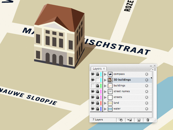
Group your building together and make sure it’s correctly placed on your map, preferably on a new layer for 3D buildings.
32. Other Buildings
The principle remains the same for all buildings:
Draw visible walls.
Measure unscaled footprint dimensions.
Apply corresponding widths to your illustrated walls.
Position walls with scaled footprint.
Skew walls to match footprint and scale horizontally as you do so.
Position rooftop.
Apply pitch to rooftop.
Place shade on appropriate face of building and on ground.
Position on map.
Now you need to continue with your buildings. As you position them on your map, they may well throw up some other issues. You can see on the image below that at least one of my street names had to be moved to allow for a building—this can be done by simply selecting and repositioning, or by altering the original and going through the scaling process again. You can also see here that the shadow of one building falls against another—these sorts of details will add authenticity to your final illustration.
33. 3D Land
Let’s give our land a bit of a 3D feel too. Make a copy of your land form (Command-C) and paste it in place (Command-F) on a new layer. Now just move it directly downwards, either with the arrow keys or your mouse.
34. Polish Up the Land
Make sure your new 3D land edges have a slightly darker shade than the existing land, and then begin neatening up the corners. Use your Pen Tool to add anchor points where paths need raising or lowering.
Then use your Pathfinder panel to create extra pieces where there should be shade (according to your light source). Make these objects a suitable degree darker.
35. We Want… A SHRUBBERY!
(Sorry to those who have never watched Monty Python.) In any case, now is a good time to start decorating your map. Greenery is a good way of giving your map some atmosphere, so go and make some bushes and trees. Remember that whatever you draw should be based upon its overhead footprint, scaled vertically to 60%, just like the buildings and the map itself.
Make a few different things and scatter them around your map (all together now…) on a new layer…
36. Number Crunching
Should you need to identify the buildings or areas on your map, adding some numerical references would be a good idea. You could do this by placing numbers in the same way as the street names; scaled and as though they are lying on the ground. Alternatively, clear differentiation could also be advisable. Simple 2D circles and numbers will allow easy identification of your buildings.
37. Welkom!
It’s in Dutch, but we’ll just put that down to authenticity. Welkom in Brielle is typical of the kind of sign you’d see entering any town or village in Holland, so we’ll add a welcome sign to our map. It’s fairly important that people know what they’re looking at after all.
Awesome Work, You’re Done!
Having tied together all your elements (plus an unlimited amount of possible other elements), you’ll have a finished map. It can always be edited in the future, either by directly editing the 3D illustration or the 2D basis which you saved earlier. Whether your map is of a town, a room, or a University campus, the theory remains the same. Don’t forget; the important thing is that information is conveyed quickly, logically, attractively and clearly. I hope you have fun with this one!
How to offer great user experience? When prioritizing between search ranks and users, we will rather advice you to start with the users rather than search ranks. Without users, you just cannot make any progress to whatever direction you want your website to take. Getting positive user reaction through offering a great user experience makes Read More …
This tutorial was originally published in April 2011 as a Tuts+ Premium tutorial. It is now available free to view. Although this tutorial does not use the latest version of Adobe Photoshop, its techniques and process are still relevant.
If you’ve ever attempted to write words using traditional light painting photography techniques, you probably know how challenging it can be to create words that are easy to read. In this tutorial, we will demonstrate how you can create a similar look without a camera and tripod. Let’s get started!
1. Sketch Out Your Composition
Step 1
Let’s start in Photoshop. Launch the program and create a new document. When creating everything from scratch, it’s always a good idea to make it really big. That way an A2 format can later be chopped up and cropped in any other format desired. We’re going to create a borderless illustration for an A2 and later crop it into an A3. So create a new document with these sizes: W: 42.5cm, H: 59.4cm, 300 dpi, CMYK.
We want the overall shape to form a heart, so draw a heart really quickly.
Step 2
Use the guideline to draw in your text with a tablet. Consider this a sketch. If you’re more comfortable doing this on paper, do it and scan it.
Step 3
For this single step, I’m going to switch to Illustrator. I’m more comfortable with ol’ Illy when it comes to lettering, but it’s entirely doable in Photoshop too. Once you’re done, Copy it (Command/Control-C).
2. Create the Multiple Lines
Step 1
Paste it in Photoshop as a Path (Command/Control-V, select Path in the pop-up dialog).
Step 2
Select the Brush Tool (B) and change your brush to a 100% soft edged, 10 px diameter brush. Grab the Pen Tool (P), right-click and select Stroke Path. In the pop-up dialog, make sure Simulate Pressure is not checked and press OK.
Step 3
Go to Filter > Blur > Motion Blur. Change the direction to a 60 degree angle and strength to 20. Press OK.
Step 4
Reduce the Opacity by approx. 50% and duplicate it. Apply a Layer Mask (Layer > Layer Mask > Reveal All) and start to hide away portions with a large, black, soft brush.
Step 5
Grab the Pen Tool and trace your first light streak in Path Mode.
Step 6
Just as you did before, stroke the path with a 10 px brush. You need to do this individually in order to keep the appearance realistic. Alternate between 5, 10 and 15 px brushes and various levels of Opacity.
Step 7
After you’ve applied it, you need to hide both ends of the line. Use a Layer Mask and draw with black on each end.
Step 8
Use the original lines only as a guide. Start to add thickness to the letters, but preserve a classic typeface look by keeping the top and bottom of the bowls thin, and the sides thick.
Step 9
As you progress with the words, try to thicken the left side of each letter. Doing so will preserve the spacing between the letters.
Step 10
Remember to fade out each end of the lines, otherwise they won’t look real.
Step 11
Work your way through the letters until you have reached a similar result.
3. Add Color
Step 1
By now, it’s a good idea to nail the colors of the project. Above all other layers, create a Gradient Map Adjustment Layer (Layer > New Adjustment Layer > Gradient Map) Use these colors: #000000; #54000c; #d69f0a; #fffee9.
Step 2
Leave the Adjustment Layer always on top. Now that we’ve finished the lines, it’s time to add glows. Repeat the path creation process, but this time use a very large size (100–200 px) and enable Pressure Simulation. As a color, use a 50% gray (#8c8c8c). Change the Layer Style to Screen.
Step 3
Cover all the thicker portions of the letters with similar glows.
Step 4
It’s time to add even thicker lines, but with Pressure Simulation enabled and white color. Use lines of varying widths (25–75 px).
Step 5
Add thicker, soft white lines all over the letters.
4. Add Flares to the Letters
Step 1
Download this flare image and place it in your project. Rotate it until the angles of the rays are at 90 degrees. Set the Layer Style to Screen.
Step 2
Duplicate the flare, and double its size. Rotate it by 45 degrees.
Step 3
Go to Filter > Blur > Gaussian Blur, and use approx. 30 px to soften the secondary flare.
Step 4
Duplicate this flare (both layers) and place it around the scene in points of interest.
Step 5
Repeat the previous steps to achieve the same effect for the bottom text.
Step 6
Create a few more lines around the scene that follow the original path only to a certain point. Make them white, and of different Opacity levels.
5. Add Bokeh
Step 1
Open the blurry lights image and place it in the document. Set its Layer Style to Screen.
Step 2
Apply a Layer Mask and mask out portions of the image that have lights under the crop of the image. Make sure all the lights that are left aren’t sliced.
6. Enhance the Light
Step 1
In order to add a bit of contrast to the lights image, add a Black and White Gradient Map Adjustment Layer and make it a Clipping Mask for the lights image. Set its Layer Style to Overlay.
Step 2
Duplicate the lights image and apply it to different parts of the image. Use composites where you combine large dots with small.
Step 3
Apply the image to different points of interest. Try not to make it too heavy.
Step 4
We’re now going to combine these lights with a custom brush to make our own. Create a new brush, and change the settings as seen below.
Step 5
Keep Shape Dynamics on and change the Scatter to 550.
Step 6
Enable Other Dynamics and change the settings.
Step 7
Use this brush to draw much finer blurry lights along the letters.
Step 8
Repeat this process.
7. Add Noise
Step 1
We’re now going to add some noise without damaging the colors and lighting. Choose a 50% gray and fill an entire blank layer with it. It will appear brown because it is underneath the Gradient Map Layer.
Step 2
Go to Filter > Noise > Add Noise and add a max amount noise filter.
Step 3
Blur it by 0.8 px (Filter > Blur > Gaussian Blur).
Step 4
Change the Layer Style to Vivid Light and Opacity to 5%.
Step 5
And as one last adjustment, go to Layer > New Adjustment Layer > Photo Filter. Choose the red one.
Awesome Work, You’re Now Done!
Great work! Feel free to share your own end results in the comments to show others.
This tutorial was originally published in November 2012 as a Tuts+ Premium tutorial. It is now available free to view. Although this tutorial does not use the latest version of Adobe Illustrator, its techniques and process are still relevant.
I’ve created several vector portrait tutorials in the past, but one request is made several times and that is how to create curly hair. In today’s tutorial, I’m going to show you one of the easiest ways of creating detailed curly hair. So let’s jump in and begin creating!
1. Prepare the Document
Step 1
I start by creating a New document and then File > Place my stock image onto the canvas. As I want the hair to be one of the biggest features of this composition, I want to make sure that it has enough space to garnish the attention from the viewer.
I then set up my layers as shown in the Layers panel below. In the layer “BG” I have placed a white fill Rectangle (M) over the stock image set to 50% Opacity. This is to make the edges of my shapes more prominent against the stock image when I’m tracing shapes.
Step 2
I often use the default “Skintones” palette from Adobe Illustrator. You can access these by clicking on the drill-down menu in the Swatches panel > Open Swatch Library > Skintones. For Caucasian skin, I select the top four palettes so I can mix them to create multi-tone shading. Skin isn’t all one color—there are different shades depending on the area of the face/skin, which I’ll go into later on. By clicking on the folder to the left of the palette, you can automatically add them to your Swatches panel.
I’ve then selected a mid tone and used the Pen Tool (P) to trace my overall skin base shape.
2. Render the Skin
Step 1
For the initial skin shading shapes, I’ve used the same skin tone as the base and traced areas of highlight on the face with the Pen Tool (P). I’ve then created a Compound Path (Control-8) with the first set of shapes and used Pathfinder > Minus Front from a duplicate of the skin base shape.
I use the same process several times. Once done, I set the shapes to Blending Mode Multiply, Opacity 10%, and then Group them (Control-G).
Step 2
Using a slightly darker skin tone, I trace areas of shadow with the Pen Tool (P). Again after one set is created, I’ll add it to its own Compound Path (Control-8). Each Compound Path is then set to Blending Mode Multiply, Opacity 10% and then Grouped together (Control-G).
Step 3
As you may have noticed the shapes go beyond the base shape. I’ve duplicated the base shape and Grouped the two groups of skin shading shapes (Control-G) and then created a Clipping Mask (Control-7). All future skin shading shapes will be added to this Clipping Mask to keep a clean edge.
Step 4
Using an even darker shade, I add darker shadows with the Pen Tool (P) using the same process. Typically the darker the area, the smaller the shapes created. These shapes are set to Blending Mode Multiply, Opacity 10%.
Step 5
Now to add the highlights. I create a transparent radial gradient using the lightest skin tone. I then use it to fill shapes highlighting areas of the skin. These shapes aren’t added to a Compound Path.
Instead each set of shapes is Grouped together (Control-G). Each set is set to Blending Mode Screen, Opacity 15%.
Step 6
There are areas which are in deeper shadow than anywhere else. Typically it’s areas where the skin folds (eyelids, lips, nose crease), but also near the hairline, along the nose to help it stand out, and around the nostrils. These shapes are much darker and are set to Blending Mode Multiply, Opacity 15%.
Step 7
From the more pink hue skin tones, I’m going to add a light pink transparent radial gradient to the skin, first to just below the cheekbone within an Ellipse (L).
The next is on the shoulder. These shapes are set to Blending Mode Multiply, Opacity 60%. I’ve added the cheek coloring above the other skin shading, whereas the shoulder is below the skin shading.
Step 8
To modify the overall base of the skin shading, I’m going to add gradients below the rendered skin shading shapes. Duplicate the original base shape and first add transparent radial gradients with the highlight gradient. Using the Gradient Tool (G) move the sources of the gradients over the face and over the shoulder/arm. These are set to Blending Mode Screen, Opacity 30%.
I’ve then added a transparent linear gradient under the skin shading set to Blending Mode Color Burn, Opacity 100%.
Step 9
Using the skin highlighting radial gradient, I’ve then added more intense highlights to the eyeball and skin. These are set to Blending Mode Screen, Opacity 60%.
Step 10
Skin isn’t all one color—there are a variety of tones throughout. Typically you’ll find a hint of grey towards the corner of the eyes. Use a transparent radial gradient set to Blending Mode Color to add a grey tint. Reduce the Opacity accordingly, although keep in mind that the more prominent the grey, the more aged a person will appear.
The tip of the nose typically is more rosy. So use a red radial gradient set to Blending Mode Color Burn, Opacity 20% to add a hint to the nose.
To make the cheekbones stand out more, add shading underneath them. I’ve added more color to the cheekbone with a purple transparent radial gradient. This is set to Blending Mode Color Burn, Opacity 10%.
Step 11
To show the creases in the neck, I’ve added further highlights using the highlighting skin gradient. These are set to Blending Mode Screen, Opacity 30%.
3. Render the Lips
Step 1
When I begin skin shading, I always treat the lips as if they have no color and shade them with the skin. This is because I don’t want the lips to look as if they are floating independently on top of the skin.
I then use gradients to add color to the lips. I’ve used a pink transparent radial gradient on the three shapes I’ve created for the lips: one for the overall lips shape and one each for the top and bottom lips. They overlap in the center to help darken this area which is in shadow. These shapes are then set to Blending Mode Color Burn, Opacity 40%.
Step 2
I use a brown transparent radial gradient to add shadow and creases to the lips. These shapes are set to Blending Mode Color Burn, Opacity 50%.
Due to the contrast created with these shapes, I’ve added further shading to the face with the same gradient. These shapes are set to Blending Mode Color Burn, Opacity 100%.
Step 3
With the Pencil Tool (N) and a light pink transparent radial gradient, add highlights to the lips. The Pencil Tool (N) will allow you to add many shapes much quicker than using the Pen Tool (P). These shapes are then set to Blending Mode Overlay, Opacity 30%.
Then using the highlighting skin gradient, add further more intense shapes. These are set to Blending Mode Color Dodge, Opacity 40%.
Step 4
I want the lips to appear more pink than red/orange, so I duplicate the shape covering the whole of the lips area and add a dark blue transparent radial gradient. Set it to Blending Mode Soft Light, Opacity 100%. This helps “neutralise” the red/orange tone.
4. Render the Eyes
Step 1
Using a similar theory, I’m going to “neutralise” the red/orange tones on the eyeballs slightly by using a light blue radial gradient. This will be set to Blending Mode Color and Opacity 30%.
Then I’m going to add highlights to the eyeball using the highlighting skin gradient set to Blending Mode Screen, Opacity 40%.
Step 2
I’m going to add a pink tint to the water line with a rose transparent radial gradient set to Blending Mode Color, Opacity 100%.
Then add a bolder and darker gradient in the corner of the eyes set to Blending Mode Multiply, Opacity 30%.
Step 3
With a golden brown fill color, use the Pencil Tool (N) to add shading around the waterline and corner of the eye. These shapes are set to Blending Mode Multiply, Opacity 10%.
Then with a light pink, add highlights with the Pencil Tool (N) set to Blending Mode Screen, Opacity 40%.
Step 4
I’m going to use Clipping Masks (Control-7) for the iris. First duplicate the largest shape for the eyeball. Then draw an even circle with the Ellipse Tool (L).
Create a Clipping Mask: first a duplicate of the iris and then a Clipping Mask containing this iris mask, with the eyeball duplicated shape. This will give you a Clipping Mask within a Clipping Mask. You will see the benefit of this soon.
Step 5
I’ll be adding the detailing to the eyes via the Appearance panel. I’ve used a mid brown for the iris. The first fill is set to 60% Opacity, and the second from bottom fill is Offset Path by -1 pt and 100% Opacity. This gives the iris a soft edge.
Then the pupil is made from two dark brown fills. One is Offset Path by -12 pt with a Blending Mode of Multiply, Opacity 40%. The next is Offset Path by -13 pt and with a Blending Mode of Multiply, Opacity 80%. Again this is to create a soft edge.
Step 6
Gradients are then added to the iris. These are Offset Path by -1 pt. An inverted dark brown radial gradient is applied to give a vignette effect around the iris.
This is then duplicated and with the Gradient Tool (G) is enlarged and brought down towards the bottom of the iris. This gives a slight shadow at the top of the iris.
Then a green to orange radial gradient is applied to the bottom of the iris. This is to give a golden brown tone to the eyes.
Step 7
Duplicate Item and give an Offset Path-1 pt and a dark brown transparent radial gradient fill. Then go to Effect > Transform & Distort > Zig-Zag and use the settings below. If the two Clipping Masks were not applied, the zig-zag effect would overlap onto the eyelid and onto the eyeball. Once done, go into the Graphic Styles panel and Add New Graphic Style and apply it to the other eye so you’ve got the same effects on both.
Step 8
Using the Pen Tool (P) and a dark brown fill, draw shapes around the eye and eyelid crease. This is to help build upon a base for the eyelashes and to define the eyelids. These shapes are set to Blending Mode Multiply, Opacity 30%.
Further, more subtle shapes are added with a black fill, set to Blending Mode Multiply, Opacity 10%. These help to add shadow onto the eyeball.
Step 9
Using the skin highlighting gradient, add a light reflection along the waterline and over the pupil. These are set to Blending Mode Screen, Opacity 70% to 100%.
Step 10
Eyelashes are added using the Width Profile 1 brush I’ve created in a previous tutorial. Both lashes use a dark brown stroke color, but the top are set to Blending Mode Multiply, Opacity 70%, and the bottom are set to Blending Mode Multiply, Opacity 40%.
5. Render the Hair
Step 1
Before I begin adding the hair, I decide to sketch out ideas. I use the Blob Brush Tool (Shift-B) to sketch with. I Create New Layer above and below the core elements of the portrait to sketch hair on top and underneath the portrait. I’ve decided in this case I’m going to fill all the negative space with hair.
Step 2
For curly hair, you need to treat each curl as its own entity. Each curl should cover any hair which is underneath it to create a mane of healthy, thick curls. One of the easiest ways of going about this is to create an Art Brush of a curl. Of course we’re not drawing an actual curl, but imagine pulling a curl straight.
Using the Rounded Rectangle Tool, draw out a shape and use the Direct Selection Tool (A) to select the end points of the shape. Then use the Free Transform Tool (E) to reduce the size at the end of the shape to create a tapered effect. I want to give the portrait a mass of green hair.
Step 3
As you can’t include a gradient or a Clipping Mask with an Art Brush, I’m going to create a gradient effect using a Blend. Duplicate the tapered shape twice. Use the Free Transform Tool (E) to reduce the size of the shape on top. For the larger one, set it to 0% Opacity. Then with both shapes selected create a Blend (Control-Alt-B) with Specified Distance Spacing of 4 pt. Set the Blend to Blending Mode Multiply.
Step 4
Using the Width Profile 3 brush, add strokes using the Line Segment Tool (\) at the tip of the tapered end with a 2 pt Stroke Weight. These strokes should be the same green as the original tapered shape and placed below the Blend.
Step 5
With the Width Profile 1 brush, add 2 pt Strokes with the Line Segment Tool (\) on top of the shape with Blending Mode Screen, Opacity 30% to add highlights. Then using the same settings, add darker strokes with a Blending Mode of Multiply, Opacity 30%. Group all the elements once done (Control-G).
While the group is selected, in the Brush panel create a New Brush > Art Brush and click on OK.
Step 6
Using the Pen Tool (P) for a smoother curve, add curls around the face underneath the face elements. Group them together once you’ve applied the initial curls (Control-G).
Add the curls in groups so you can place them underneath the previous ones. The curls in front should be above all the others and the curls at the back should be at the bottom of the layer.
Step 7
While layering the curls, for any gaps present I use a dark green shape to block the gaps.
Then when I’ve finished the layering of curls, I add a dark green Rectangle (M) behind all the curls.
Step 8
Using the Width Profile 1 brush and the Paintbrush Tool (B), I add strokes with a medium green along the sides of the curls and at the tip. As each curl is identical, I want to make them look more individual. So adding additional strokes helps me achieve this. These strokes are set to Opacity 80%.
I repeat this same method for the curls at the back and add them in stages.
Step 9
With a lime green, I add 4 pt Stroke Weight, Width Profile 1 strokes to the curls. These are set to Blending Mode Color Dodge, Opacity 40%. These strokes add a highlight to the curls and give them further definition.
I then add 2 pt Stroke Weight strands to add more detail to the highlights. These are set to Blending Mode Screen, Opacity 40%.
Step 10
Using the Pencil Tool (N), I add lime green transparent radial gradients over the top of the highlighted areas of the curls. This adds a smoother highlight to them. These are set to Blending Mode Color Dodge, Opacity 25%.
6. Create the Eyebrows
The finishing touches are to add eyebrows. I’ve used the Width Profile 1 brush to add 1 pt strokes to the brow bone. The initial strokes are set to Blending Mode Normal, Opacity 80%.
Finishing off with some strokes set to Blending Mode Multiply, Opacity 50%.
Awesome Work, You’re Now Done!
If you’ve followed my tutorials in the past, you’ll know I finish off with a couple of moles to the face and skin. These are created using two-layered brown transparent radial gradients set to Blending Mode Multiply. I hope you’ve enjoyed this tutorial and learnt one of the methods possible for creating curly hair.
In this tutorial I will introduce you to the types of drawing materials you can use to set you on the path to sketching and doodling, wherever and whenever the mood takes you.
Why Drawing?
You can draw just about anywhere and with the most basic of
materials. Drawing can be one of the most relaxing and pleasurable pastimes,
and if you want to take your creative skills further, drawing trains
your hand-to-eye coordination, helping you to improve your work with any tool you choose.
So, pick up a graphite or Conté pencil, or a piece of
charcoal, and draw on the train on the way into work, an image that catches
your fancy off the television, your husband/wife, your local garden—anything
or anywhere.
1. Pencils
The Basics
Graphite pencils are generally wooden with a lead running through them, but you can buy a propelling pencil (an outer case), filling it with the lead you wish. The actual lead we use today is made up of a mixture of graphite and clay, as the original historical lead was poisonous.
Pencils range in hardness from 9H (the hardest) to 9B (the softest), with F and HB in the middle. I prefer using the softer pencils for drawing—the Bs—and will concentrate on these in this tutorial.
B to 9B Pencils
B pencils have the following characteristics, with B being the hardest and 9B the softest.
The softer the pencil, the darker your lines and shading.
The deeper your shadowing, the easier the pencil is to smudge.
The thicker your lines, the more difficult it is to keep a pencil sharp, the more difficult it is to rub out your lines cleanly, and the more resistant they are to water-based paints. B is easiest to cover, while 9B is the most difficult (almost impossible), especially if you lay the graphite down thickly.
When I first start to sketch, I tend to use a B. This allows me to draw light lines, which can either be ignored as I work into the drawing or can be drawn over with a softer, darker pencil (see the sketch of the little boy above). If an object is moving—for example, the panda below—the B pencil allows me to make loads of quick corrections without losing what I am drawing.
Keeping Pencils Sharp
Working with sharp or blunt pencils is a
personal choice, but I wanted to add a small note about sharpening them
in the first place.
Pencil sharpeners do what they are
supposed to, but if you are out and about sketching, there may not
always be somewhere for you to leave your shavings. So consider
buying a tub sharpener, one that has its own reservoir for all your
sharpenings until you can dispose of them.
Using a knife
instead of a sharpener is a romantic idea, but carrying a knife around
for that purpose isn’t practical, and is possibly illegal. Although it gives you an
unusual squared-off point, sharpening a pencil with a knife eats them at a phenomenally fast rate.
What Should You Buy?
To start with, you should buy a selection of individual pencils: B, 2B, 4B, 6B and 8B. You will get a feel for what they do, and will be able to decide if certain ones are just a bit too dark for you, or too light. Once you get used to them, you can then buy the harder or softer pencil before or after that.
There are so many makes of pencil out there, but I have a couple of favourites: Derwent and Faber-Castell. That’s because they are less likely to break the whole way through if you drop them (something I am prone to do), and the graphite feels smoother when you draw with it, less gritty than others.
You can buy tins of pencils, but be careful of the labelling—make sure they contain a selection of soft and hard pencils, not all the same type. A lot of tins contain a number of H pencils as well as B, so keep an eye out for the contents.
2. Charcoal
Charcoal is messy. It goes everywhere, especially on your hands, your face, your work surface, your clothes, and the floor. But it is great fun to use, and the effects
are really quite different to those of any other material out there.
The Basics
There are three types of charcoal:
Vine, which is normally around the width of a pencil and is the result of burning sticks.
Compressed, which is shaped into sticks of varying lengths and thicknesses.
Charcoal pencil, which is charcoal through a wooden pencil instead of a lead.
As you can see from the drawing of the eye, above, you can get a lot of detail from the vine and pencil charcoals, and they can be used as you would a normal pencil. The compressed charcoal, though, is best for taking advantage of smudging and working in large areas.
In the above drawing, I used a compressed charcoal to fill in the whole area, smudging bits with my finger or leaving the lines the charcoal has made. I then took a putty eraser (more details in section 4) to draw into the charcoal, lifting the black dust off to create the cube. You can scratch into the charcoal with your nails, and add more detail with charcoal vines, pencils or even a small knife. And if you are worried about smudging your finished drawing, a bit of hairspray will fix it in place.
What Should You Buy?
If you want to experiment with charcoal, I would start with two types.
Willow charcoal of varying thickness allows you to get lovely lines, and is controllable, like a pencil.
Compressed charcoal will enable you to cover large areas quickly and is darker than willow.
3. Conté Pencils
I have included these in this tutorial as they are treated just like pencils, but have a little bit of colour to them. Instead of graphite, Contés contain chalk and are available in black, brown, terracotta red, grey and white. They are great as stand-alone drawing materials, or they can be used alongside charcoal and ordinary pencils to lift your drawing, especially if you are working on coloured paper.
I have to admit I love using these, and have just spent a few happy
hours drawing in a museum with them. They didn’t need sharpening the
whole time, and when I made a mistake, I could gently smudge it away with
a finger.
What Should You Buy?
This is an easy one. Conté pencils are the make, so you just need to decide which colours you prefer. To start with, you can buy packs of six assorted colours, but I would look for the ones that contain white, as white can have the most uplifting effect on your drawing, and it’s well worth playing with.
4. Erasers
You can buy erasers just about anywhere, but they are not always the ones you should use when creating art. Below is an image of four erasers, and the top two I would avoid. The blue could colour the paper you are working on, and the black (which could do the same) is also so rough that it could damage the surface of your drawing.
What you are looking for is a smooth white eraser, like the one on the bottom left.
The one on the bottom right is a putty eraser, and although it is no good at large areas, it is great for creating clear or white spots within your drawing. It can be shaped into a point for precision, but the more you use it, the dirtier it becomes, as you can see below. (The sphere was created using a 9B pencil and a putty eraser.) I tend to use a putty eraser more as a tool than an eraser.
However, I actually try to avoid using an eraser, as going without tends to push me to improve. If I make a mistake, there is nothing I can do about it but draw on, and try not to make that mistake again.
What Should You Buy?
You should buy two erasers: latex and putty. The best latex, I find, hands down, is Staedtler Mars Plastic, because it keeps your work clean and doesn’t fall to pieces. The putty eraser you use can be any make, and white. I’ve never been keen on coloured erasers, as you don’t know what the colour is going to do.
5. Papers
There is an endless choice and variety of paper out there, ranging from smooth to textured, whites, creams and every colour you can think of. The one you choose to use affects so many aspects of your drawing. You can buy paper loose or in a sketchbook.
Paper Thickness
When you are talking about the weight of paper, you are actually referring to its thickness. I prefer to work on papers that are 120gsm and heavier. They have a luxurious feel to them, and can take a lot more abuse than 80gsm. I can lean heavily without my pencil marks imprinting on the paper below, and I can (if I have succumbed) repeatedly use an eraser without damaging the surface. And on the heavier ones, I can add water-based materials without the paper getting very wrinkly.
Surface and Texture
Texture is a personal choice. When drawing, I like to work on a slightly textured stock, because smooth can smudge and at times it is difficult to make the lines I want with my chosen materials. A rougher texture also affects the finish of your drawing, as you can see from the sketch of a cat below.
Colour
I prefer to draw on whites, creams, muted browns, greys and blacks, and find that any other colour tends to be too overpowering. The darker shades of paper are wonderful for concentrating on light and highlight—Conté pencils are wonderful for this.
Sizes
Paper comes loose leaf and in a variety of sizes. A4 is the size of printer paper. A3 is double that, A2 double again, and so on. Below are the ones most artists use, but they can go a lot bigger:
A1: 59.4 x 84.1cm, 23.4 x 33.1″
A2: 42 x 59.4cm, 16.5 x 23.4″
A3: 29.7 x 42cm, 11.7 x 16.5″
A4: 21 x 29.7cm, 8.3 x 11.7″
A5: 14.8 x 21cm, 5.8 x 8.3″
A6: 10.5 x 14.8cm, 4.1 x 5.8″
I should mention that paper sizes differ in the US.
What Should You Buy?
For pencil drawing, start with something off-white and very slightly textured. It would be tempting to use printer paper, but it’s far too smooth and gives no room for making mistakes. With both charcoal and Conté, use a more textured paper, and go for something with a bit of colour to see what effect it has on your chosen subject, but try and avoid bright shades as they are very overpowering.
And, to keep the costs down, I have also been known to use lining paper (the stuff that goes under wallpaper), which is available at DIY shops. It has a slight texture to it, can take a lot of punishment, is great for most media, including some paints, and can be torn off to the size you want.
The size of paper you choose is a preference, but if you are drawing out and about, taking a selection of A4 sheets on a clipboard works very well, and it can easily be rested in your lap.
6. Sketchbooks
Sketchbooks are an artist’s diary, notebook and inspiration. They come in a wide variety of shapes and sizes, which can be carried in a bag for convenience, or under your arm if you like something bigger.
Some have their pages permanently stitched in, while others have perforations for tearing paper out.
What Should You Buy?
I tend to avoid the spiral bound ones as I like to work across the two pages that are open in front of me, allowing my conveniently sized A4 to become A3. The spiral can get in the way of my hand when I’m working.
If you are out and about or have little space, look for an A6 or A5 sketchbook as they are easy to store in a bag, and can rest in your other hand while you are drawing.
Larger sketchbooks are great for working on at home, but unless you are happy, and comfortable enough, to sit on the ground or don’t mind carrying a portable easel, I would avoid these if drawing elsewhere.
Put your contact details in your sketchbook in case you lose it, and date it. It is wonderful to see how you have improved over time, and the date will help you keep track.
Conclusion
There are no steadfast rules to drawing and sketching, except practice with your materials and use what you like best. Mix graphite pencils with charcoal and Conté, and see what effects you can get. Sketch while you are traveling, and most of all have fun.
All the materials I have mentioned are available from art shops both on your high street and online.
Giving a designer Photoshop brushes is like putting a kid in a candy store. We all go nuts experimenting with different brush effects to see our new tools in action!
Submit to Our Tuts+ Community Brush Pack!
Have you ever experimented with making your own brushes in Photoshop? Well, don’t let them go to waste!
For this project we want your help in building the ultimate brush pack full of free goodies that can be used in Photoshop. From grunge, to fractal, and even the experimental, bring us your own unique brushes to share with the community!
Want to contribute but not sure how to get started? First read up on the rules and guidelines, and then scroll on down for tutorials and inspiration.
How to Enter This Community Project:
Create and upload your custom Photoshop brush to your own site or social media (e.g. DeviantArt) as a .ZIP file. Link to the brush within the comments section of this post.
Include your name, website, and a brief bio of yourself along with your entry.
At the end of this project, all brushes will be collected and organized to create the ultimate freebie brush pack!
Guidelines
Brushes must be Photoshop compatible. Link to one or more custom brushes in the comments. The deadline for submissions to be included in the showcase article and official community brush pack is July 31st, 2015.
Link only to brushes created by you. Please no links to outside sources other than your own custom creations.
Link only to brushes that are free for personal and commercial use. We’re giving these away after all!
When
you publish your artwork on this article, you agree that the graphic(s)
can be included in one or more articles on Tuts+ and perhaps shared with
other readers on the Tuts+ network via social media.
Submit and have fun!
Get Inspired!
Check out these tutorials to learn how to make your own Photoshop brushes from scratch!